
Take inspiration from these 10 mobile website design examples, and learn how to replicate their success.
10 best mobile website design examples and best practices.
In this post, I’ll share ten inspiring mobile website design examples, why they worked, and how you can do the same for your site.
You’ll walk away knowing concrete ways to implement the newest trends and stay ahead.
Let’s get started…
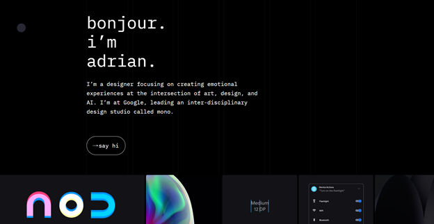
1. Adrian Zumbrunnen
Adrain Zumbrunnen is a writer, designer, and speaker and he has his own website. When you visit his site, there are a few things that you can immediately notice.
First, it’s unique – I’ve never seen any website similar to this style. The way it’s formatted and written is just breathtaking. It looks like his website is some sort of word editor so you can immediately see he’s a writer.

Second, it’s super conversational and simple. There is not much information on the screen and you can easily navigate through it – you just scroll down.
But probably the most outstanding feature is the way he engages with visitors.
There are personalized buttons you can click on that will automatically scroll you further and reveal more information – everything nicely animated.
This is one of the secrets of his success. Personalization is huge when it comes to making your audience feel understood and cared for.
And if you fail to do that, you’ll end up as most websites that visitors quickly abandon.
Another great thing about his mobile website design is that it’s engaging.
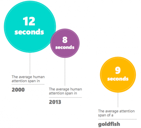
You must do everything in your power to create an engaging design because if you fail to do so, your visitors will quickly move. In fact, our attention span is as little as 8 seconds.
So What Can We Learn From Adrian Zumbrunnen?
If you look at his website’s mobile design, it’s totally unique and engaging.
He offers a personalized experience and quickly grabs the user’s attention and holds it with animated buttons that create a personalized experience.
It’s super-simple and intuitive so you don’t risk losing visitors because they get confused.
2. Shutterfly
Shutterfly is a site that allows users to create personalized cards, photo books, albums, and so much more. Basically, everything has something to do with photography.
When you arrive at their mobile site, they greet you with a “The Best Deal” promotion and a sign-in button to become part of the family.

You can scroll down and there you can see the real beauty of their mobile design.
They present you with beautiful images that showcase all their features and what they are capable of delivering.
You can see that they have a nice structure and design and use only a handful of words. It’s super-simple, clear and you have everything served on a silver platter.
And That’s Exactly What You Should Do.
Simplify your website and give it a nice structure.
Make everything visually pleasing with images and videos and use words sparingly. It’s key to appealing to your visitors and making them stay on your site longer.
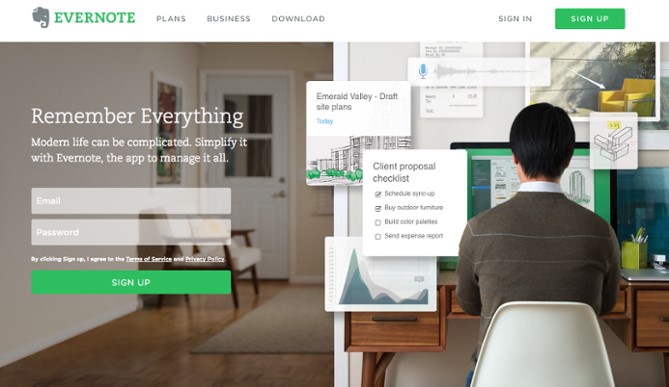
3. Evernote
If you love note-taking, you must have stumbled upon Evernote at some point.
Evernote is a note-taking app that allows its users to easily create notes, include pictures, highlight stuff, and access everything across all devices. What’s even more stunning about Evernote is its mobile experience.
When you enter the page, you’ll see a big vibrant logo and a catchy headline below it.

If you pay close attention, you’ll see that there’s a lot of whitespaces left around.
This makes the design simple but also ensures that you know exactly what to focus on – the headline and logo.
Another great tip to take home is being consistent with the brand colors. They use the same color palette over the whole website which makes their design more aesthetic. These colors are also carefully picked…
The green color represents nature and health – they are saving trees with online note-taking.
Lastly, there’s a big call-to-action you can not miss.
This is one of the key elements that made their mobile website design so successful. A call to action is crucial especially if you’re looking to boost sales and conversions.
Did you know that using CTA can boost your sales by 1617%?
Unfortunately, most businesses either don’t use it or make it super complicated.
So What Should You Take Home From Evernote?
You should keep your design simple and include a lot of white space.
It’ll allow you to shift your visitor’s focus to the things that matter and prevent them from feeling confused or overwhelmed.
You should also choose colors wisely based on what they represent.
Lastly, don’t forget to include a big CTA to boost sales and make your mobile website design sell like crazy.
4. GetResponse
GetResponse is a company that provides email services.
It’s exceptional especially if you’re looking to build a solid email list with tons of leads. One of the secrets of their success is their mobile website design.

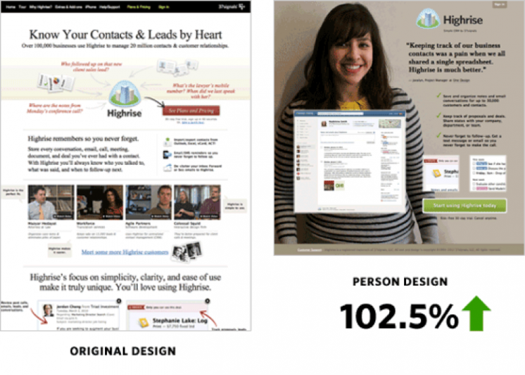
When you arrive at the site, you can immediately see a real person looking at you.
You may not realize it, but this simple thing makes their mobile website design great. This is because you no longer feel like talking to a giant company. Instead, you feel like you’re having a nice talk with a friend – it takes all the pressure off.
And the results it brought?
A 102% increase in conversions just by adding a picture of a person on the landing page.
The second tip from GetResponse’s mobile website design is to use space sparingly. They don’t write walls of text. Instead, they only include short snippets of text and if you want to read further, you click on “learn more”.
So What Can We Learn From GetResponse?
Including pictures on your site is great, but placing people on these pictures is even better. It’ll take the pressure off from talking to your company and make it seem like a friendly discussion.
You should also use the space sparingly and add “read more” buttons to your site.
5. Lego
Lego is the most popular toy brand in the world.
What separates it from most brands is that they have two opposite target audiences. They target not only children but also adults so they had to find the right balance between them.

The first thing you can notice about their mobile website design is a drop shadow. This creates an illusion of 3D objects on their site and makes each element pop out.
Another reason why this site pops out is the vibrant colors they use.
They do the exact opposite of what other sites like Apple do. They don’t use basic colors. Instead, they are different and stand out with vibrant colors.
So What To Take Home From LEGO?
You don’t always need to follow the trend and be like others.
Experiment and try to make your website unique. You can also use drop shadow and vibrant colors to make your whole website pop out more.
6. SquareDot
SquareDot is a company that helps customers with their inbound marketing strategy. They have a very beautiful website mostly because of the complementary colors they use.

They also feature a simple design with easy navigation, making everything seamless.
You can see that the structure of the design is similar to Evernote.
But what’s different is that it’s even simpler. Yep, that’s right, if you scroll down, you don’t see a bunch of benefits listed like with Evernote.
Instead, you see only one thing at a time.
This is superb for shifting visitors’ focus and making each benefit stand out.
Another great feature is the animations. They allow visitors to have a better experience and also make the whole website more beautiful and dynamic.
It’s no longer a boring static website. Instead, it’s engaging and constantly changing with animations.
So What Can We Learn From SquareDot?
Be sure to break down your design and show only one thing at a time. Use animations and make your website more dynamic and engaging.
7. MTV
MTV is a streaming platform similar to Netflix. You can watch the latest movies and TV shows. It’s very popular and especially beloved by teens mostly because of its great mobile website design.

When you enter their site, you get hit by a card view images of the movies, snappy titles, and names of the episodes.
What’s so great about this design is that it’s easily scannable.
This is especially important with Gen-Z because they want to have everything instantly.
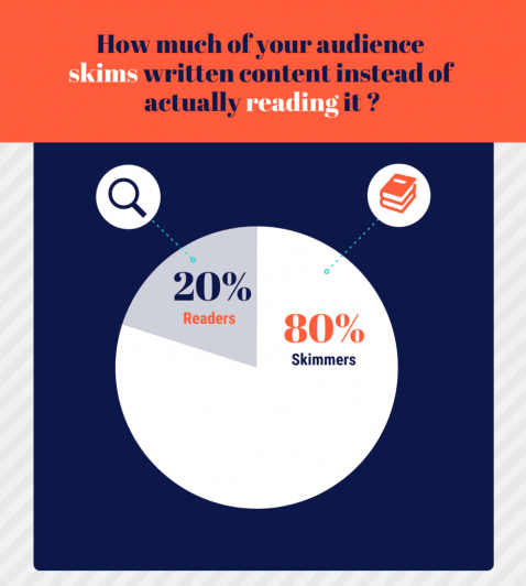
Making your content easily skimmable can help you with that. In fact, did you know that 80% of visitors are only skimmers?
That’s right, so be sure to make it a priority.
So What Makes MTV’s Design So Great?
Keep everything nice and simple.
Use pictures, short headlines & paragraphs to make your mobile website more visually pleasing and skimmable.
8. LeanLabs
LeanLabs is a marketing company that creates high-conversion, engaging web solutions.

There are multiple reasons why their mobile website design is so successful.
When you get to their site, the headline will immediately grab your attention.
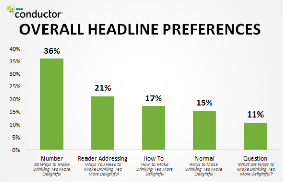
It’s very impactful and carries a strong benefit – 10X Your Brand. It also features numbers which is the key part of every successful headline.
If you scroll further, you get to the Frequently Asked Questions section.
This is the section most websites lack (which is a big sales killer). Imagine you persuade visitors to buy. But they are still not quite sure if it’s what they’re looking for.
That’s when they will go to find the answer in the FAQ section. But if you don’t include it, you lose them.
Fortunately including it on your site isn’t difficult, you just need to find common questions people ask. You can easily do that by performing keyword research.
Go to BiQ’s Keyword Intelligence and type in your main keyword in the search bar.
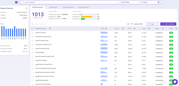
Hit enter and you’ll be presented with a list of related keywords. Click on the Popular Questions tab in the upper menu and there you have it.
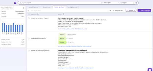
You get a list of the most common questions people ask in your niche.
You can push this a step further with competitor analysis and find out competitor’s top-ranking webpages, create a better piece of content and stay ahead of them.
So What To Take Home From LeanLabs?
They have a powerful headline that carries a strong benefit. This is crucial because 80% of visitors will read your headline, but only 20% of visitors will read further.
To improve that ratio, you must produce a compelling headline carrying a strong benefit.
They also feature an FAQ section that answers visitors’ questions and ensures them on their decisions and increases sales.
9. Etsy
Etsy is one of the biggest e-commerce sites where people sell or buy handmade items. They have two target audiences – similar to Lego.

They target buyer’s who know what to buy but also people who are just browsing, looking for inspiration and items to buy. What makes their mobile website design great is that they target both of these groups from the early beginning.
As you can see, you can immediately choose what you want.
Do you want to browse categories and find something or you have something specific in your mind you want to buy?
Either way, they presented you with both options. And if you scroll a little bit below, you can instantly see trending items with great-looking images.
This is extremely important for sales, because of crowd psychology.
“If many people bought the product, it must be good.”
This is how we think, it’s in our nature to do what others are doing. That’s why including trending items or “The best option” on your site can drastically boost sales.
So, What Can You Steal From Etsy?
You should make sure to target all visitors, whether it’s a person at the top of the funnel or down at the bottom looking to buy.
The second thing is adapting to evidence-based decision-making. If others bought it, it must be good. Highlight the number of customers on your site that has bought a certain product to generate more sales.
10. Nike
Nike is one of the biggest clothing brands in the world. Its design is very similar to the websites we’ve talked about earlier. But it features one thing none of the others does…
They have probably the best website for mobile because of their “Customize Your Shoes” feature.

This feature is extremely engaging and attention-grabbing. It makes visitors be invested in the brand and leads to massive results.
So What Makes Nike’s Design Stand Out?
Make your website different and highly engaging.
Allow users to invest their time and effort into it, let them create their own work and they’ll be happy to pay for it. It’s one of the best money-making ideas.
Final Thoughts
So that’s 10 of the great mobile website design examples to inspire you.
They can inspire you to create something similar, update your design, and smash 2021 like never before. But it’s important to try what works for you.
There’s no one-fit solution though. That’s why you have to try what works best for you. So which mobile website design will you try first?
Or did I forget to mention your favorite site’s mobile design?
Either way, feel free to let me know in the comment below.