
There are multiple things that make a great website design. Here are 10 best website design examples and best practices.
Website design refers to the design of websites that are displayed on the internet.
As a website designer, life is always a constant struggle to come up with fresh ideas and repeatedly try not to end using the same design.
It can be frustrating, especially when you feel like you’re going nowhere in the project you’re working on.
Therefore, here are 10 best practices and examples that can help you get your creative juice going and help you build an elegant website.
These website design examples will help you make your website beautiful and engaging, which will allow you to drive more traffic and sales.
Let’s dive in!
1. Make Everything Intuitive
This is probably the biggest tip that yields the most sales.
Your customers are always in a hurry. They don’t have time to figure out where to click or what’s the site about. If you confuse them, they’ll immediately abandon your site.
An easy way to prevent that and make your customers stay on your site longer is to make everything intuitive. Don’t make your customers think, rather do the whole thinking by yourself.
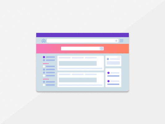
A great example of the top website design that’s intuitive is Moz’s website below.

Let’s now look at how you can make your web design more intuitive.
Tip 1: Remove Unnecessary Information
In the past, websites were full of ads, sections, texts, and images. You can see an example of that below.
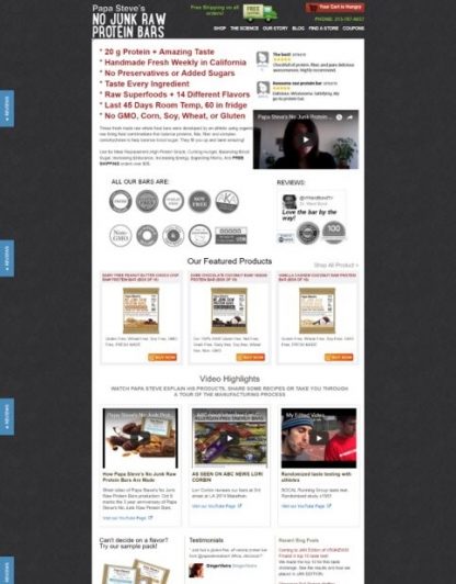
This isn’t the case today. The ads and too much information only distract customers and confuse them. They’ll get lost, not knowing where to click and leave your site.
So be sure to delete everything unnecessary and make your site more intuitive.
Tip 2: Give Them Fewer Choices
This is one of those web design ideas that won’t make your website look better.
But they can help you get more clicks and increase sales. This is because of Hick’s law. In essence, it says that the more choices you offer, the longer it takes for your customers to make a choice.
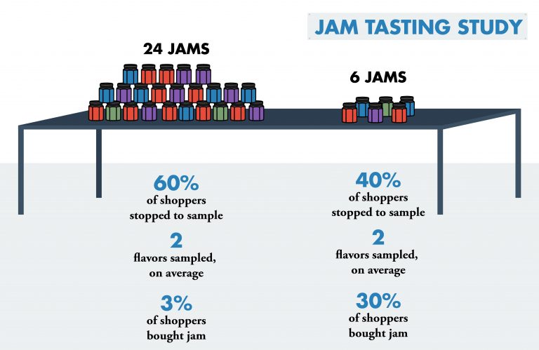
The study found that those who had more choices were less likely to end up buying. That’s why the best website design is so simple, showing visitors only what’s needed.
Making your design intuitive will allow you to get more clicks that will lead to more sales.
2. Give It Life & Make It More Engaging
As the years go by, our attention span is getting shorter.
This trend isn’t going anywhere. In fact, we’ve reached the point where our attention span is shorter than the attention span of a goldfish.
This is why it’s so important to get customers’ attention immediately.
The easiest way to do that is to include the combination of action and visuals on your site. For instance, you can create an animated object that will stay with your customers during their whole journey on your site.
This works so well because of human nature. We’re drawn to visuals and action – that’s why videos are consumers’ favorite type of content.
You can see an example of using an animated object in the Pei Jung Ho website below. Immediately after you enter the site, you’ll see an animated hamburger in the upper right corner.
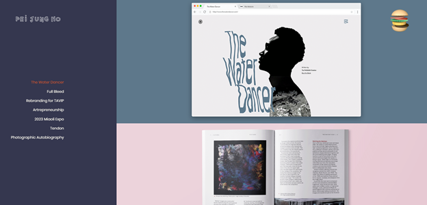
It makes the whole experience more pleasurable and fun.
But this is very subtle, and if you want to get all the benefits, you should think big. That’s exactly what MA True Cannabis did. They got the whole website consisting of animated objects you can play with.
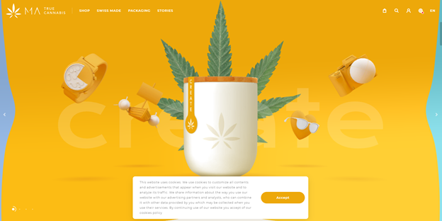
It’s super cool and will make their site stand out.
So be sure to include animations and animated objects on your website. It’ll allow you to grab customers’ attention from the very beginning and make them stay on your site longer.
3. Make Use of Effective Writing
Your sales copy can make or break the sale. That’s why hiring a skilled copywriter creates a vital part of every successful website design.
That’s exactly why we’ll now look at the three tools you can use to perfect your writing and maximize your sales.
BiQ’s Keyword Intelligence
You can have the best website design, but if nobody can find your site, you’ll make no sales whatsoever.
That said, you must perform keyword research. Choose the right keywords people search for and include them in your sales copy. It’ll allow you to rank higher, get more traffic and acquire more customers.
Fortunately, you can do easily find the right keywords to target using our BiQ’s Keyword Intelligence.
Go to the keyword research tool, and you’ll get a handful of keywords you can use on your content.
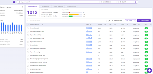
It allows you to gather data on keyword volume, trends, keyword competition, related keywords, and more.
What makes BiQ’s Keyword Intelligence stand out from the rest of the keyword research tools on the market is the keyword analyzer feature. It helps you see why someone might be searching for the keyword in the search engine. With this data, you will be able to plan your content in such a way that meets your users’ needs.
If you are unsure which keyword to use, you can sort the keywords based on their value. The higher valued keyword means it can potentially bring more traffic to your website at a lower competition.
BiQ’s Content Intelligence
After you write the sales copy, it’s time to optimize it and make it convert better.
There are a couple of things that can help you make your copy better. For instance, you could make it more readable, easier to digest, or more persuasive. If you look at the snippet of the text below, would you read the whole thing?
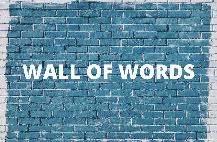
Of course not, it’s unreadable and screams, “don’t read me.” You must be sure that your copy doesn’t say the same. That’s what we’ll use BiQ’s Content Intelligence for.
BiQ Content Intelligence provides you with the best content-driven strategies which are SEO-friendly. While you write in the block editor, you will also be getting interactive writing tips to help you.
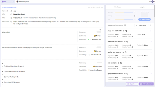
You will be able to see BiQ’s Content Intelligence real-time text editor. At the same time, you’ll get your “content grade” and keywords count that tells how relevant your article is. You’ll also quickly see if you’ve included enough keyword density.
As you can see, the paragraph-by-paragraph analysis will show each paragraph’s relevancy, sentiment, and readability.
Use these insights to improve your content readability and make your writing more appealing to your readers.
Grammarly
Lastly, you should check your content with Grammarly and fix all grammar errors.
Did you know that one grammar error in your copy can cost you 50% of your sales? You must prevent that at any cost.
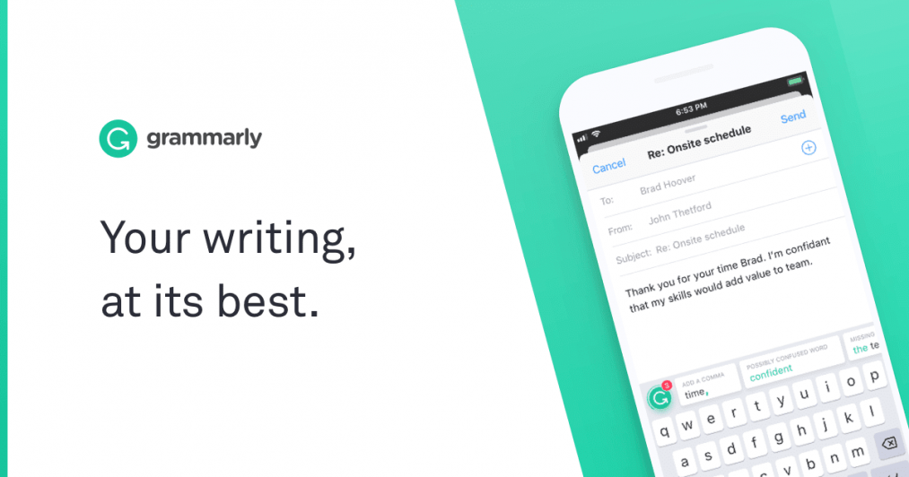
It’s an absolute lifesaver that will help you spot grammar issues you missed and prevent you from losing sales.
One of the excellent website design examples that have great writing is Eleven2.
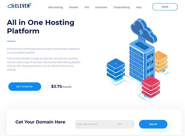
It’s seamless, nicely-formatted, grammatically correct, and SEO-friendly.
4. Strive For Simplicity
There’s no point in showing off your fancy vocabulary if your audience can’t get what you are trying to deliver.
Your website shouldn’t be complex nor difficult to navigate. It should be one seamless and super-simple experience you can’t resist.
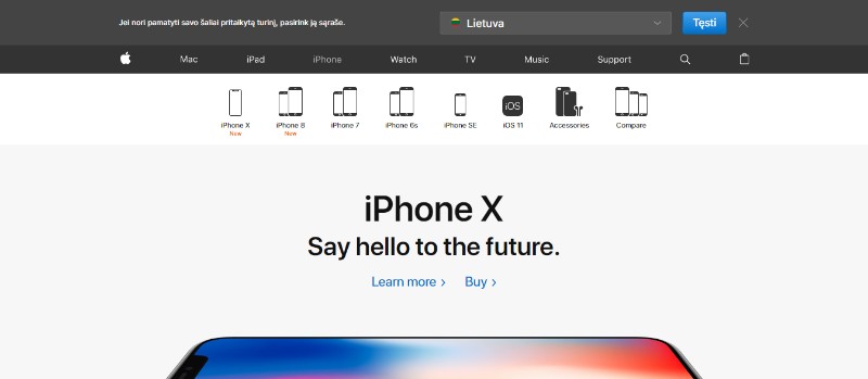
A great example of that is Apple’s website – one of the all-time best website designs.

It’s very neat, easy to navigate, and extremely simple – one of the simplest sites I’ve seen.
The secret behind its success is that Apple tells customers exactly what they want to hear; it uses basic colors and includes tons of images.
Try to emulate it, make your design simple and attract and convert like crazy.
5. Don’t Be Afraid of the White Space
Another secret of Apple’s neat style is the use of white space.
Most website owners fear space. They have a feeling that they must remove all the white space and replace it with website elements.
Unfortunately, that’s the wrong way of thinking.
White space is great. It not only makes the information on the screen pop out more, but it also makes your visitors digest content better.
As you can see in the example above, there’s a lot of white space all around. Does it look bad or unpleasant?
Of course not; instead, it helps you focus on the things that matter.
So be sure to implement this best website design. Don’t fear the space, rather use it to your advantage, and make your website’s important elements stand out.
6. Prioritize Scrolling over Clicking
What’s the one thing all the best website designs I’ve shown you have in common?
They use scrolling instead of clicking. It’s the newest web design trend we are adapting to, and it makes the whole experience smoother and better. It’s also more natural because we use scrolling all the time when on mobile.
It’s super important, especially if you’re looking to boost your sales.
In Crazy Egg’s case study, they ran two sales page variations – scrollable and clickable.
The scrollable sales page increased sales by over 30%.
Also, you may try out the parallax design. It’ll make your website design more beautiful and enjoyable. You can see an example of that below.
Make your site scrollable, implement parallax scrolling and create the best website design.
7. Use People In Pictures
Using people in the pictures is a great way to enhance your website’s friendliness.
The thing is, your customers don’t want to feel like they’re talking to a giant company. Instead, they want to feel like they’re talking to a real person.
That’s exactly what using pictures of people allows you to do. And the results?
A study by Basecamp saw a 102% increase in conversions just by adding a picture of a person on their landing page.
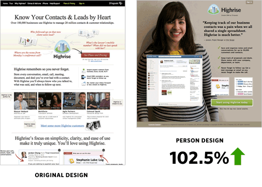
So be sure to add images of people to your website design.
It’ll increase the overall engagement, make your customers look more welcome, and boost conversions. It’s one of the easiest ways to one-up your website.
8. Use The Right List Order
Ordered and unordered lists are a great way to break the walls of texts.
They can make the text easier to understand and clearer. Unfortunately, most people don’t use them or know how to use them properly.
It’s common sense to put the things in the list by order of importance, right?
You start with the most important element, then the less important ones, and the last one is the least important. But as it turns out, this is wrong, or at least not optimal…
This is mostly because of the phenomenon we call the serial-position effect.
In essence, it says that we are most likely to remember the items in the beginning and the items at the end. And we usually forget the middle section.
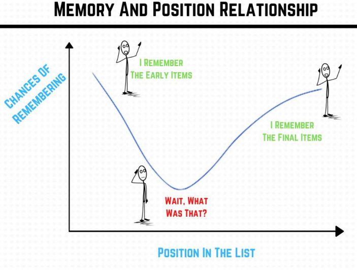
So don’t sort the items on the list by importance.
Instead, put the most important things both in the beginning and the end and leave the middle section for the less important stuff.
9. Show One Thing at a Time
Customers love a clean and neat design.
They don’t like clutter and complexity. They much rather prefer white space and simplicity. In 2012, Google conducted a study to find out what websites are perceived as the most beautiful.
They discovered that the simpler the design, the more beautiful the site is perceived.
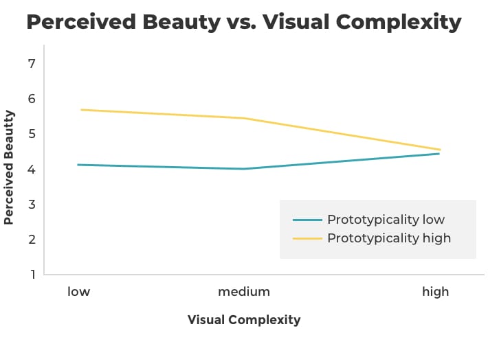
This just proves how important simplicity is in website design.
There are many ways to achieve simplicity, which we’ve talked about earlier. But one of the best ways to do that is to show visitors only one thing at a time.
And you guessed it, the best website design examples of that come from Apple.
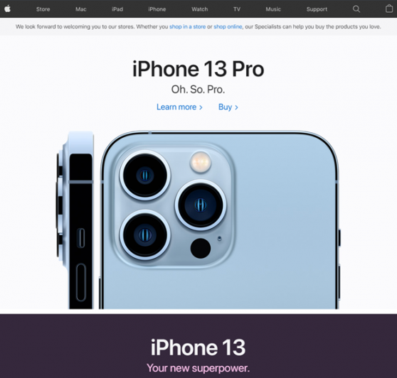
Apple shows you all features of its products, one thing at a time.
It’s super-clean, simple, and highly aesthetic. It makes the product look great, improves user experience, and leads to more sales.
10. Add Evidence & Social Proof
“If many people use a product, it must be good.”
This is how we think, and it’s our nature to do what other people are doing. If you can show evidence that others chose your company, it may seem like selecting your company can be a good choice.
The easiest way you to do that is to include the “number of happy customers” on your site.
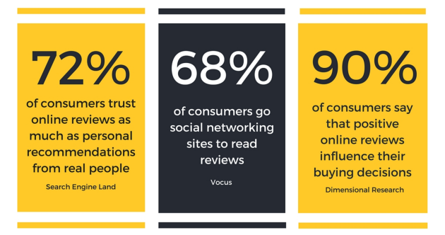
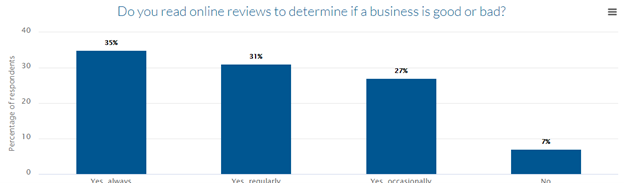
Another great way to add social proof is to include reviews and testimonials.
They’re super important, and people trust them. In fact, 72% of people trust online reviews as much as personal recommendations from real people. They’re incredibly important; just a 0.1-star increase in a brand’s average rating can increase the conversion rate by 25%.
Just be sure not to use black-hat tactics like buying reviews. It’ll only lead to a penalization from Google, which may completely ruin your chances of ranking high.
It’ll also make your reviews less credible – too good to be true.
But make sure to do everything in your power to avoid negative reviews. They can destroy your sales and decrease conversions by 70%.
The worst thing about it is that it takes 40 positive reviews to reverse one negative review’s damage. So do everything in your power to avoid them.
Evidence and social proof can make or break your sales.
Be sure to use them wisely in your website design to maximize their benefits and yield as many sales as possible.
Start Supercharging Your Website Design Today
Whenever it comes to designing a website, it is easy to get hung up on the aesthetics. But as you can see from the 10 best website design examples above, it is more than just the aesthetics.
Have a constant work in process. Make designs that are not intended to be permanent, but rather, they should evolve to fit your audience’s needs over time.