

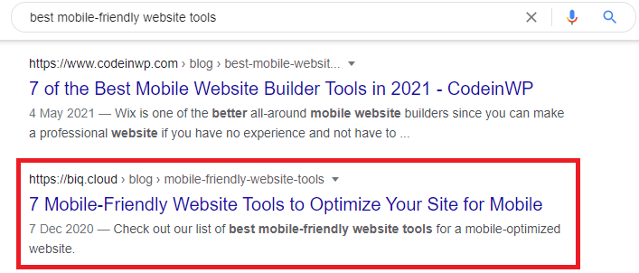
Check out our list of best mobile-friendly website tools for a mobile-optimized website.
Looking for the best mobile-friendly website tools?
You have come to the right place! I’ll share with you the SEVEN mobile-friendly website tools that we used in BiQ.
Did you know that by the third quarter of 2020, mobile accounts for more than half of all web traffic worldwide?
Mobile search wasn’t even a thing until some time in 2009 before smartphones started dominating the market. Before then, mobile-friendly website tools didn’t even exist. Mobile search optimization wasn’t even a thing.
Nowadays, you must test the mobile-friendliness of your website to be in Google’s good books. Otherwise, even your best blogs and posts might not get the visibility and traffic they deserve.
Search engines now care more about mobile site optimization than ever. Therefore, if your site has a low mobile-friendly test score, you may want to roll up your sleeves and start working on improving your website’s mobile-friendliness.
Before we jump to the tools that you need for making your website mobile-friendly, here’s what you need to know:
How to Make Your Site Mobile-Friendly
“Is my website mobile-friendly?”
“What can I do to get my website mobile optimized?”
Such questions are probably eating at you right now. You know the transition to mobile-first is here. And it’s in your best interest to try and get your website as mobile-friendly as possible.
You must optimize your website for users who access it using their smartphones to pass a mobile responsive test.
To make your site mobile-optimized, it must:
- Load fast
- Have a mobile responsive design
- The content must be crisp and create quick engagement
- The page must not be cluttered with many elements
As a marketer, you must categorically analyze these data points to ensure your website is as responsive as you can make it.
Moreover, it must deliver a better mobile experience for all users accessing your site through their mobile phones. As such, you must test the mobile-friendliness of a site and ensure its score is excellent for you to rank higher in search engine results pages (SERPs).
Previously we have discussed the mobile optimization tips that will make your website mobile-friendly. Now, let’s talk about some of the best mobile-friendly website tools you need for a mobile-optimized website.
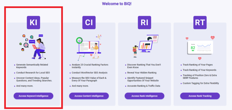
1. Keyword Intelligence
If you want more people to find you efficiently, you will need to give your website a mobile SEO boost.
One of the real boosts that can give you immediate effect will be mobile keyword research.
Let’s see.
People often use different search queries on mobile devices versus desktops.
For example, you may have found this article after searching for “best mobile-friendly website tools.”
But it would be less common for you to type that on your mobile device.
Due to the different queries between the two devices, it’s crucial to optimize your website for mobile queries.
One significant difference is local search. People that are looking to making a purchase usually doing a mobile search before visiting the store.
Take a look at these numbers for yourself:
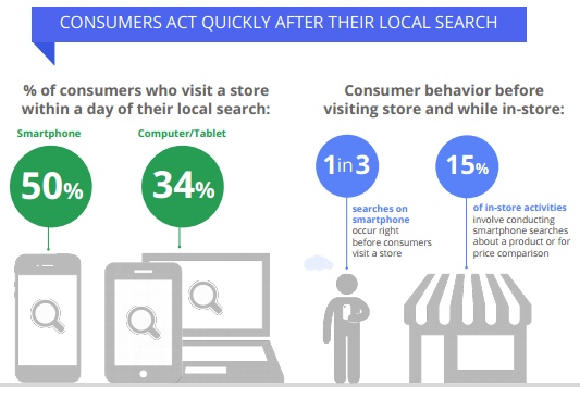
So if you have a local business, you may want to optimize for local keywords even more. You may use BiQ’s Keyword Intelligence to find untapped local keyword opportunities.
It’s easy to use this keyword research tool. First, enter your target keyword. Then, choose your preferred locations and languages.
The keyword tool will show you the list of relevant keywords the local people are using.
Your target keyword’s search volume could be 1,000 in your preferred location and possibly less than 100 in another. Don’t be panic. That’s simply because of the different demands in different places. With this insight, you will have more control in knowing which keywords have the most searches and pings and which ones to avoid.
So choose the keyword that has high volume but lower competition. I know it can be quite challenging to decide which keyword to use. That’s where you can sort the keyword value in Keyword Intelligence.
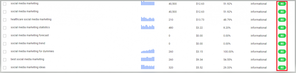
Using high-value local keywords will bring more traffic to your site at a lower competition while not sacrificing your site’s mobile-friendliness.
People tend to have transactional intent when they make a query, such as best restaurant near me, plumbing service open now, best florist near me, and so on—they are usually ready to complete a purchase.
But the question is, how do you identify keywords with transactional intent?
Use the same keyword research tool above, Keyword Intelligence.
What makes BiQ’s Keyword Intelligence stand out from the rest of the keyword research tools on the market is the keyword analyzer feature. It helps you see why someone might be searching for the keyword in the search engine. With this data, you will be able to plan your content in such a way that meets your users’ needs.
For instance, when you optimize for a keyword with transactional intent, you may want to add content that convinces your potential customers to purchase from you. Give them a valid reason why they should choose you over your competitors. Or, you could also utilize your social proof or any ongoing promotions.
This data should allow you to create more mobile-friendly content and website to meet the customers’ needs.
2. Content Intelligence
Once you have published your content, you need to check how it looks like in the eyes of search engines and real humans.
Here’s where Content Intelligence can help you. Let’s walk through this tool to see how it can help you to improve your mobile search.
First, enter your content URL and the target keyword in the Content Intelligence’s search box.

Content Intelligence will start to analyze your content and show you all errors that can be further improved. Make sure to switch to the Analysis tab on your top right corner.
The ‘WordVector SEO’ will show your keyword performance. At the same time, the ‘Fundamental SEO’ tells you the on-page SEO performance.
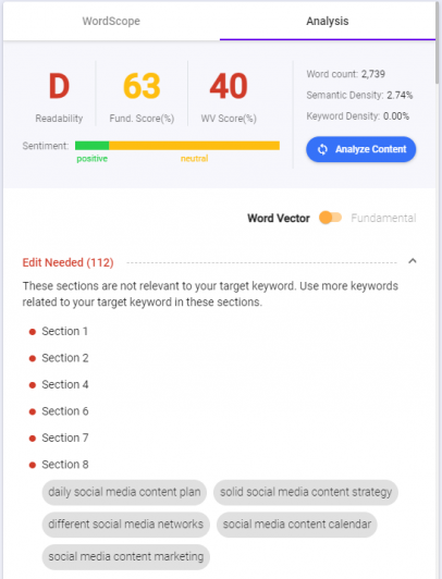
They’re a lifesaver if you want a quick insight into how your content is performing. It will unveil all critical SEO errors in your content.
Both the Important and Alert tab shows errors that have impacted your search rankings. Start fixing the errors in the Important tab because it needs your attention more than the Alert tab. You will see a list of errors and the actions you need to take to fix them.
The WordVector will mainly go in-depth to analyze your content performance against the top 10 SERP content in relation to your target keyword. It will tell you exactly which paragraph has lesser relevance to your overall content.
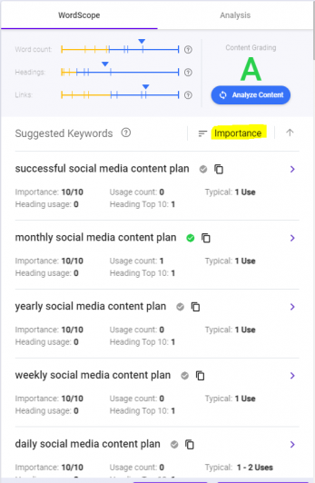
Again, you want to start with revising the Important tab. You may use the keywords suggested on the tool to improve each paragraph’s relevance to the overall content.
As you may have noticed, Google favors content that gives its searchers the most relevant and accurate content. By improving your content relevance, it will improve your ranking and, most importantly, user experience.
When optimizing for mobile-friendliness websites, you also need to improve your content readability. Considering that searchers are looking on a smaller and narrow screen mobile device, you need to avoid big chunks of content. Instead, aim to make sure that each text is shorter and easier to read.
You can easily see your content readability grades in the Analysis overview.

And the best part?
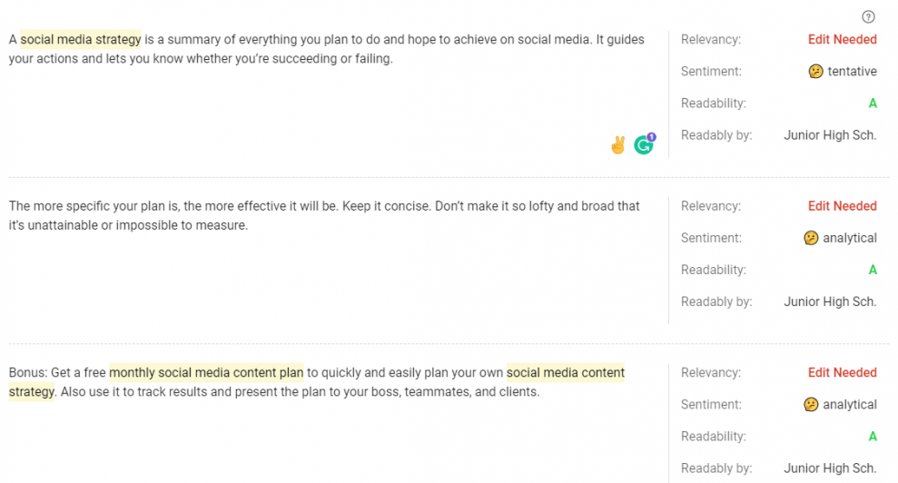
You can see each paragraph’s readability. You can immediately identify which paragraph needs revision.
With a few tweaks to your content, you can now improve your content’s mobile-readability. Thus, making your website more attractive to mobile users.
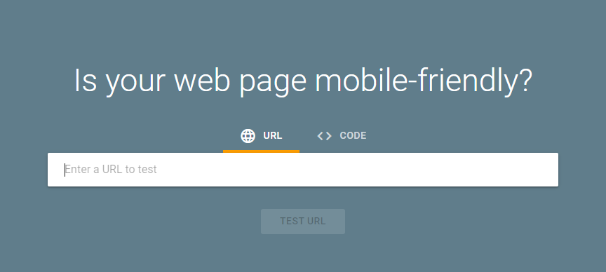
3. Google Mobile Site Test
Yes, the name tells it all – Google-operated mobile-friendly test tool. It is specifically designed to help you test mobile-friendliness.
If you follow Google Webmaster Blog, you’ll have noticed an illustration on the website urging website owners to run the mobile-friendly test.
Thumbs up to the effort Google puts into helping bloggers and site owners make their sites more mobile-friendly. They are really for the transition into mobile-first. And Google Mobile Site Test is the best evidence to prove it.
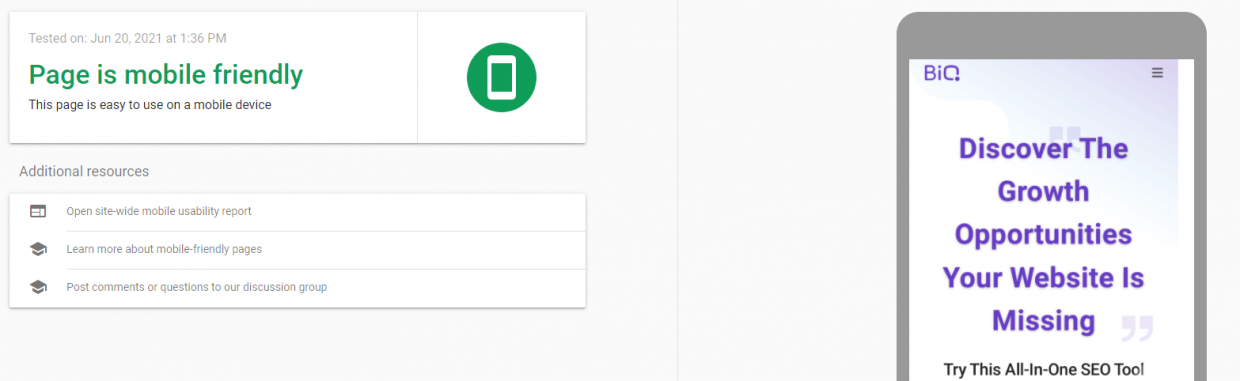
It’s a very straightforward and straightforward site. All you need to do is paste your site’s URL into it and run the test. It will provide you the results in under a minute.
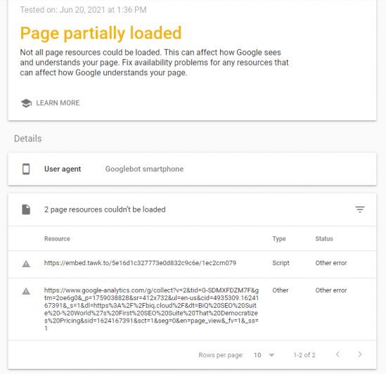
Then, you will see something like this:
Click the View Details button to show any page loading issues.
The mobile-friendly test result will either be:
- Green – to show that your site is mobile-friendly or;
- Red – to show that your site isn’t mobile-friendly
Here are three other scores you should expect to see from the site:
- Mobile-friendliness: measures the usability of your website for mobile. It tests users’ ease to tap, scroll, swipe, and navigate the site on their smartphones or tablets.
- Mobile speed score: measures how quickly your site pages load on mobile devices. Mobile users usually have less patience than desktop users. Then there’s the issue of less bandwidth speed.
- Desktop speed: measures how quickly your website loads for desktop users.
All these are factors to watch out for and provide you with an overview of what you should fix to make your site more mobile-friendly.
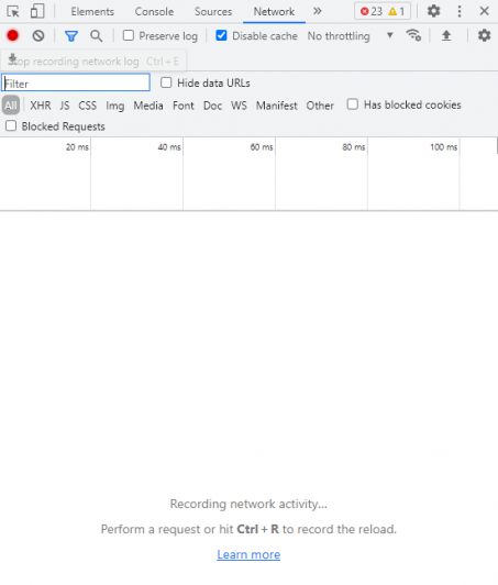
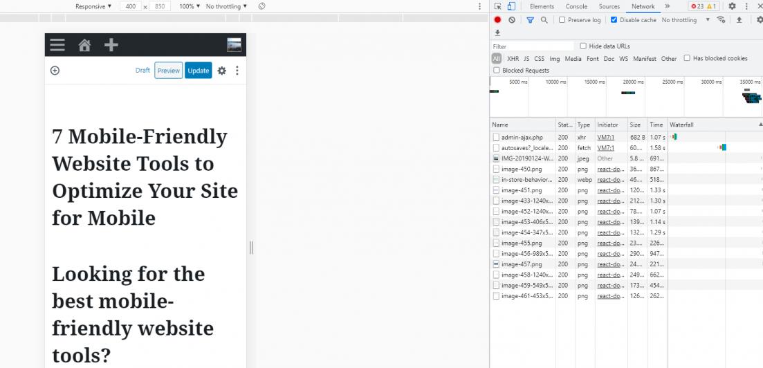
4. Chrome DevTools’ Device Mode
If you are a Google Chrome user, you can utilize the browser’s DevTools’ Device Mode to build a more mobile-friendly website. Chrome’s DevTools’ Device Mode allows you to simulate the environment of several portable devices. This tool will enable you to gauge your site performance.
You may access the DevTool in two ways:
- Right-click, then click Inspect.
- Use shortcut, Ctrl + Shift + I
Here is how it looks like:
By utilizing Chrome DevTools’ Device Mode, you can monitor your site’s responsiveness through a list of portable device emulators. But it also has a few downsides. For instance, DevTools’ Device Mode cannot emulate CPU and GPU behavior.
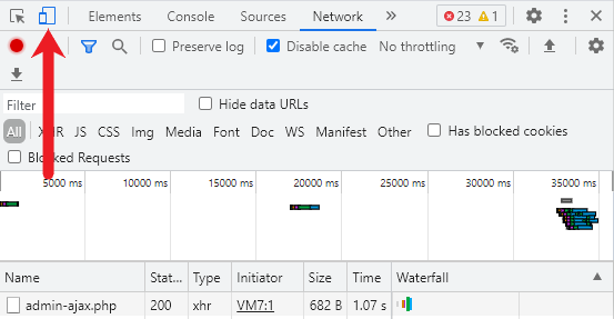
However, the tool is sufficient for testing the mobile-friendliness of your website. You can click the Toggle Device Toolbar to simulate a mobile viewport. You can choose between the different mobile device types or select your custom dimensions.
Check out some other cool features you can use in the Devtools: https://developers.google.com/web/tools/chrome-devtools/device-mode
Therefore, ensure you make fair use of this free mobile-friendly website tool to tweak your site. Ensure you up to your site’s mobile-friendliness and responsiveness to improve your overall ranking and visibility on search engines. Google takes precedence here as over 96% of all US users who search for content on their mobile phones use Google.
5. Google’s PageSpeed Insights
This mobile-friendly site optimization tool helps both development and management teams. Both teams can use it as a valuable tool to ensure the site delivers quality, especially with regard to mobile optimization.
Google PageSpeed Insights provides webpage owners with relevant insight on how best to optimize their sites to improve mobile-friendliness.
This web performance tool gives you stats on your site’s speed, optimization level, etc. It’s an excellent tool since it can provide you with the best solutions to fix your site’s issues. A single click could be the answer to all your website optimization issues.
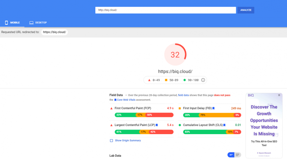
All you need to do is enter your website URL, then click Analyze.

Then, you will see a full analysis of your website speed. Here is how it looks like:
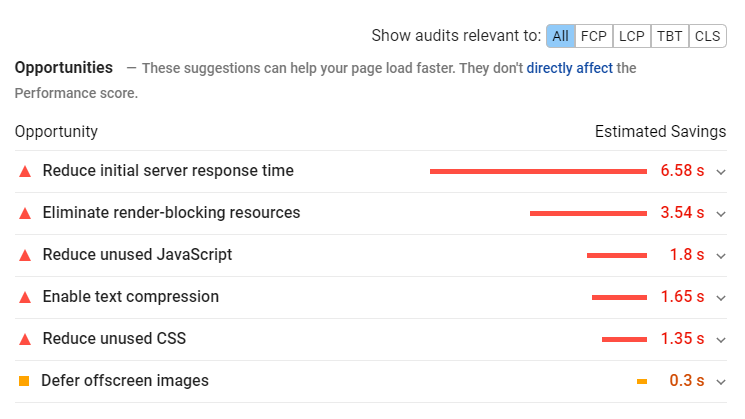
If you scroll to the bottom, you will see the Opportunities section. It will show you a list of suggestions you can use to help your page load faster.
The Diagnostics gives you more information on your application performance:
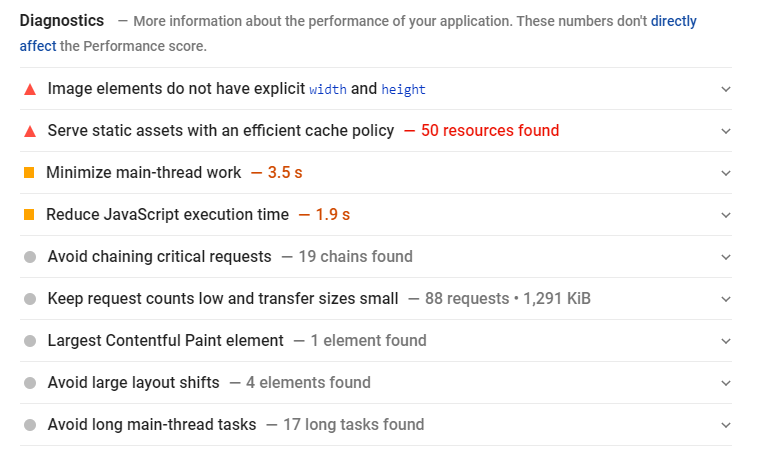
You can also click the down arrow at the side to learn more about each diagnostic.
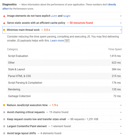
While it doesn’t directly affect the performance score, you can use the information to guide you on improving your overall website performance.
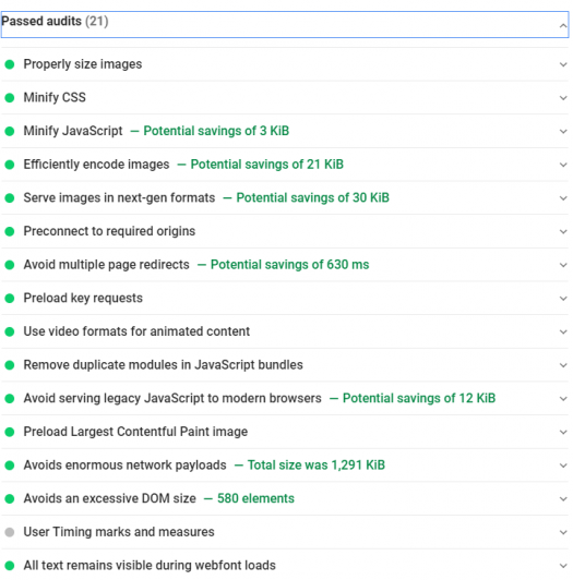
Lastly, the Passed Audits show you what your website is doing good at.
Besides checking for your mobile’s speed performance, you can also use the tool to check the desktop’s speed performance. Just click the Desktop tab, and you will see the desktop’s speed score.

6. Chrome User Experience Report
Chrome User Experience Report, or also known as CruX, was introduced by Google in 2017. In short, it is a database of real Chrome user experience on millions of websites.
One of the best reasons to use this mobile-friendly web tool is that you can pair it with Google’s PageSpeed Insights. This should provide you with a clearer overview of how your site performs as a whole.
I found a comprehensive article on using Chrome User Experience Report to improve your site’s performance by Search Engine Land. I recommend you read them because it tells you a step-by-step guide on accessing your Crux data.
Generally, any site with better performance will gain more edge over the others in the mobile-friendly race. Chrome user experience report should provide you with more data on your site’s performance, mobile-friendly-wise. After all, the best thing about testing your site for mobile-friendliness is actually viewing it on mobile!
7. Bootstrap
Bootstrap is a popular front-end framework for designing mobile-friendly websites. Using this free open-source framework, you can quickly build your entire website or application with their responsive grid system, prebuilt components, and plugins built on jQuery.

Using a pre-built system is easier than attempting to code every combination yourself. It’s also much less of a headache as the system comes pre-built and ready to make your site more mobile-friendly.
But still, you’ll have to check any frameworks you are using for full compatibility to ensure your site functions fully and can still meet all your existing and future goals.
Even though the framework is made for everyone, at all skill levels, it could become difficult to ensure it works properly on mobile devices when you have more custom functions and coding on your website. Nevertheless, Bootstrap allows you to jump over all these strings without compromising your content or website structure.
Bottom Line
After the rise of smartphones, it took just a few years before mobile search dominated the online space. As a marketer, you must equip yourself with the changes or risks of being left behind.
In an age when the smartphone is dominating internet traffic, it makes a lot of sense to make your website as mobile-friendly as possible. Be sure to optimize your sites to become mobile-friendly since digital marketing relies heavily on search engines and meaningful marketing strategies to make your sites visible.
At the end of the day, all users want is to find and access mobile-friendly websites that have relevant information that will add value to their lives. Therefore, you can trust that Google will continue to try and deliver by advising websites to become more mobile-friendly.
With the mobile-first index roll-out, the age of the internet on mobile is no longer a future concept. It’s already here.
Make use and take advantage of these mobile-friendly website tools and guidelines today to rank higher on SERPs and increase your brand’s visibility.
Let me know if you know of any other mobile-friendly tools that I should add to the list above!