

Learn how to improve your mobile rankings with the top 10 effective mobile optimization tips and best practices.
Learn how to improve your mobile rankings with the top 10 effective mobile optimization tips and best practices.
Did you know that the future of search lies in mobile friendliness and how optimized your website is for mobile phones?
Well, I bet you do since you are here looking for mobile optimization tips. *wink*
Great. Stay with me and have a look at these mind-blowing numbers.
In 2020, 5.19 billion people own a mobile phone, and almost 60 percent of the world’s population is already online.
Do you think you can live without a mobile phone for a day?
Let the following number speak for you…
87.8% feel uneasy about leaving their phone at home!
It’s no secret that mobile phones have been ingrained into our everyday lives. And this device forms part of almost everything we do.
They connect us with friends and family and even wake us up in the morning. Mobile phones are, literally, the first thing people turn to when seeking answers to queries.
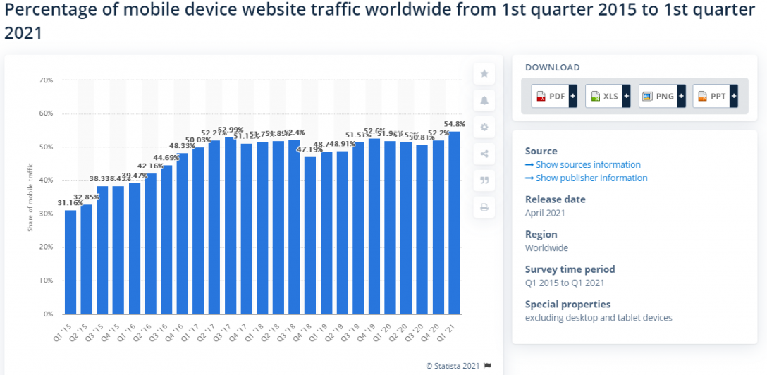
And today, over 61% of Google searches are done using smartphones. Five years back, the figure was 34%, nearly half that.
One thing for sure:
There has never been a better time to invest in mobile optimization for your website.
Why?
More than half of the website traffic comes from mobile devices.
You must get your website up-to-scratch and ready for visitors who access it through their mobile devices. And if it is not, they’ll likely get frustrated and leave. The world is turning into a “mobile-first” everything. You will be left behind if you don’t get in on the action too.
Today, users live, breathe, eat, and sleep with their phones in their hands. As a business, this is where the consumers are.
What Is Mobile-Friendly Optimization?
A mobile-friendly web page is one that doesn’t just look and function smoothly on a desktop; it operates the same on smartphones, tablets, and other hand-held devices.
A mobile-optimized website should automatically resize to fit on these device’s displays. You should also ensure users have the same good experience navigating your website without any complications.
For instance, a mobile user should have the same smooth experience when subscribing to your newsletter or buying a product as they would if performing the same actions on a computer. It’s as simple as that.
Mobile shopping is booming. And trust me, it’s never going to stop.
You can’t deny that shopping via your mobile phone is hassle-free and convenient. I know it’s cliche, but everything is now at your fingertips.
That could be the reason why more than half of consumers saying they prefer purchasing from mobile friendly websites.
Reasons to Make Your Website Mobile-Friendly
As a business, you must focus on user experience to make your website optimized and enjoyable for users to browse with ease.
Prioritizing a mobile-friendly experience couldn’t be more vital now as more consumers turn to their smartphones to access information and make purchases.
Just take a look at the graph below, and you will realize how rapidly this mobile commerce trend is growing year by year.

There are a few other reasons that should also make you consider optimizing your website for mobile use:
- Google prioritizes mobile-friendly websites
Yes! Google has made it explicitly clear that it will always prioritize mobile-friendly websites over non-mobile-friendly ones.
Since the giant search engine updated its algorithm to include a mobile-first index, businesses are forced to optimize their websites to become more mobile-optimized.
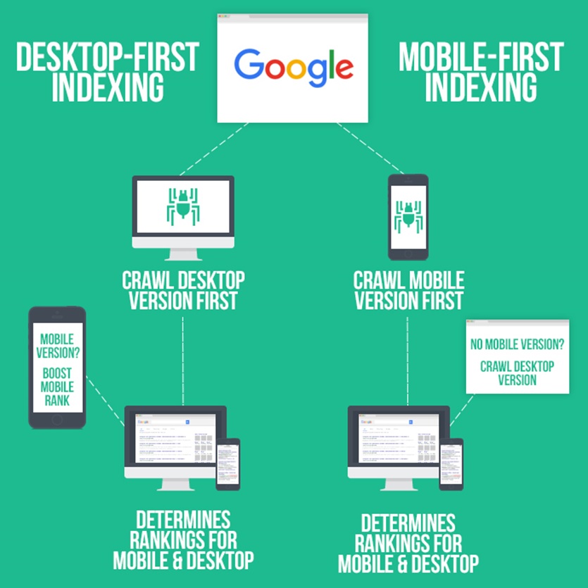
All websites are now switching to mobile-first indexing since September 2020.
- Smartphones play a massive part in online searches
As aforementioned, over 60% of all search queries come from mobile phones. It is because they are quicker and more convenient to use.
- Forge connections with the target audience
Anyone using a mobile device to access your site will have a positive experience if it is mobile optimized. Only then, users will be more willing to visit your other pages and likely return in the future.
- Keep your brand relevant
Business websites that aren’t mobile-optimized will look outdated as mobile-friendly websites become the new norm.
The poor design can make you stick out like a sore thumb even if you have relevant and engaging content. And no one will want to engage with you.
Next, let’s look at how you can optimize your website for mobile SEO.
Mobile Optimization Tips and Best Practices
Keep Your Mobile Site Simple and Easily Navigable
One important fact to always have in mind is that mobile screens are much smaller than laptops and desktop screens.
Always ensure you give only essential information to the user. The best way to do this is by making the visitor’s user experience pleasant and concise.
Too much information can become distracting and frustrating to the user, especially when using small mobile screens.
Some crucial things to keep in mind when making your site mobile-friendly:
- Don’t make your page content-heavy with excess information
- Keep important features consistent across the entire site
- Prioritize content that users need the most
- Ensure the landing page is clear and concise. Visitors should be able to access more information quickly on a secondary page
- Include a search bar if your site contains complex information. This should allow for easy navigation
- Use as few form fields as possible to make the page neat and streamlined
- Lead potential customers to the heart of the information faster
Optimize for Local Search
Local SEO plays an essential part in mobile-friendly SEO. Mobile searches with the phrase “near me” continue to increase as more users turn to more local content and businesses.
Just take a look at the keyword trend below…

Online users often do searches with phrases like “open now,” “near me,” and “where can I buy” as a way of finding local businesses near them. This makes it all the more important to adapt your business strategy and services to reach these people quickly.
One of the best strategies is to adopt local keywords to help make your content more optimized for local searches.
Using more local keywords in your website will help your website to rank in more local search results. Besides, it is an excellent strategy to excel with your SEO optimization strategy for mobile.
You can use Keyword Intelligence to find untapped local keyword opportunities.
All you need to do is insert the keyword you want to target and choose your preferred location and language.
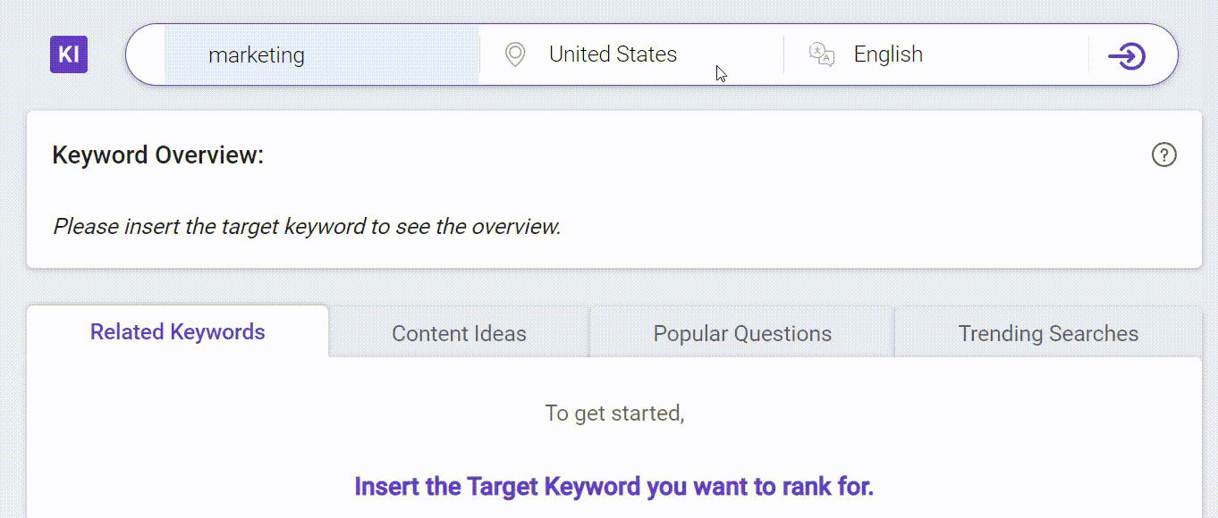
Voila!
The fantastic keyword tool will show you the list of relevant keywords the local people are using.
Your target keyword’s search volume could be 1,000 in your preferred location and possibly less than 100 in another. That’s simply because of the different demands in different places.
So choose the keyword that has high volume but lower competition. I know it can be quite challenging to decide which keyword to use. That’s where you can sort the keyword value in Keyword Intelligence.
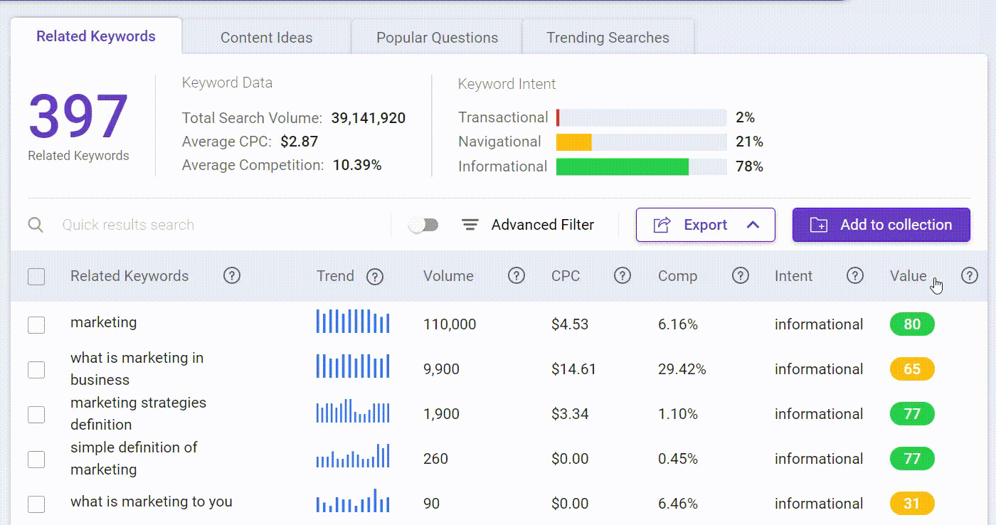
A high-value keyword means it will bring more traffic to your website at a lower competition.
Image Optimization
Image optimization is perhaps one of the key areas where most businesses fail, especially when it comes to mobile SEO optimization.
Images can easily cause longer load times for mobile webpages if not correctly optimized for mobile devices.
I know that it’s almost impossible or inefficient to resize all images one-by-one, especially if you have more than hundreds of blog posts on your website.
So if your website is built on WordPress, consider using a plugin to fix all images at once.
Using responsive images would definitely help. The user will be able to see a larger, higher resolution image on the desktop. And it will reduce the picture sizes and total page weight when on mobile.

The size of responsive images automatically adjusts to fit different screen sizes.
Here is an image of best practices recommended by Google:
Keep Texts Short, Sweet, And to the Point
It’s a fact that reading large blocks of texts can be very difficult and frustrating, especially on the small and narrow screens of mobile devices. You can quickly lose potential clients with this tiny but easily rectifiable issue.
Whenever possible, always try to minimize your texts into shorter, more concise statements. Numbers, graphics, and icons are also a great way of saying more with less on mobile phones.
Ultimately, the main point is to drive the story home to your visitor as early as possible in the simplest way possible. And shorter, sweet, and concise texts help you achieve that fete.
You may use Content Intelligence to check your content readability. It tells you how easy it is to read your content and lets you know which paragraph needs improvement.
Simply enter your content URL and target keyword, and Content Intelligence will analyze them. Here is how it’ll look like:
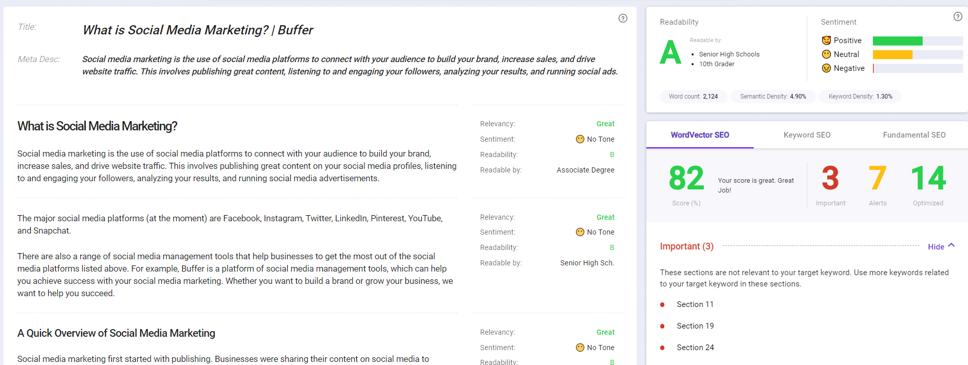
You can see the overall readability grade in the content overview.
While scrolling down your content, you’ll see the tool analyzes each paragraph. You can instantly check which paragraph needs quick fixes.

Of course, as you can see, Content Intelligence tells you more than just content readability. You can even do a full SEO content audit.
Provide Easy to Scroll Experience
One mistake you must avoid is setting up your visitors to a “pinch and zoom” situation when navigating your website. You’ll lose most of your customers with all the hassle this creates, especially when asking them to fill out an extended form or survey.
Instead, you should use scrolling menu bars and checkable boxes to simplify the user’s data entry process.

Reducing your web page content also allows you to make your texts a little bigger and easier to read. Doing this makes all essential information on your page accessible with a single vertical scroll.
Remember to make the action buttons a decent size with enough space between each for easier navigation. Your website visitors will use their fingers to navigate your site, not a mouse arrow. So, ensure you use a readable font on your mobile site.
Redesign Pop-Ups for Mobile Devices
While pop-ups continue to receive a lot of criticism for their use, they remain very practical strategies for grabbing your visitors’ attention.
The only challenging part about pop-up is knowing where to place them strategically and how many to use in a single web page.
Pop-ups help to pass vital information to the users and increase conversions. But that’s only if they’re used appropriately.
Pop-ups can easily become a problem, especially when your site is viewed on mobile devices. Seeing them everywhere blocking the smaller mobile screen can become far more disruptive than you would want.
Google has started penalizing websites regarding the inappropriate use of mobile pop-ups. They call the pop-ups intrusive interstitials, and it refers to the mobile pop-ups that block the entire page.
Pages that show intrusive interstitials provide a poorer experience to users than other pages where content is immediately accessible. This can be problematic on mobile devices where screens are often smaller. To improve the mobile search experience, after January 10, 2017, pages where content is not easily accessible to a user on the transition from the mobile search results may not rank as highly.
In the same article, Google shared the examples of interstitials that make content less accessible to the user:

Here are other examples of how you can make content more accessible to the user:

Therefore, you must ensure that your mobile pop-ups adhere to Google’s guidelines and configurations to avoid being penalized. Do this right, and you shouldn’t be at risk of any penalties on this front. Moreover, visitors won’t feel bothered by the pop-ups they see on their mobile screens.
Responsive Design
Having a responsive mobile website design is a crucial component of every business. It is one of the core features that determine whether you make a conversion or not.
According to Google:
Responsive web design is a setup where the server always sends the same HTML code to all devices and CSS is used to alter the rendering of the page on the device.
When you use a responsive design, your website adapts to all devices the online users use.

Your website must provide the best mobile user experience for visitors. Integrating responsive design into your website makes it easier for your prospects to browse through your site and possibly make purchases.
This means that users can easily scroll through your web pages and view your website correctly. That’s a bonus in any business’s playbook as the user will be likely to interact with your web page or return in the future to make a purchase.
Separate Mobile URL
When businesses optimize for mobile, most create a separate mobile URL. This allows them to create a parallel site for their mobile users. It’s one of the best strategies for creating a custom experience for users who visit your site using mobile devices.
A mobile URL usually appears as “m.website.com.” Whenever a user enters your site using a mobile URL, they will see a parallel version of your website that’s adapted for mobile phones. This adaptation allows the user to have the best user experience using your website.
For example, Facebook mobile URL would be https://m.facebook.com/
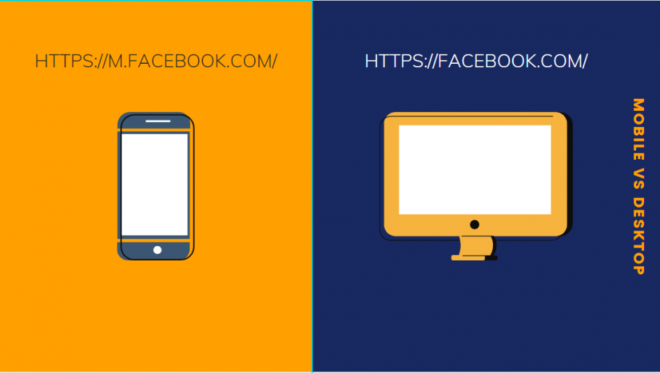
With this setup, your site determines which device the visitor is using before directing them to the best URL optimized for that device. It can be the “main” desktop version of the mobile “M” version.
Test Your Website Using Google’s Mobile-Friendly Tool
Search engines, especially Google, value mobile-optimized websites, and always encourage websites to adopt mobile optimization.
Google has even gone one step ahead to design a free resource to help businesses test their site’s mobile appearance and friendliness on mobile devices. The process is fairly straightforward.
Simply input your site’s URL into the Google Mobile-Friendly Test Tool, then click the “Test URL” button.

You should receive the results after a few seconds. However, it’s important to note that just because your site is mobile friendly doesn’t mean it’s fully optimized for mobile devices.
There’s always work to be done as mobile use continues to be more intertwined. Search engines expect you to keep up as well.
Improve Load Times
Load speeds on laptops and desktops are imperative to user experience. And slow page load times usually mean high bounce rates, which correspondingly affect your site’s ability to rank highly.
Just look at how the page load time affects your user experience:
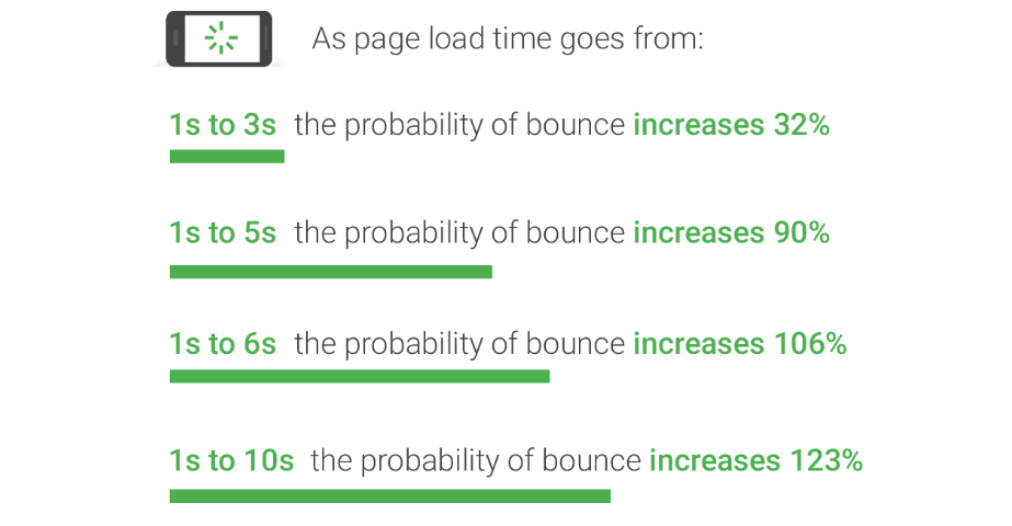
Well, the same is also true for mobile devices. For you to rank highly on search queries on mobile, you will need to optimize your site to be faster, even for users on slow cellphone networks.
Let’s look at some of the best ways to improve your site’s speed:
- Compress your images
- Implement caching
- Keep all aspects of the site up-to-date.
- Minify your code
- Use a Content Delivery Network
While these may seem like a lot of work, most require little-to-no configurations and setups on your part. You can actually find simple free solutions to complete these tasks for you and have your site performing better on mobile devices.
Wrapping Up
Mobile optimization is an integral part of your growing online business. Therefore, if you want to grow your business through SEO, you must also account for the users that search for your content through mobile devices.
There’s no doubt that the future is mobile when it comes to search. And online businesses must prepare for it.
Making your business mobile-friendly is the first step toward a more promising future for the business in terms of traffic and user experience.
I hope you find this information useful and informative in your mobile optimization endeavors.