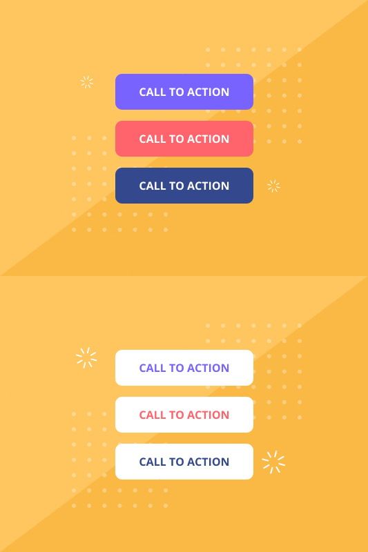
Sending a message to someone means you will want them to take action afterward. But this would not be possible without implementing an effective call to action button.
You’ve probably heard why one shouldn’t miss out on having a call to action button in content creation.
The call to action is vital for the success of any marketing program. You cannot claim to have had a successful marketing campaign without a proper and effective call to action.

You’ve already started a new website, and everything seems to be running smoothly. You’ve got a call to action – multiple calls to action, probably. However, you don’t really know how to apply them.
All SEOs know that conversions, revenue, businesses, and profits all depend on the mighty CTA. Therefore, how you use it will largely impact how successful your marketing campaign will be.
The CTA is so important, so powerful, and so fundamental to your online marketing initiative and your SEO success that you have no option but to learn how to use it. There’s no escaping its use if you want to benefit from your future marketing campaigns’ successes.
This information is just too important to sit on.
Definition of Call To Action
The call to action button is the line of text or image that prompts your website visitors and leads them to take action. It’s quite literally a “call” on your visitors to take “action” on a specific instruction on your web page.
The best calls to action buttons provide a clear encouragement to a target audience to take action.
There’s a chance you’ve come across multiple call to action buttons during your time surfing the internet, with one of the most effective and common examples being the “click here” button.
It’s also key to note that not all CTAs offer the same form of efficiency. Some are more effective than others. Check the picture below:
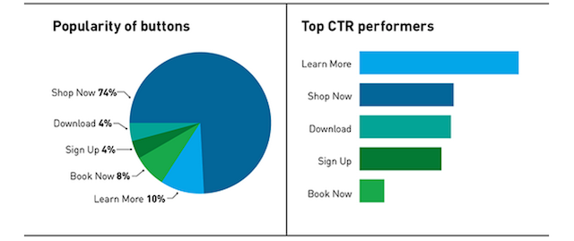
Another critical fact to note is that not all CTAs are buttons. They can also come in the form of lines of text, which could even be more effective in different circumstances.
Stats by Leighton Interactive shows that CTA buttons have about 4.37% average click-through. Texts have a 6.27% click-through, while images or other developed designs recorded a 2.89% average click-through.
Therefore, it’s crucial that you know exactly where and when to use your call to action and in which format to use it.
Types of Call To Action Button
As with all things SEO, there’s just no one-size-fits-all solution when creating an effective call to action. Unfortunately, here’s where many content creators and marketers fail miserably.
You cannot just slap words like “Click Here” on some red button and paste it everywhere on your website. People won’t click on it. If anything, they’ll choose to ignore it. You won’t rake in leads and customers this way.
An effective call to action is a bit more complex than that. For one, you’ve got different people checking your website every day – visitors, customers, leads, promoters, etc. As a content marketer, you’ll want each group in this list to do different things.
You’ll want to turn your visitors into leads. Turn the leads to customers. Then convert customers into promoters. However, you cannot serve everyone in this group with the same CTA and hope to accomplish these different goals.
The solution: we advise that you sample multiple CTA types that will serve different audiences to your goals. This way, you’ll be able to bring more people to your marketing funnel.
Most Common Types of Call To Action Button
You don’t necessarily have to go overboard with your CTA. There’s really no need for creating a bajillion different CTAs.
In fact, there are about eight different CTA types you’ll need on your site when you are first starting out.
You may have to switch things up as your business continues to grow and the site becomes more complex.
Here are great jumping-off points you should consider the next time you’re writing a post:
1. Lead Nurturing
Lead nurturing CTAs are great for prospective clients who visit your website but aren’t quite ready to spend their cash on your products/services. You’ll have to entice them with a different offer that’s more aligned with your offerings than a typical marketing offer.
You’ve probably come across lead nurturing CTAs several times.
When you think about offers like free trials, free quotes, or product demos – these are all lead nurturing CTAs you should consider trying. You’ll also want to showcase these CTA types in places you know many potential leads will visit.
Here’s what a lead nurturing CTA should look like:
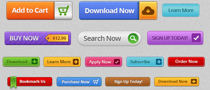
Think of them as a smart CTA option for your blog post. They can also function as an offering just below your initial marketing offer thank you page.
2. Form Submission
Here’s another effective call to action type you’ve probably bumped into multiple times.
Once your visitors arrive on your landing page, you’ll require a few details from them before they can register as leads. They must fill out a form and click on a submit button to get their information into your contacts database.
By this stage, your visitors are close to becoming leads. Therefore, it may be wiser to trade out the “submit” button for something more specific and actionable to your marketing offer.
Remember, your visitors are about to share with you their information. You don’t want to scare them off before they get to see what you’ve got to offer.
A good form submission button should look something like this:
Simple and straight to the point.
3. Social Sharing
Another common call to action button is the social sharing CTA.
It’s one of the simplest CTA types that encourages your visitors to share your content with their friends. This CTA button is a low-commitment way for letting your visitors, customers, and leads engage with your brand more.
Therefore, you must remember to include them in specific places where they make sense on the website. These may include landing pages, blog posts, etc.
You cannot just afford to slap social sharing CTAs on everything you think is worth sharing. Include them in specific places where visitors will feel free to share their personal information.
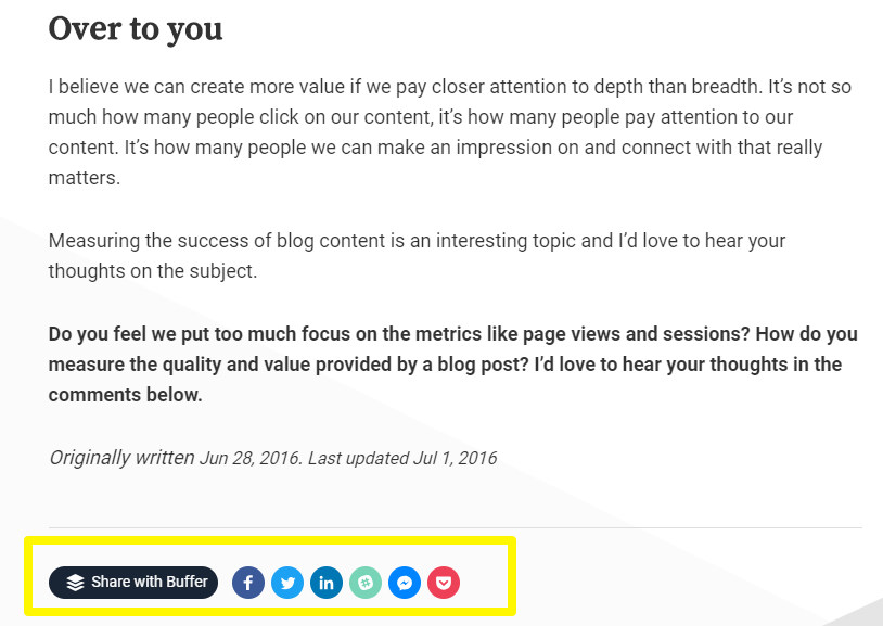
And the best part about using this CTA type is that it’s very customizable. You don’t have to do much to switch it to your liking.
4. Continue Reading
This CTA type is usually common on press newsrooms or even landing pages looking to boost their CTR. When using this CTA type, you’ll obviously have no intention to display your entire post on your homepage.
However, to succeed in making your visitors click on the “continue reading” button, you must ensure that the section available for them to read is enticing enough to make them want to read more.
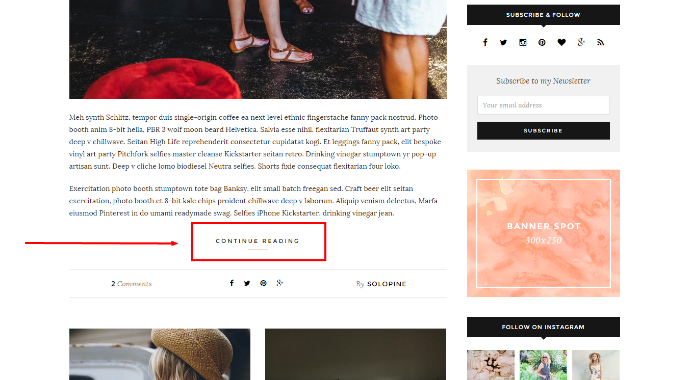
You cannot just stamp this CTA type on your homepage then expect readers to click on them. The little piece of content you allow them to read must be appealing enough and highly informative, enough to make them want to check the entire post.
5. Sales Closure
By the time you’ll be using this CTA, you should be done with lead generation and lead nurturing. Now is the time to get down to business.
This CTA will turn your leads into customers – if used properly.
This CTA type should be very sales-focused since you’ll be looking to secure potential customers to purchase your product/service right here, right now.
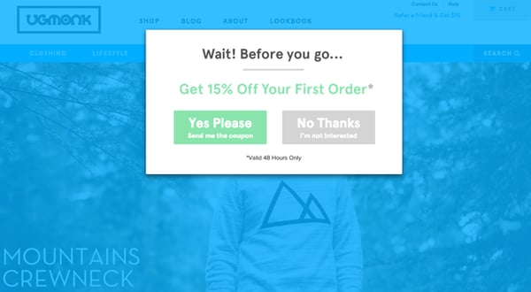
It would be best to place this CTA on your product pages for better engagement.
6. Service/Product Promotion
If you’re monitoring your website, you’ll definitely know when someone is poking around it, trying to learn about your brand and what you have to offer. The service/product promotion CTA makes work easier for them to do so.
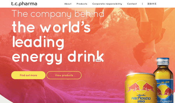
After all, your products/services are what keep your brand afloat.
The best thing about this CTA type is that you don’t have to include fancy images. Instead, you can use simple texts on a button provided the button contrasts with the background. After all, you want your visitors to see them.
Benefits of a Call To Action Button
There are several reasons to use the call to action button as a part of your content marketing plan.
For one, people are always just curious by nature. Therefore, having an effective call to action can tickle their curiosity senses, encouraging them to find out what comes next. What happens after they click that button?
Here’s what a good CTA can do for your content:
1. Motivate Customers to Take Action
You’ve probably gathered this from the multiple times we’ve mentioned it in this post already.
If you want your visitors to do something on your website, tell them by emphasizing it with an exemplary design or text.
2. Increase Sales and Conversion Rates
Most CTAs aim to build an audience with your visitors. Websites that urge their target audiences to subscribe to their newsletters to hit their social media-like buttons know this all too well.
The best calls to action will definitely drive your sales and conversion rates through the roof. Therefore, you’ll want to use them wisely.
Tips for an Effective Call To Action Button
Here are some great tips for crafting an effective call to action:
1. Have a Compelling Copy
Your CTA copy plays a much bigger role in determining its effectiveness. People won’t be willing to click on a CTA that contrasts what the rest of your content is about.
Remember, you have limited space to convey your message and wow your audience. Therefore, ensure you use that space to tell your visitors exactly what they should expect by clicking the CTA button. Make it as straightforward and action-oriented as possible.

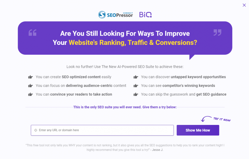
From the example above, what would you expect after clicking this button? People should be rushing to get the deal offered, right? Now, what if you run out of ideas to write as such?
BiQ Content Intelligence is an excellent tool to draft the most optimized CTA that targets your user’s needs. With BiQ’s Content Intelligence, you can create content and edit it in real-time, allowing you to spot and rectify any errors in your work.
The Content Intelligence feature makes it possible to also include some of your key phrases in your CTA, especially in text format.
2. The Best Call To Actions Appear at a Logical Place
According to Fitts’s Law, the further away your target is, the smaller it becomes, and the more difficult it is to hit.
The same applies to CTAs. To craft the best user experience CTA design, you must also consider your CTA buttons’ placement.

You can add design elements to make your CTAs appear more obvious, like an arrow as illustrated above.
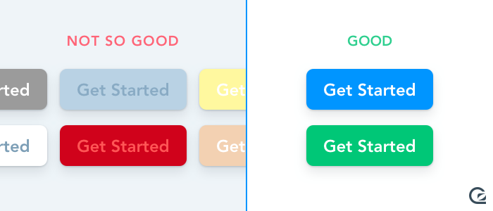
3. Use the Correct Color
You just cannot put a light gray CTA on a white background. That’s just to illustrate what we’re about to discuss here.
Selecting your CTA button’s color is just as critical as the information in the CTA. It must contrast with all other elements on that page.
Something like this should suffice:
The first thing you’ll notice from the above image is the red button at the bottom of the page. You want to focus as much attention as possible on your CTA for the best results. Therefore, ensure it’s extremely eye-catching. A color like Red, Orange, or Hot Pink should do well.
4. Never Put Another Important Element Next to a CTA Button
You don’t want any other element to steal the show. Your CTA is what will drive sales, increase revenue, and generate leads for your business. Therefore, you’ll want to ensure it owns its space.
The first thing you’ll see is that giant “Try BiQ Free” button. That’s what a good CTA is supposed to do.
5. Use First-Person Speaker Angle
People love when you speak to their needs. Remember, you are talking to your customers. Not at them.
Take a good look at this picture:

By using “my,” you’re basically giving the customer ownership of unlocking their access to the tool. This tiny but crucial change will cause a transformation that affects everything.
Speaking from “I, me, my” is much better than “you or yours.”
6. Don’t Limit Yourself to Only One CTA
You’re not limited to using only one CTA on your website. In fact, it would be in your best interest to switch things up a bit to make your CTAs more interesting and unique. You can even use CTAs on your popup messages.
But don’t overdo it. Or the whole thing might backfire on your face.
You want to mix things up just enough to break the monotony. But not too much as to look spammy.
7. Make It Look Like a Button
No offense or anything, but CTA buttons are… well, buttons.
They are buttons, not text or gifs, memes, hyperlinks, black holes, or anything else.

Also, they don’t have to be rectangles, although they usually are. CTAs can have rounded corners, shadow effects, or beveled edges, all of which are totally fine.
8. A/B Split Test CTA Buttons
At the end of the day, you’ll only truly know your CTA’s effectiveness by testing it. In fact, you’ll notice that most of the CTA advice on this post is about testing and experimenting.
Google Optimize is one of the best tools to use here.

Work on testing your CTAs, elements around them, their buttons, their colors, and just about everything else around them. Only then will you truly know how effective they are.
Test every single tip because not all of them will work for your website.
Conclusion
Creating an effective call to action doesn’t necessarily have to be a complex process. You simply need to keep your users in mind while creating your CTA. Follow the tips above, and you’ll be on the right track.
Start creating your call to action buttons today, keep testing, and see your conversions rise.


