
Use the following best practices website design for greater website conversions.
Use the following best practices website design for greater website conversions.
If you’ve done some web design, you know that you need to do a lot more than website design for you to get the most out of your website. Website design as a strategy to increase traffic to your website can have either positive or negative results, or sometimes both.
And unfortunately, it cannot be relied on its own to build your website’s traffic or even lead to conversions. Especially if you’ve already established your brand, and you feel like it’s time to grow. You can do this through some best-converting web design practices.
But first, what makes a good website design?
Several factors make a great web design, such as color, imagery, typography, functionality, catchy CTAs, fast loading time, and others, which we’ll discuss below. These practices help enhance the website’s interface, mood, and customer experience, which leads to more traffic and conversions.
Here is a list of the best-converting website design best practices 2021 that can be used to give you an edge over your competitors, bring you even more traffic, and help you get more conversions.
1. Consistency
To help you get even more traffic to your website and increase your conversion rates, you should begin by being more consistent in various sections such as:
Branding
It would be best if you aimed to be consistent in delivering a message that is in line with your brand. To do this, you should start by defining your brand. Here are a few questions you need to ask yourself to help give you some insights about your brand.
- What is your target audience?
- What do you aim to achieve with your brand?
- What’s your company’s vision?
- What culture do you need to build within your company?
Asking these questions will not only help you determine what your company is really about, but it will also help you set out a game plan. A blueprint that will guide you in brand advertisement and help you set your company’s mood through which your customers can relate with you whenever they see your logo.
Spacing
Using both negative and positive space in your web designs can help your website become easier to read for your users and make your website’s user interface more appealing. Consistent spacing in your design will help your readers become more accustomed and comfortable with your website.
You should ensure that you adjust the space between lines to keep your readers from straining as they go through the article. You should also adjust the space between the buttons such that it becomes easier for your readers to press the button and even enjoy your website’s layout.
Using negative space can also help give your readers some breathing room. It sorts out all the clutter and spaces out of your design elements, which helps bring out some rhythm. Using this design practice well could entice your readers to go through the entire page or even website!
Style
Consistent styling ensures that common elements in your web design appear in the same place throughout your website’s pages. Doing this helps your visitors know where to scroll to whenever they need to perform an action.
For instance, Facebook has its home button, search bar, and logout button in the same place throughout all its pages. Doing this helps their users access these buttons whenever they need to without a lot of hustle.
Color
Most website users often relate color to websites. What does the color blue remind you of? Facebook or Twitter, and the color red? YouTube. This is how much of an investment that a website user can make towards a website’s color.
Here is the graphic by Material UI that showcases all the colors used by top websites around the world:
Take your time to find and consistently use the best color throughout all your engagement platforms.
Font
Reading such fonts can be a little distracting, especially if they make up your entire website. You could use different fonts for emphasis and break the monotony on some sections of your website. However, it would be best if you didn’t use them, especially in your article’s main body.
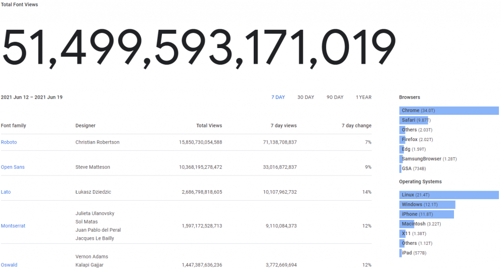
To give you an idea of which fonts to use, here are the top five fonts that garnered the most views in the Google Fonts Analytics:
Alignment between items
You should ensure that there is some consistency with the alignment between items throughout your website. Doing this helps make your website look more organized and easier to navigate, improving your user experience.
2. Strong eye-catching CTAs
CTAs, or call to action, are words or phrases used to compel a potential buyer into making a purchase. A great CTA is supposed to project confidence in both your product and your customer. It should show that you trust them, and you are confident that they will make the purchase.
It would help if you defined the purpose of your CTA to give your visitors a better understanding of what you need them to commit to.
Here are the estimated conversion rates for CTA locations on a page by Grow & Convert:
- Sidebar: 0.5 – 1.5%
- Generic, end-of-post: 0.5 – 1.5%
- Pop-ups: 1 – 8%
- Sliders and bars: 1 – 5%
- Welcome gates: 10 – 25%
- Feature box: 3 – 9%
- Navigation bar: varies
Your CTA should also be short and precise. You don’t need to write so many words since you may come off looking somewhat spammy or fraudulent.

The best way to get more conversions through CTAs is to reward your visitors for signing up for any service or for giving you their email address with discounts, for instance. Doing this makes your visitors happy, which helps you create a bond between your brand and your customer.
3. Fast loading time
If you want to improve your traffic, you need to increase your loading speed. Most mobile websites load from between 1-2 seconds, while for computer websites, it’s 6 seconds, whereas the 2018 recommendation was for it to be under 3 seconds.
Mobile users tend to abandon websites if the loading time takes more than 3 seconds. A two-second delay led to bounce rates of up to 87%. Therefore, suffice to say that a slow-loading site could cost you a lot of cash, especially through unprofitable email campaign investments. That said, it’s essential to optimize your website design for mobile too.
You could change all this by optimizing your website for faster loading. You could begin by reducing the average weight by bytes for both your desktop and mobile devices appropriately.
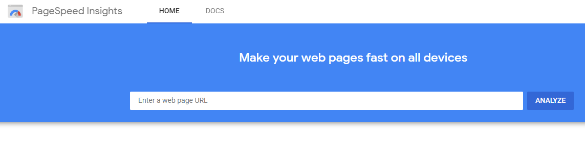
Check your website speed using Google’s PageSpeed Insights:
You could then work on optimizing the amount of individual content displayed on your websites to help make it load faster. You should also ensure that the computer you use for serving your clients with the web pages is capable of handling the load.
Here are some tips on mobile optimization.
Remember, faster is always better!
Now, let’s move to the next website design best practices…
4. SEO (search engine optimization)
You could increase your website’s traffic by applying search engine optimization practices.
SEO helps increase your website by utilizing organic search engine results. Doing this increases your visibility in Google rankings, which allows you to convert qualified prospects into customers.
To do this, you need to add relevant keywords to your content. You can find the relevant keywords by searching for them through BiQ’s keyword Intelligence.
This keyword research tool allows you to gather data on keyword volume, trends, keyword competition, related keywords, and more.
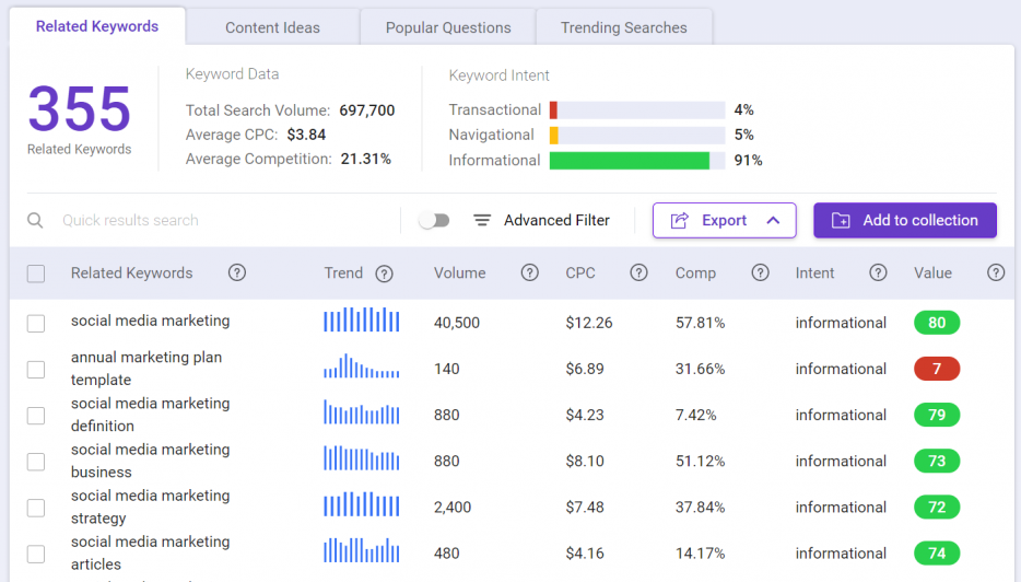
What makes BiQ’s Keyword Intelligence stand out from the rest of the keyword research tools on the market is the keyword analyzer feature. It helps you see why someone might be searching for the keyword in the search engine. With this data, you will be able to plan your content in such a way that meets your users’ needs.
If you are unsure which keyword to use, you can sort the keywords based on their value. The higher valued keyword means it can potentially bring more traffic to your website at a lower competition.
Getting a better ranking will help you get better visibility, which will, in turn, lead to more traffic to your website.
You may gain immediate access to BiQ’s Keyword Intelligence for free by signing up here.
5. Responsive design (mobile friendly)
A responsive web design follows the idea that a website should respond to the user’s actions and environment based on their device. If a user accesses a desktop website on their mobile device, then the website should transition and adapt to the user’s platform seamlessly.
The seamless transition can be achieved by using flexible grids and layouts and using intelligent CSS media queries. In short, the technology should be able to adapt and adjust to the user’s preferences automatically.
Using this technology will help reduce bounce rates for your website, increase traffic, and boost conversion rates. It will also help boost your pages and make them load faster. The technology is also great since it has lower maintenance costs and has easier analytics reporting.
6. Make navigation as simple as possible.
Simplifying your navigation will also go a long way to increase your website’s traffic. This is because it helps your visitors access and use your website more easily, significantly improving their user experience.
You should keep your navigation consistent and divide your categories clearly. You should also ensure that you use accurate navigation titles and that your search feature works correctly. These small improvements will have a hugely positive effect on your website and prove effective is user retention.
Using these website features ensures that your visitors easily access any information they came for quickly, efficiently pushing you ahead of your competitors.
7. High-quality photos and videos
Placing optimal quantities of high-quality photos and videos on your website will not only help pass your message more efficiently, but they’ll also help break the reader’s monotony. Placing photos and videos on your website gives your readers something to look at as they browse your site.
Statistics state that most people prefer to receive their information by video and a huge percentage of them enjoy looking at photos as opposed to reading text.
Providing them some of the information on your website in video format will help them understand your product better, which will improve traffic.
You could always shoot your photos and videos. However, if you are still new at it, you can still find copyright-free images on various web pages on the internet that you can use as free content for your website.
8. Apply the rule of thirds
The rule of thirds implies that whenever you want to design your website, you should ensure that you divide it into three equal parts, both horizontally and vertically. By doing this, you end up with nine equal parts with which you can base your design.

The thirds rule is the best visual design for your website since these are the main focal points that appeal to your readers. Placing your key elements in these sweet spots, especially on the top third part of the page, makes it easier for your readers to pick them out.
Using this rule also fits with the visual hierarchy since consumers read from top to bottom while scanning around the sidelines, especially to the right side of the page, for any other information. Taking advantage of this practice consistently is sure to improve your metrics.
9. The proposition of the Highest Value Placed on Top
Value propositions are like the foundation for your website. You don’t see it, but it’s there. They are the reasons why your reader should choose your product or service. Your highest proposition value should state what sets you apart from the rest of your competition by emphasizing your values.
Placing propositions on top of your page allows for better visibility and keeps the customer thinking about the product.
It would help if you took your time to create a high-value proposition to help bring about the best conversion rates. You should avoid stating your product’s features but instead focus on how your product will benefit your customers.
You should also ensure that you use the language that your customers normally use to help bring about a sense of connection between your customers and your brand.
Finally, here comes our last website design best practice…
10. Check for readability
When checking for readability, you should look into appropriate color contrast, sentence length, line length, headers, and bullet points to enhance glance understanding. It would help if you also used proper color contrast to improve the page’s text visibility.
To help your reader understand your text better, you should ensure that you use short sentences and large fonts. You could also add some images in your text as a distraction and as a way to help break the reader’s monotony when going through your text.
You can use BiQ’s Content Intelligence to check your content’s readability. It shows you the readability for better content optimization.
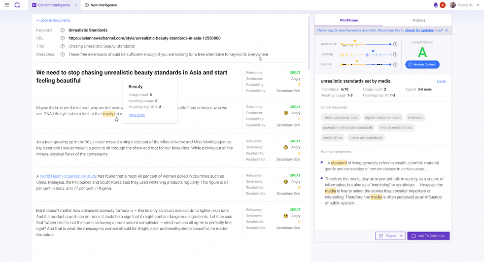
Get quick results on readability and other metrics for content optimization!
Readability is an important factor that can increase your site’s SEO levels when it comes to online content. It is a practice of making your writing understandable and easy to digest for your readers.
It’s really simple to use Content Intelligence. Just enter your domain, targeted keyword, hit analyze and BiQ will do the rest of the work for you! Get your results in seconds and see which areas you can improve better.
Besides that, you’ll learn about the relevancy value and types of sentiment of each and every paragraph.
You may want to check out how you can use Content Intelligence to achieve greater content marketing success.
Conclusion
And that’s it; 10 best practices for website design you can use for greater conversions on your website.
Those are the best practices that we learned and implemented on our website.
The best part?
They have been proven to work.
Let me know if you have any other website design best practices in the comments!