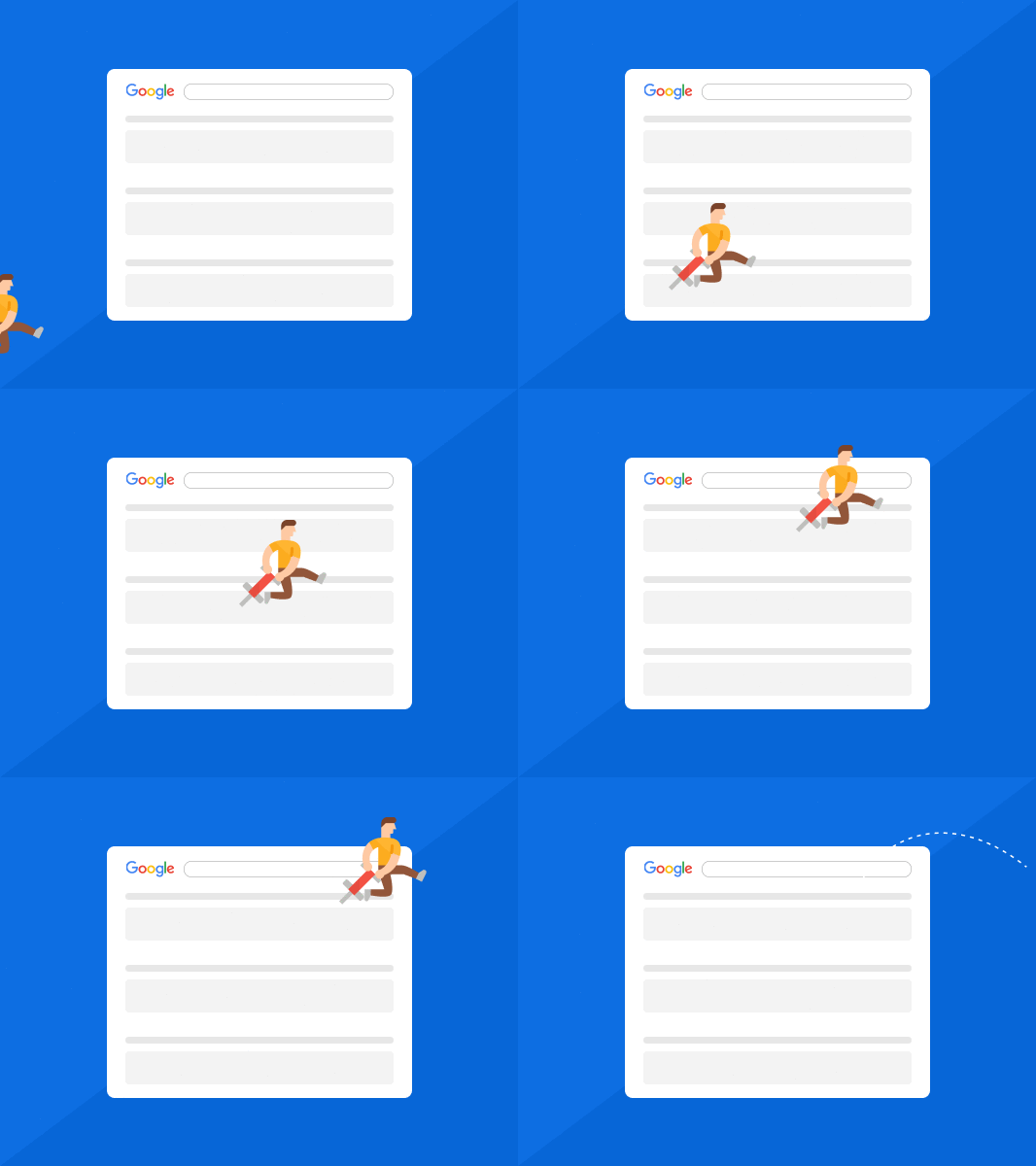
Pogo sticking is hopping from one search result to another because of users' dissatisfaction with the initial result. Pogo sticking indicates that the site was not relevant to users' search queries.
You search for something on a search engine, click on one of the results that pop up.
Next thing you know, you immediately click back because what came up is not what you were looking for.
Well, you just pogo sticked!
Most of us have done that at one point or another.
Pogo sticking is essentially the habit of hopping from one search result to another.
That said, pogo sticking is not good for your SEO as it tells search engines that people are leaving your pages because they did not get what they want.
What Is Pogo Sticking?
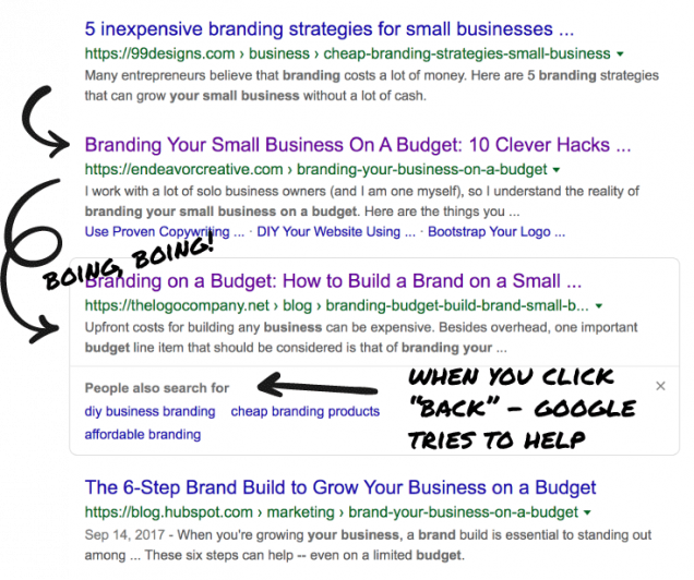
Pogo sticking takes place when users search, click on a site, but then quickly click back to the results page and then click on another result.
This is mainly because of instant dissatisfaction with the initial result.
Why is Pogo Sticking Important?
As mentioned earlier, pogo sticking is not a good thing.
It shows search engines that users did not find what they needed.
This is an indication that the page was not relevant for that keyword.
That said, there’s a difference between pogo sticking and bounce rate.
Bounce is not a bad thing as it can indicate that though the visitors did not move deeper into your website, they did spend a minute or two on the page.
They may have shared it on social media or bookmarked it.
But because they did not read more, it is considered as a bounce.
Of course, you won’t be punished if pogo sticking happens twice or thrice.
But if it happens several times, it is crucial that you find out what the problem is between what browsers are searching for and what they are locating on your site.
So what could be the problem of pogo sticking?
Here are some common causes:
- Many pop-ups
- Cluttered or confusing design
- Slow loading pages
- Poor usability
Another cause of the pogo sticking problem is non-relevant content or poorly spelled and spammy content.
For instance, if you post several click-bait articles that do not actually deliver on the promise that is on the headline, they can easily deter readers.
Also, if a user clicks through and then sees that what pops up is a single paragraph with tons of keywords, that would immediately turn them off too.
How To Fix Pogo Sticking?
Create Relevant Content
When a user is not contented with what they find on your site, chances are they will click back.
And when they do this, search engines track that and consider it pogo sticking.
But why are your users discontented?
Usually, it’s because of incomplete or irrelevant information.
In most cases, when somebody finds irrelevant content, they will stay on the page for less than 5 seconds then go back to the main search page.
So, what can you do to fix pogo sticking?
Ensure the content on the page is crafted with information that users searching for the target keyword are looking for.
The content should cover all the important information your users may be searching for.
There are some amazing tools online that can help you create useful content.
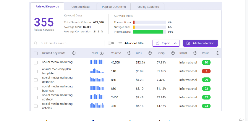
I like using BiQ’s Content Intelligence.
The tool’s keyword analyzer feature will help you determine why somebody might be looking for a certain keyword in search engines.
If you are not sure which keyword to use, just sort the keywords depending on value.
A high-valued keyword phrase means it can drive in more traffic to your site at a lower competition.
Cover Everything In Your Content
Another reason why users could be pogo sticking through your site is because of incomplete content.
In such situations, long content that answers the most probable queries of users is ideal.
The main effect caused by this kind of pogo sticking isn’t as severe.
This is because users found your content useful, but they want more.
So do not give shallow explanations or leave some questions unanswered.
This way, users will not pogo stick and look for other posts than answer their queries.
Again, you can use BiQ’s Content Intelligence analyzer tool to help you discover your visitors’ intent.
Then craft content that is customized for the keywords they are searching for.

It will also tell you the type of sentiment, relevancy value, and readability of each paragraph.
Use The Right Font Size

Your text’s body size should not be less than 16px.
If it is less than that, it will force mobile device users to zoom in on the page to read the rest of the text, which is not good.
Make sure that users can easily read your content when the computer or phone is held at a natural distance.
For the secondary text, make it a bit smaller than the size of the body text so that people can differentiate between them.
Make the hierarchy clear from the headline to the end.
Most people rarely read the entire text.
Instead, they scan the information for what they are interested in.
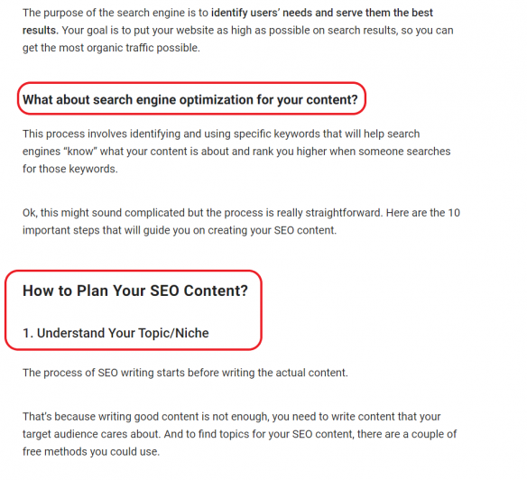
Headings and subheadings help them know what the information below is about and whether it is relevant to them or not.
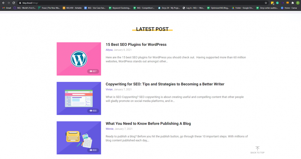
Here’s an example of headings being used in one of BiQ’s blog post on SEO content writing.
Internal Linking
An internal link is a link on one page on your site that links to another page on the same site.
Google and users use links to locate content on the site.
Users use internal links to move from one page of the site to another so as to locate the information they want.
Google also uses the same strategy to navigate the site.
You make it hard for Google to find other pages on your site if there are no links to them.
Now, there are many types of links.
Besides the links on the home page, post feed, or menu, you can also include links within the content.
These types of links are known as contextual links.
Their main job is to direct users to other related and useful content.
They also help Google and other search engines locate any related content on the site and ascertain the content’s relevancy.
A page with important links will definitely rank higher.
This means links are not only good for countering pogo sticking as they also send users deeper into the site.
This makes them less likely to move back to the initial search results, but also for your SEO efforts.
What’s more, internal links are things you can control as a site owner or administrator.
With useful and appropriate links, you will guide your site visitors and search engines to the most important pages on the site.
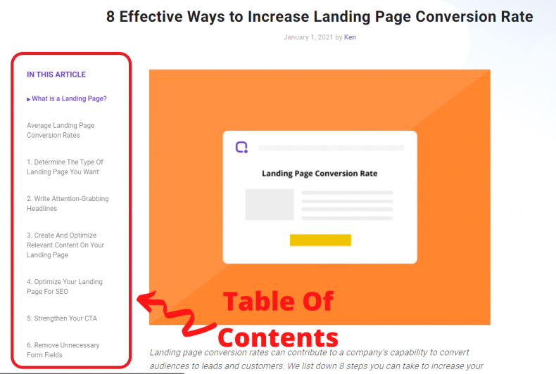
Add A Navigable Table Of Content
Usable navigation is something that every site needs.
It dictates where browsers are leading as well as how they engage with the site.
Without the right navigation design, content becomes absolutely useless, leading to pogo sticking.
Menus must not only be simple for users to read but also contain the elements ideal for guiding users through the site with some good design and creativity tossed in.
An innovative table of content helps visitors locate the content they want easily.
That keeps users going on and never changes when you add more content.
The right TOC enhances the user experience, which leads to more traffic and business for you while minimizing pogo sticking.
To enhance online navigation, create categories.
Keep them less than ten and use keyword phrases that explain what the information is about.
Put the main navigation at the top.
Keep it simple and use concise and clear wording.
Also, keep in mind that small screen sizes such as android phones need a responsive design.
So, try and reposition your main navigation and prioritize content for the limited space.
Another important aspect of easily navigable content is whitespace.
This is the area that is left blank on a web page (it doesn’t need to be white. It can be blue, red, even black).
The space is essential because it helps de-clutter a page so that visitors can concentrate on the content on a web page or article.
It also enhances user experience by marshaling content for better understanding.
Not to mention, it develops a clear content hierarchy by differentiating different page elements.
This makes it easy for readers to engage and consume content, making them stay around for a while, which in turn counters pogo sticking.
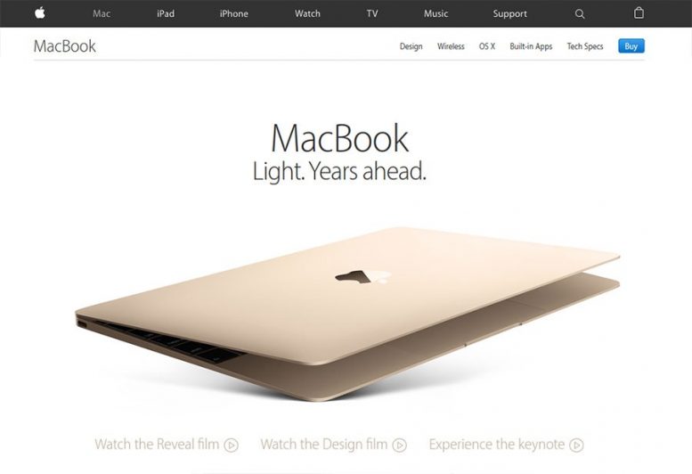
For instance, large spaces between layouts and elements, also known as macro white spaces, are ideal for guiding visitors through the pages and prioritizing where the user should focus.
Below is a good example of a screengrab from Apple.com indicating what the reader should focus on.
For more on white space and how to make yours navigable, click here.
Update Old Content
Updating old posts will rejuvenate and breathe new life into them.
This has various benefits, including turning old posts into relevant content, boost your SEO efforts, increase customers/ subscribers, and enhance click-through rates.
All while minimizing pogo sticking.
According to a study by Adobe, 38% of site visitors stop interacting with the old or unattractive content.
Refresh your content and make it attractive.
Imagine somebody landing on one of your old blog posts.
But instead of abandoning the page with disappointment, they are excited!
Because they found an updated content that accurately represents information!
Improve Page Loading Speed

Speed is not only an important aspect of content usability but also a big contributing factor aspect of page abandonment.
According to a report by Kissmetrics, 47% of consumers expect a web page to load in less than 2 seconds.
Also, a 2009 report by Google indicated that a 0.5-second delay in page load causes a whopping 20% drop in traffic!
That’s a considerable number for half a second.
Nonetheless, it doesn’t have to be like that.
There are various things you can do to enhance your site’s load speed.
- Optimize your images
- Don’t scale down images
- Compress and optimize your content
- Place JavaScript and CSS in external files
- Minimize HTTP requests
- Cache your web pages
- Reduce 301 redirects
Also, if you are not sure about your site’s loading speed, there are various tools online for checking loading speed.
Some top website performance tools to check are Pingdom, Page Speed, and Web Page Test.
Reduce Organic Bounce
Bounce rate is another vital metric for digital marketing strategies.
It refers to the percentage of visitors who land on your site and then decide to move out without visiting any other page.
A reader can bounce from a website by typing a new URL, opening a new tab, clicking on another site’s link, or clicking the back button to leave the site.
That said, it is important to keep your bounce rate manageable.
A low bounce means more page views and engagement, which leads to more conversions.
On the other hand, a high bounce indicates low relevancy, poor user experience, and other problems that are making users leave your site early.
It shows that your pages are not convincing readers to stay and purchase your product or act on the call to action.
That said, fixing the issues with your pages can seamlessly counter high bounces.
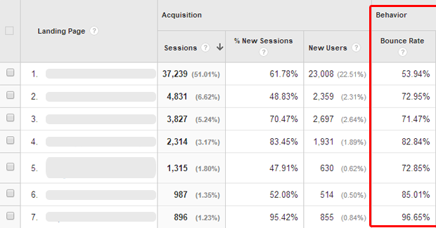
But, before you start, it’s good to determine the pages in question.
Google Analytics can help you with that.
To do that, click on “Behavior”, site content, and then landing pages.
Identifying such pages will help identify problems and solve them.
Ideas to reduce pogo sticking through minimizing bouncing rate:
- A/B testing + Targeted landing pages
- Improve your site’s speed
- Use high-quality images
- Optimize your call of action placement
- Use videos to engage your audience
Conclusion
One of the most effective ways to prevent pogo sticking is by getting in a user’s mind.
You will want to satisfy the queries of everybody who lands on your site, even if they will not act on your CTA or buy from you.
To achieve that, ensure that your site looks appealing, functions optimally with an innovative user interface, and supports various devices.
Categorize the information well for readability and easy understanding.
Lastly, make sure your pages are engaging and have relevant content to the keyword that you want to rank for.


