What is website redesign? Learn the ins and outs of a website redesign to improve your website experience and boost conversions.
Here are 7 best practices for website redesign you can use to improve your website experience and boost conversions.
Poor web design can hurt your sales.
You might have a beautiful website. However, chances are you haven’t updated it in years, right?
Technology goes forward increasingly fast. If you’re looking to stay on top, you must adjust your website accordingly.
Don’t be mistaken…
Redesigning your website isn’t only about visual features. It is far from that. It’s a strategic approach that will help you implement the newest technologies and best practices.
It’ll make your website up-to-date and SEO-friendly, which will boost conversions and help you beat your competitors.
In this website redesign guide, I will show you what a website redesign is, why it is important, when you should do it, and the best practices.
Let’s dive in!
What Is a Website Redesign?
A website redesign is a process of updating and optimizing your website for better user experience and conversions.
It’s about changing the layout, style, and format of your site.
Optimally, you should redesign a website every 3 – 5 years. The reason for that is that technology and design go forward super-fast.
You need to stay updated to keep up with the trends.
Website Redesign vs. Website Refresh
A website redesign usually involves changes in the code and visual appearance of the website. This presents significant changes like new branding, functionalities, or CMS.
A website refresh isn’t about significant changes. It’s usually just small changes like color, typography, etc.
Refreshing a website means giving it a little spark, while a website redesigning makes significant changes to optimize conversions.
Why Is Website Redesign Important?
A website redesign presents the opportunity to transform your website, improve branding, and have a more successful business.
There are three main reasons for redesigning a website.
1. Capture visitor’s attention
You have only a fraction of a second to impress a visitor.
“It only takes 0.05 seconds for users to form an opinion of a website.” – CXL.
Our brains are incredibly fast. If you don’t make a good first impression, your visitors will leave you for your competition.
“89% of consumers will shop with a competitor after a poor user experience.” – LedgeView Partners.
Redesigning your website will help you capture visitor’s attention and make them stay on the site longer.
2. Generate more leads
If you wish to increase your conversions, redesigning your website can be a great place to start.
“Website redesign and an SEO campaign improved monthly leads by 314% for TYKMA Electrox.”
We know that referrals play a big role in conversions.
“B2B companies with referrals have a 70% higher conversion rate, and they report a 69% faster close time on sales.” – Extole.
But would you refer a friend to an old, slow, and ugly looking website?
“57% internet users won’t recommend a business with a poorly designed mobile website.” – Axon Garside
Poor website design costs you valuable customers and sales.
3. Strengthen your brand
Your website design can make or break your brand.
“94% of people say web design is the reason they mistrust a website.”- Crazy Egg.
You won’t get any sales if your customers don’t trust you.
However, proper web design will help you stand out and improve your brand awareness.
“73% of companies invest in design to help their brand stand out from competitors.” – B12.
It’ll help you be unique and strengthen your brand.
Do You Need A Website Redesign?
You may be wondering, “Do I need a website redesign?”
You’ll usually know if your website needs redesigning.
The most common reasons businesses redesign their websites are low conversions, high bounce rate, poor UX, or is outdated.
However, if you’re not sure, don’t worry. We’ll look at three things you can check to find out.
User experience
If your visitors struggle with navigation on your site, they’ll leave.
“67% of customers claim unpleasant experiences as a reason for churn.” – Forbes.
User experience is crucial for retaining customers and driving sales.
“70% of customers abandon purchases because of bad user experience and companies with poor customer service lose $62 billion every year.” – Red signal.
If you have a bad user experience, whether your website is slow or not optimized for mobile, it’s time to redesign.
Conversions
Are you happy with your conversions?
If your answer is no, you probably need to redesign your website.
It’ll help you get more customers, drive more sales, and make your business more profitable.
Staying Up-to-date
Having an old-fashioned website won’t help you capture your visitor’s attention. If your website looks like the one below, you need to get a new web design.

This might have been popular a decade ago, but now it’s not. You need to stay up-to-date to get ahead.
Update your old website with a fresh web design people love.
Website Redesign Best Practices
Redesigning a website isn’t difficult. You just need to create an action plan and follow a few best practices.
Next, we’ll look at 7 ways to redesign your website, get more traffic, and boost conversions. They’ll help you keep up with your competitors and follow the trend.
1. Start With A Strategy
First things first, you need to know what it is that you want to achieve through the website redesign.
You need to identify all the issues your users may have experienced with your current website and in-depth understanding of the problems you need to address.
Why are you doing a website redesign?
This is an important practice so that you can identify measurable results. The metrics could be in terms of sales, better user engagement, or increased brand awareness.
At the same time, be sure to define your buyer personas. List out the target audience that will be affected by your website redesign. And how you can serve them better.
What can I do to appeal to my audience more?
You want to make sure the website redesigning will sync up with the types of the audience who will be coming across your website.
Next, take a trip to your competitors’ website to see what you like, don’t like, or where you can perform better.
Where do my competitors excel, and how can I achieve that via redesign?
This step will give you an idea of what you include in your website redesign.
2. Create A Blog
Build a blog if you still haven’t.
Why?
This is because those who prioritize business blogging are 13 times more likely to have a positive investment return than those who don’t.
A blog is one of the easiest ways to drive traffic to your website and increase your SEO. It’s easy – when you create more content, there is content the search engines can crawl and index. They can easily recognize your website as a source of information.
From the users’ point of view, they will see you as a trusted source for useful and helpful content, which usually results in conversion.
So if you still do not have a blog, make sure to create one today.
3. Do Keyword Research
Doing keyword research is important because it helps you understand what keywords users used to find you and what their intent is.
You need to know your customer’s intent so that you can redesign with your customer in mind.
Start with checking your ranking keywords. It will help you understand what keywords people used to find your website.
First, enter your website URL into Rank Intelligence. Then, select the country where the audience is based.
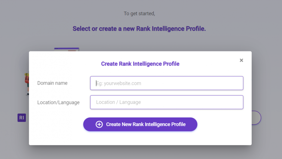
You’ll get a list of keywords you’re ranking for in the top 100 positions of Google. These are the most valuable keywords that will help you understand how people have found you.
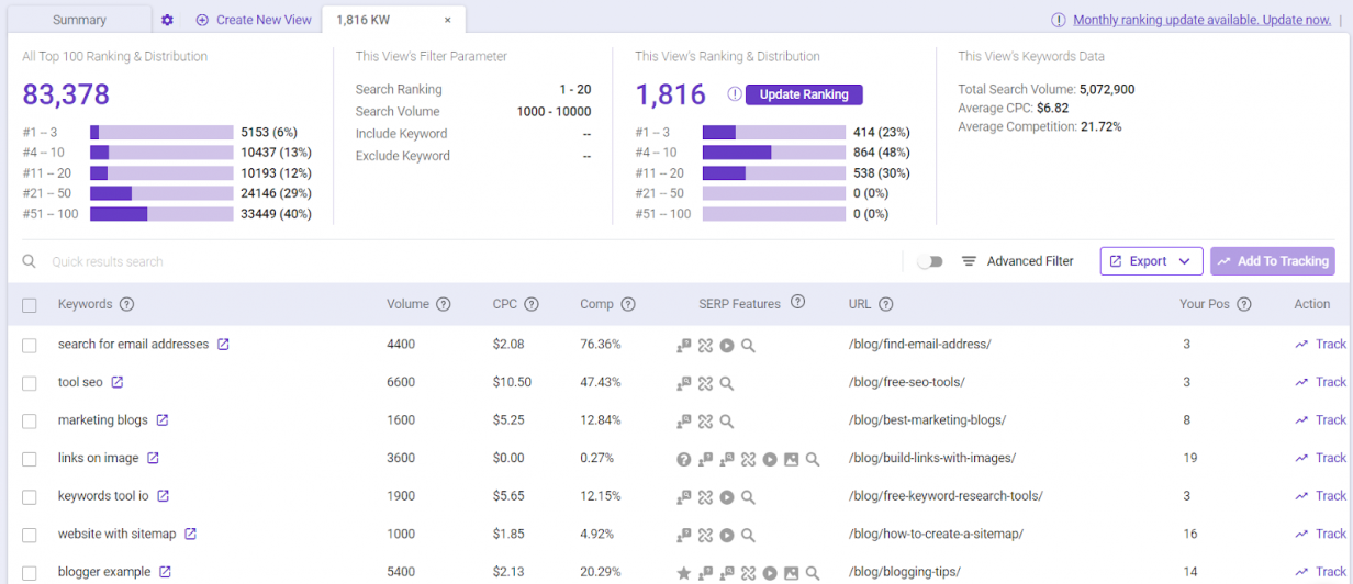
These insights let you know what the search terms that searchers are searching for to reach your website are.
Next, you may use BiQ’s Keyword Intelligence to check the keyword’s intent.
Let’s say you want to know the searcher’s intent when searching for ‘content marketing.’ Type them into the keyword tool.
It will show you the estimated keyword intent percentages based on the total number of related keywords.

The keyword has an informational intent from the example above, which means the searchers are in the awareness stages.
Since they are interested in getting information, the best thing you can do is give them that. Don’t try to force your visitor them to buy, but simply provide the information they want. You can always nurture the leads along the buyer journey.
This information helps you paint a clear picture of who you are redesigning for. Make sure to keep their needs and motivations in mind as you make any redesign decisions.
Scroll down and you’ll be able to identify each keyword intent so that you can understand your target audience better.
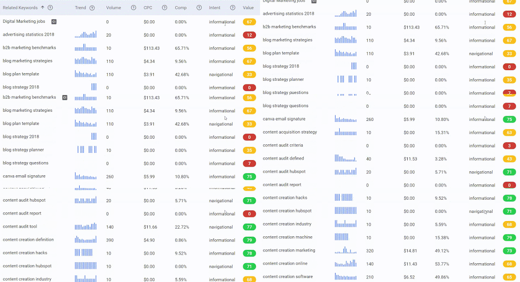
That is a great help because it eliminates assumptions and guesswork to identify the searchers’ intent.
3. Optimize Content For SEO
Here is the thing – the longer someone stays on your website, the better the chances of converting to a customer. And this is only possible if your website contains a value that keeps filling the customer’s cup.
So it is your responsibility to create content that is helpful and relevant to your audience.
We’ll be using BiQ’s Content Intelligence for that. It’ll help you make your content SEO-friendly and engaging at the same time.
Enter your content URL and target keyword. Then, you’ll get an in-depth analysis of your content.

You’ll see an overview of your content performance in terms of its readability, on-page performance, semantic density, and more.
One feature that is worth mentioning is WordVector. It tells you your content’s performance against the Top 10 SERP content in relation to your target keyword.
The best part about this feature is that it can tell you exactly which paragraph has lesser relevance to the overall content.
Now, you will be looking at the “Edit Needed’ section to check which paragraph needs revision.
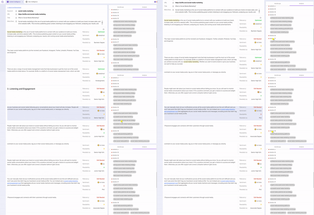
You can then dive deeper into the paragraph and better understand how to improve its relevancy to your target keyword.
Use the guidance to increase your overall content relevancy than stuffing the same target keywords, which will negatively affect the user experience.
Next, switch from WordVector to Fundamentals.

In the Fundamental, you’ll get the actionable ways that will make your content more engaging and easy-to-read.
They’ll help you make your readers stay on your site longer and enjoy your content more.
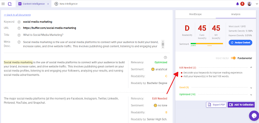
This will help you improve UX and convert visitors into customers.
Learn more about making your content SEO-friendly.
4. Add Visual Features and Elements
Visual elements help to capture your visitor’s attention immediately.
The more visual your website, the better it is. This is because the human brain processes image 60,000 times faster than text.
There are two main types of visuals that we typically use; image and video.
Images
Images are catchy, eye-appealing, and attention-grabbing. That could be the reason why blog posts with images get 94% more views than those without.
Videos
We love watching videos. In fact, 85% of consumers want to see more video content from brands. They can be a complete game-changer if you use them right.
5. Personalize Your Website
Next, you want to personalize your website based on your brand. Conveying your brand’s image is crucial.
It’ll help you stay in your potential customers’ minds and turn them into customers.
You can use various elements to personalize based on your brand, including color and mission.
Colors
The color represents what vibe your company is giving.
Align it with your brand’s mission and keep it consistent.
Brand’s mission
Your brand’s mission should represent your company’s personality and what will you help your customers achieve.
Consider the following slogans.
- Apple – Think Different
- Coca-Cola – Open Happiness
- Nike – Just Do It
Get inspired and create your brand’s slogan. Then start personalizing your website based on your brand.
6. Perfect Your Landing Page
Here are 3 easy strategies to improve your landing page.
Craft a compelling headline
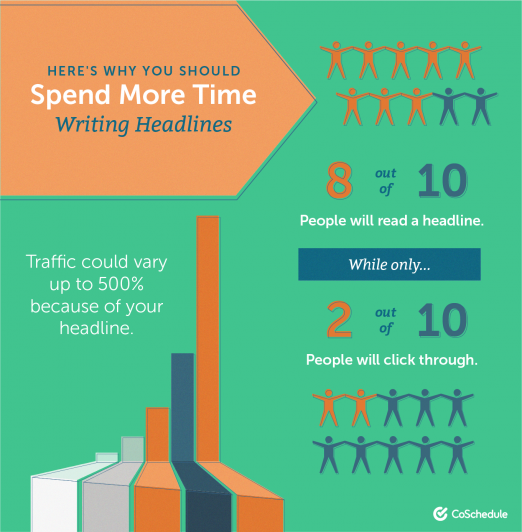
A headline is the most important part of your landing page. That explains why 80% of your website visitors will read the headline, but only 20% will continue to read the rest.
If you’re looking to improve this ratio, you must come up with a compelling headline.
The most important thing is to include benefits in it.
Including benefits in the headline gives readers a reason to click on the headline and read the content. The more clearly you communicate a benefit, the higher CTR you’ll get.
Employ Call-to-action
CTA is almost as important as a headline because 90% of visitors who read headlines will also read your CTA copy.
Call to action is what makes people click and drive sales. You might be surprised what a difference it can make.
Include at least one CTA in your landing page that is personalized and conveys a strong benefit.
Add more credibility
Your website credibility affects whether a visitor takes the next step and converts or goes on to the next.
There are many ways you can increase your website credibility, one of which is to list a physical street address and make your phone number highly visible. Adding this information helps establish your trustworthiness to both your website visitors and search engines.
Other than that, you may consider adding testimonials on your website. According to a report, 93% of customers read online reviews before buying a product. Get your customers to provide you with testimonials and reviews.
7. Think Mobile First
Nowadays, we use mobile phones almost for everything. So you need to keep this in mind when redesigning your website.
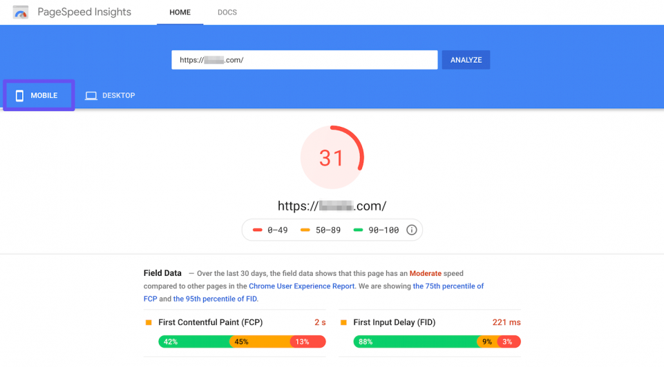
The first thing you need to improve is site speed. It’s a no-brainer – the faster your site is, the happier your users will be.
Check your site speed using the Google PageSpeed Insights. Then, follow the optimization suggestions to improve your website speed.
Another thing to take note of is mobile responsiveness. A responsive web design allows you to deliver a seamless user experience that can increase lead generation, sales, and conversions.
You can learn more about mobile optimization in our how to make your website mobile-friendly post.
Conclusion
We live in a fast-paced era.
What might have been trendy sometimes may be history today. You must make your website up-to-date, optimized, and SEO-friendly.
Redesigning your website will help you do just that.
Following the 7 website redesign best practices above will allow you to stay on top of your game and keep up with the newest trend.
However, it’s not a one-time solution, rather something you should do regularly.
Check out our other article on how to develop an SEO friendly web design.
Do you have any website redesign tips that you want to share? Let me know in the comments!


