Learn why the psychology of color in marketing is important and how to use colors to increase conversion rate.
Color Psychology: How to use the psychology of color in marketing?
For all marketers, the main goal is to motivate customers to purchase their products or services.
However, for marketers that deal with brands, their ultimate goal could be a little bit harder to achieve: influencing customers to develop an affinity to their brand above all other brands.
Psychology of color in marketing is a study that shows how colors affect the behavior and perception of marketing and branding. The study is meant to provide more insight into whether color influences a customer’s affinity to a particular brand or their ability to make a purchase.
There are many strategies that marketers could go about to achieve these goals, and most of the time, they may resort to using more than a few at the same time. However, experienced marketers know one thing, sweet influential words and enticing images alone don’t cut it.
Customers rely on something more fundamental that influences their purchasing decisions: color and color are all about perception. We’ve experienced color throughout our lives and have learned to associate various hues with various meanings.
Seeing bright yellow colors makes you happy because it’s the color of ripe fruit. Red makes you alert because it’s the color of blood; it signifies danger. Blue makes you at ease since it represents water and bountifulness.
By analyzing these primary colors, Red, Blue, and Yellow, secondary, and tertiary colors, you begin to realize how colors profoundly influence our day-to-day decisions.
Marketers who want to create successful marketing campaigns should use the psychology of color to enhance their messages and infuse their campaigns with appropriate color schemes to help them drive conversions.
Color is an emotional cue that can help you stand out in a sea of content marketing, and this article is meant to provide you with some insights on how you could go about it.
Let’s start with the basics!
Basics of color theory
Additive color mixing: The RGB model
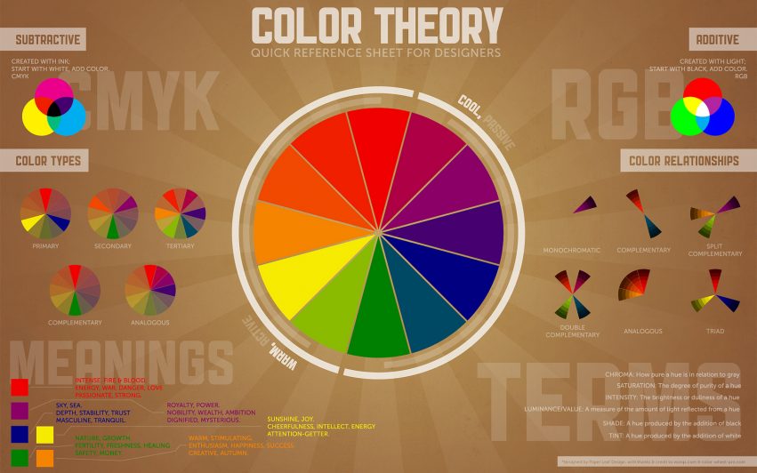
This color model relies on mixing light wavelengths and is used mainly on digital media. When you mix Red, Blue, and green, the more color you add, the brighter it becomes. If you mix all these colors, you get white.
This model is essential if your marketing revolves around digital media marketing. For instance, if you want to market your products or services on a Facebook platform, you must consider their color scheme, primarily blue.
Before choosing what logo you’ll post on Facebook, you have to consider how the logo’s color will relate to the platform’s color schematic. If you don’t use the right colors, your logo will come out muddy and out of place.
You need to pick colors that complement their color schematic. You could choose to go with different shades of blue if you want your logo to relate to the platform, or choose a secondary color or even tertiary color of blue if you’re going to stand out a little.
The subtractive color mixing: CMYK model
Let’s say that you want to create great packaging for your product. You wouldn’t want to slap on any color and call it a day. You would need to use colors that evoke emotion in your buyers, colors that call out to them from a sea of other competitive brands.
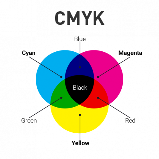
Enter the CMYK model. The subtractive color mixing model is used on print media such as paper, signage, and packaging. It involves subtracting light from a medium by adding color, and it’s better because it produces more colors that are even more emotive.
Traditionally, the colors used in this model are Red, Blue, and Green; however, as print media developed, the colors were replaced with Magenta, Cyan, Yellow, and Key-Black, CMYK. This combination helped printers produce a wider variety of colors which was better for marketing.
Customers who’ve developed an affiliation for a particular brand often take more time to look for their preferred product of choice.
Since the easiest way to process information is visual, 90% of the time spent by customers looking for products is invested in looking for the product through their distinctive colors.
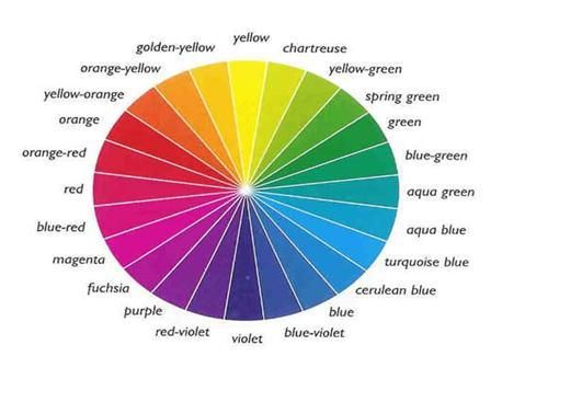
If you want to make more sales, you’ll need to hook your customers in with colors that they can positively relate your product with. To get the best idea of what colors you may use, you could try looking at a color chart.
Basics of the color wheel
To understand how the psychology of color in marketing affects your customer’s purchasing psychology, we have to go back to the basics.
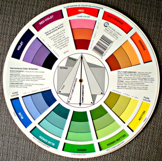
The color wheel was invented by Sir Isaac Newton in 1666, and to this date, it is still being used by artists in developing color harmonies, mixing, and color palettes.
Primary colors
The color wheel has three colors: Red, Blue, and Yellow. These are the primary colors, and mixing them produces secondary and tertiary colors.
Secondary colors
When you mix primary colors, you get secondary colors: green, purple, and orange.
Tertiary colors
Mixing primary and secondary colors produce tertiary colors such as blue-green.
Drawing a line down the middle of the color wheel divides the colors into warm colors, oranges, reds, yellows, cool colors, greens, blues, and purples. Warm colors are generally associated with bountiful energy, brightness, and actions, while cool colors are more about peace, calm, and serenity.
Recognizing that colors have temperature could help provide you with much-needed insight on choosing the right colors for your marketing campaigns, logos, and product designs. Associating your products with the right colors could help improve conversions.
Why color psychology is essential in marketing
It differentiates your brand.
Studies are shown that our brains prefer immediately recognizable brands, and color plays a huge role in this regard.
However, before settling on a particular color for your brand, it would be best if you also chose a color that sets you apart from your competitor.
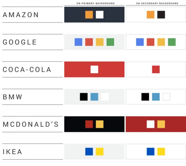
This makes it easier for customers to tell your products apart. The best example of the psychology of color in marketing is between Coca-Cola and Pepsi. Even though the two brands are in the same niche, the color used in their products and marketing is quite contrasting. The colors used differentiate their products and help them stand out.
This is an excellent strategy since studies reveal that products that stand out from the rest of their competition are more likely to be remembered. Those that don’t get lost in all the noise.
However, there are two ways you could go about it: pick colors with similar hues for your campaign (Coca-Cola’s red), or go for colors that create a stack contrast but are at the same time complementary to each other (Pepsi’s red and blue).
Either way, ensure that colors used in your marketing strategy are not in any way associated with your competitors.
It shows off your brand’s personality.
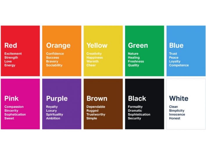
For a user to purchase a product, the colors used on the product and marketing campaign reflect its intended purpose. For instance, Apple uses the color white on most of its campaigns.
The white color communicates reliability, trust, and luxury, so most people prefer their products over most other companies.
Imagine if a company that produces electronics chose grey as its primary marketing color. Would you be able to trust its products to be efficient and high quality?
However, you also have to note that associating a particular color to your brand should limit you. You could also express your brand in another secondary color or a variety of similar hues. You could use it to express your brand’s diverse traits.
Ensure that your brand is represented by one primary color that customers can relate to.
It appeals to your audience.
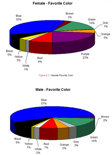
Joe Hallock’s study on the psychology of color related to gender showcased some significant differences in preference. Additional research also showed that men preferred bolder colors while women preferred softer colors.
The studies also showed that men preferred shades, colors that had black added to them, while women preferred tints, colors that had white added. While this should not be followed to the latter, you must take it as a factor in marketing campaigns whenever you feel they’ll be appropriate.
For instance, if your company deals with feminine products, then you are better off using tints of soft colors. You could use some pink, green, and any other colors that appeal to femininity. Doing this will help you attract the right audience and influence them to follow your brand.
Nevertheless, it would be best if you weren’t afraid to experiment; after all, all these rules are not set in stone. You could try soft colors on masculine products and vice versa.
Or better yet, if your company is not inclined towards either gender, you could decide to be bold with your colors; doing this will help set you apart from your competitors.
The psychology of colors in marketing

1. Red color psychology
Energetic, aggressive, provocative, passionate, and attention-grabbing
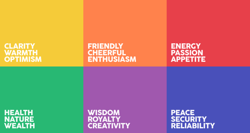
Red evokes a visceral response and passion. Seeing this color causes a person’s heart to beat faster and also makes them breathe faster. The color is associated with excitement, energy, and passion. The color is attention-grabbing and provocative.
When setting up your company/brand’s marketing campaign, you could decide to use the color red in your call-to-action if you want to elicit actionable responses from your customers.
The psychological effects of the color red, such as increased heartbeat, make people want to dispel the built-up energy. Directing this energy to your call-to-action or purchase could help boost your conversions.
2. Black color psychology
Prestige, timelessness, value, power, sophistication
Black is a classic marketing hue used by companies dealing in luxury products to demonstrate their band’s influence and timelessness. It makes their brand stand out with sophistication in contrast to their competitors.
Luxurious products are often high-quality pearl-whites. Contrasting these products with pure black colors helps them stand out even more, which evokes an even more profound emotion.
Therefore, if your company deals in luxury products such as jewels or electronics and you want your brand to communicate sophistication, value, and confidence, then you could opt to use black in your campaigns.
3. Blue color psychology
Dependable, trustworthy, secure, confident, responsible,
While this is the most popular color choice for most popular brands, it isn’t that hard to see why. Blue helps keep people at ease. It allows companies to communicate to their customers that they could trust them.
Research has also shown that people placed in blue rooms are far more productive than people placed in rooms with other colors. Want your company associated with productiveness, confidence, responsibility, dependability, and trust? You could aim to use blue or its various shades in your campaigns.
4. Green color psychology
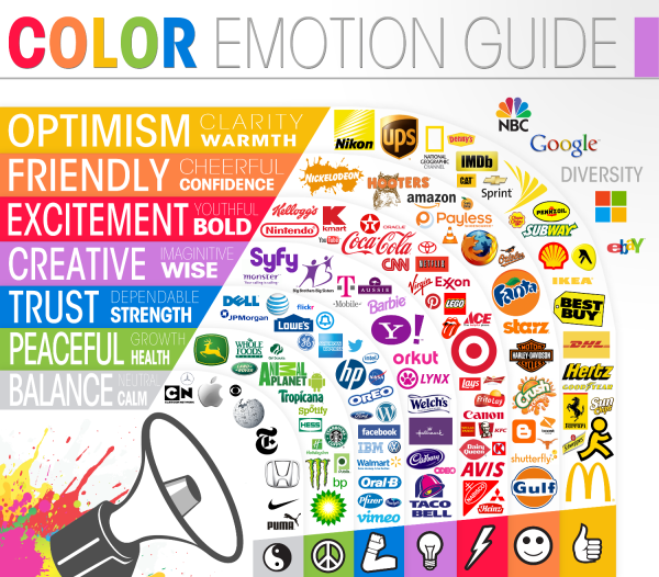
Health, wealth, prestige, generosity, serenity, safety
Green as a color is synonymous with safety, calmness, and freshness. It is an excellent color that symbolizes nature. It represents tranquility and good luck. Some also see green as exciting. It represents an opportunity to go on an adventure.
If your brand deals with nature’s products or services, you could opt for various shades of green. You could also use this color for brands representing youthfulness or youthful activities such as hiking and other outdoor activities.
5. Purple color psychology
Purple represents sophistication and mystery. One could also use it to represent religion, royalty, or elegance. Using this color in your marketing campaign could add just enough mystery to make customers interested in your products.
6. Orange color psychology
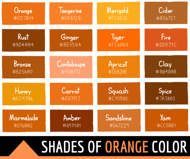
Fun, vitality, playfulness, outgoing exuberant
If you want a color that’s optimistic, bright, and yellow, then you could go for orange. The orange hue represents vitality and ripeness and is an excellent color for brands that need to market fun outdoor activities. Orange helps the brands come out as fun and exuberant.
7. Yellow color psychology
Light, positivity, creativity, warmth, motivation, joy
Want to bring out your brand and creative, fun, and full of positive energy? Then yellow is your color of choice. Yellow is creative, appealing, warm, and optimistic. If your competitors are clustered on the shaded side of the spectrum, you could make your brand stand out by playing around with yellow.
8. White color psychology
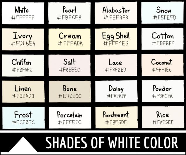
Nobility, purity, cleanliness, softness
White is a timeless color that companies could use to market almost any product. White as a color is often associated with nobility and delicate purity. It also brings about a feeling of trust, openness, and simplicity. Use this color if you want to gain your customer’s confidence.
That said and done, great marketing campaigns work best when they are accompanied by great content. If you find a hard time coming up with content that’s targeted to your desired audience, then you could use our tool, BiQ’s SEO suite.
Bonus Tips For Your Content Marketing Strategy
BiQ’s SEO suite is a content creation tool that could help you target the right audience and provide them with targeted information. Using our tool could help boost your traffic and eventually help you increase your conversions through target marketing. How does this work?
Find profitable keywords using BiQ’s Keyword Intelligence.
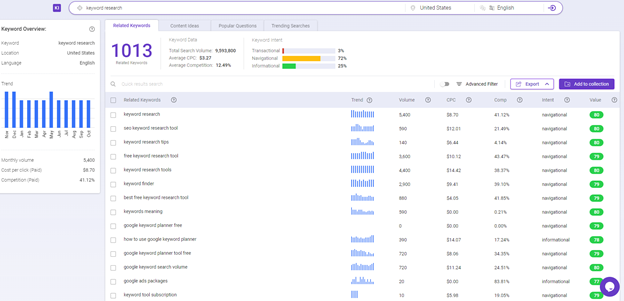
Whenever you decide to market your brand through your website, google ads, or social media platforms, you’ll need to target the right customers, customers who are highly likely to convert.
To achieve this goal, you could use BiQ’s keyword intelligence tool. Our tool provides you with thousands of keywords and keyword phrases along with relevant data that you could use to create the most effective marketing campaign.
Our keywords come with information on the user’s keyword intent.
Suppose your marketing campaign is aimed at users who are out to get more information about companies in your niche. In that case, you could use keywords with informational intent and create content targeted towards such users. You could also use transactional and navigational keywords for other content, respectively.
However, you may be asking yourself. What do I do if I have the right keywords but don’t know how to write the best content? I’ve got you.
Create great content using BiQ’s Content Intelligence
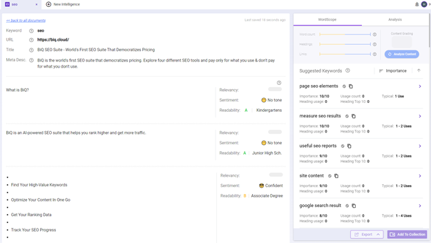
BiQ’s Content Intelligence is our other tool in BiQ’s SEO suite that you could use to create the best, most targeted content that rates highly on search results. You could write your draft on BiQ’s content intelligence tool and check to see whether it’s SEO-friendly.
Our tool helps you understand essential parts you have to cover about your topic and helps you fix critical issues that could improve your ranking. Our tool also enables you to identify gaps in your content against the top ten competitors.
Conclusion
In an ocean of content information, you have to stand out.
To do this, you’ll have to create unique content. However, using this strategy alone will not take you far enough. You’ll need to set your brand apart and make a lasting impression through color.
You know now how you can use the psychology of color in marketing. I hope this guide will help you make the right decisions when choosing the color for your marketing strategy.


