

Check out the 10 best fonts for website you should consider using in 2021.
As promised, here are the 10 best fonts for website in 2022.
Though often ignored, a website’s font choice can make or break how consumers view your brand. When appropriately selected, the best web font can boost your business’s look, enhance your site’s readability, and offer a seamless user experience to website visitors.
However, when done poorly, it will make your business look unprofessional and turn off potential clients. It is common sense that having the best fonts for blogs or the best fonts for the web is one of the most effective marketing strategies you can incorporate in your marketing campaigns today.
Actually, the easy-to-read font is an essential part of most popular brands worldwide. From BMW to Airbnb and even Nokia, they have invested heavily in the websites’ best fonts.
Why? Because fonts have an extensive effect on so many vital elements of a site, including readability, user perception, user experience, and mood.
As such, it is important that you understand the best practices for the best fonts for website so that you can develop a site that delivers your message understandably and clearly.
Why Do Your Website Fonts Matter?
Chances are you have heard this cliché “Words are powerful.” Yes, it’s often overused, but it is one of the few sayings that are still relevant and true. What you say and how you say it has a significant effect on how your audience reacts.
The same applies to fonts for websites. When you choose a font-weight or color is not just about aesthetics. Font guides have deep-rooted psychological impacts on how consumers view, read, understand, and chew over that content.
With consumer skepticism toward new products at an all-time high at the moment, marketing departments must craft their messages prudently and take font meanings more seriously than ever.
According to a study by JOSTOR, 70% of consumers think that most ads are untruthful and only seek to persuade consumers to purchase what they do not need. That’s despite companies spending billions on advertising every year.
To counter this and boost customer confidence, brands must be careful when developing content by taking advantage of every tool at their disposal to win over customers. That’s where going for the best font for blogs or websites come in handy.
You must be smart when choosing the font to use as it is a crucial point of contact between you and the target audience. Here is more on why the best fonts for website matter:
Improve readability

Did you know that it takes about 50 milliseconds for internet users to create an opinion about your site? The 0.5 seconds determine whether they like what they see or not. And one aspect that plays a key role in how consumers view your site is readability.
If a site’s words are too small or broken by hyphens, very few readers will stay. This contributes to pogo-sticking, where users quickly leave your page and return to the search results.
Also, the color contrasts, font weights, and the number of times the fonts change determine whether users will slow down to look at what you have or move to another page. That said, the rule of thumb when it comes to readability is to keep it simple.
Shift sizes, weights, and colors mainly for sub-headers and headlines. The body copy should be between 10 and 12.12.
Font also affects how readers react to your content.
Another important aspect to consider when designing content is how to use what font at what part and how internet users will engage with the content. Font can help you dictate eye flow and direct reader attention to where you want it to be.
If you read content online, perhaps you already know that readers do not read word to word of a blog or article; instead, they scan it to locate what is important to them.
Nielsen Norman Group‘s study indicates that people read online content horizontally from left to right before moving down to the far left. Every movement down is followed by a less movement horizontally, coming up with an F like pattern.
This means that eye-friendly and attention-grabbing fonts of various colors, color contrasts, and sizes in subheadings and headers can help fine-tune your blogs and articles to this movement, making it easy for readers to scan and locate what they are looking for.
While it is a bit hard to position all the important data along the left, a few changes in fonts that do not sacrifice readability, such as adjustments in color and weights, can draw readers’ attention leading to satisfied users, more conversations, and increased customer loyalty.
Creating engaging content through the best font for a website builds trust and wins customers over, which is every business’s goal.
Font affects the overall aesthetic of your website.
As mentioned earlier, most site users today are skimmers. As such, a website must have aesthetics. A visually attractive site is easy to comprehend, enjoyable, inviting, and functional, making it able to draw attention within that critical 0.5 seconds.
Clear, easy font is essential here. Do not complicate text with sophisticated effects or fonts, and do not make the text look sticky with poor sizing or color. Keep it stylish but simple, and make sure CTA buttons stand out with constructive use of text.
Also, ensure the headings and subheadings are consistent. You can use H1 and H2 for effective machine layout. This means your human guests can easily understand what an item is all about while skimming topics.

The 10 Best Fonts For Your Website
Now we come down to the 10 best fonts for your website. Let’s check it out.
1. Times New Roman
Times New Roman, a new version of Times font, is one of the most used fonts on Windows devices.
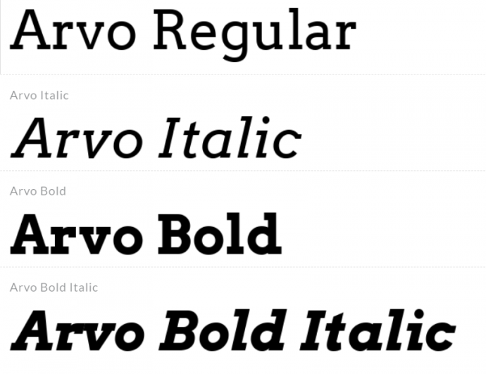
2.Arvo
This mathematical slab serif font is known for its readability and versatility. It has four cuts: bold italic, bold, italic, and regular. Depending on the one you go for, it can either appear modern or classic, making it ideal for all types of businesses.
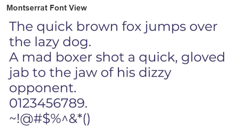
3. Montserrat
According to the Founder, Julieta Ulanovsky, the Montserrat font is designed to ” rescue the beauty of urban typography in the first half of the 21st century.” The sans serif font is named after Montserrat in Buenos Aires, where the founder stays.
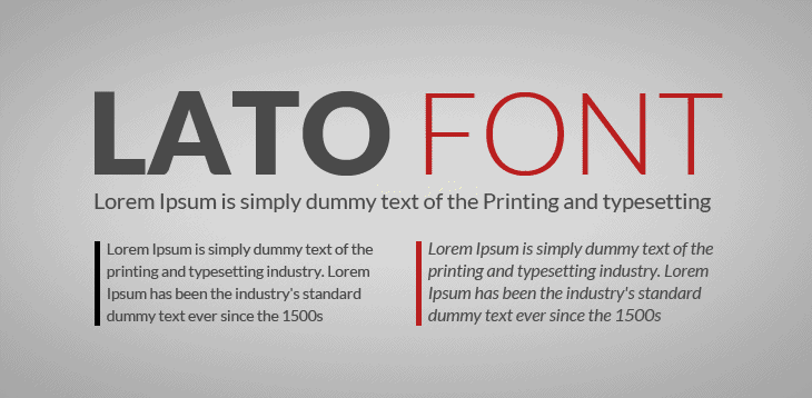
4. Lato
Lato was designed to work in body text transparently and stand out when writing large-sized titles.
5. Roboto
Roboto is Google’s in-house product. The most downloaded font on Google Fonts is smart and stylish, friendly, and professional. Chrome OS and Android devices use the font.

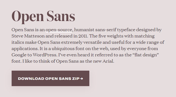
6. Opens Sans
Open Sans is another in house product from Google. Thanks to its simple and appealing design, the amazingly versatile sans serif font blends well with almost all the other fonts. You can use it in virtually any scenario; it is optimized for mobile, print, and web uses.
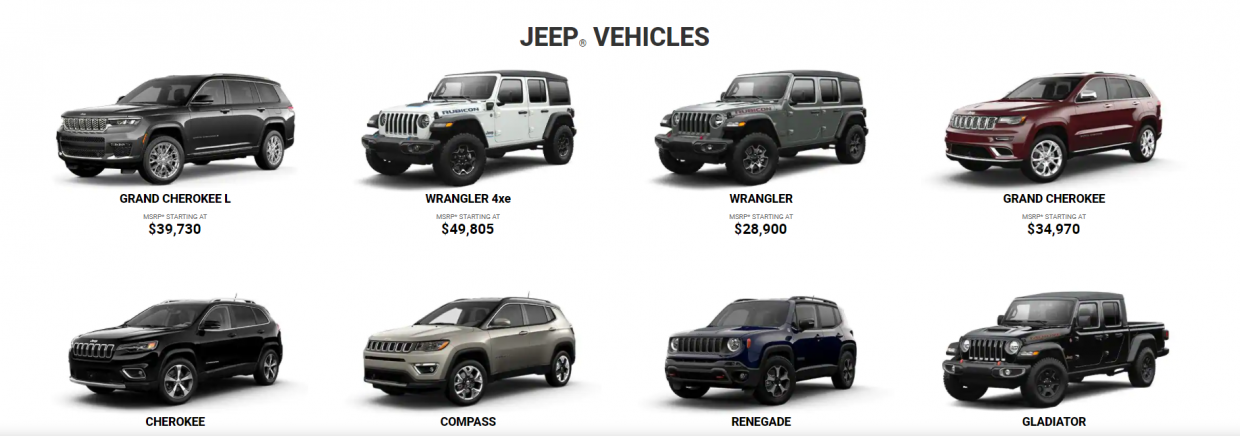
7. Helvetica
Helvetica is a favorite among designers because it is simple, neutral, and ideal for any business or industry type. That is why most popular brands such as BMW, Motorola, and Jeep use it. You won’t go wrong with this one regardless of your business type.
8. Libre Baskerville
Surveys indicate that Libre Baskerville is one of the most trusted and easy to read fonts by consumers. Actually, that is the main reason why the serif family font is mostly used by accounting firms, banks, and other financial institutions.
Designed by Pablo Impallari, you can get the open-source typeface free of charge from Google fonts. It is available in bold, normal, and italic. It does not have a bold-italic version.

Victory Group’s website is a good example of a brand showcasing their value, commitment, expertise, and commitment through Libre Baskerville font.
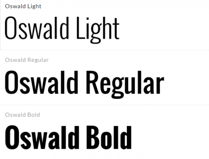
9. Oswald
A new version of the 20th century ‘Alternate Gothic’ font family, Oswald is designed mainly for digital use on mobile devices and computers. You can use it to pull quotes or titles that need to stand out in spaces where space is limited.
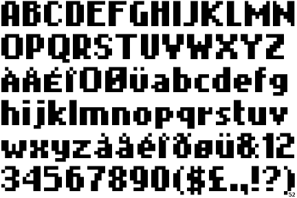
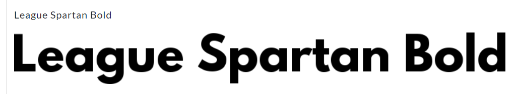
10. League Spartan
Designed from Gothic Bold, League spartan is a modern geometric font. It features a newer, bold, and all-around architecture. You can use it for titles, button texts, or even the body. It goes hand in hand with bold color schemes, as seen below.
How To Choose The Best Fonts For Your Website?
Selecting the best font for a website can have a considerable effect on your website’s appearance and feel. While it may seem like a minimal aspect, it has the power to transform your site completely.
To help you choose the best font for the website, here are factors to consider:
Choose a font that matches your message or brand identity.
Your brand goals determine how the factors that make up your business are used. Brand rules are critical to communicating your branding strategy. They communicate the dos and don’ts of your company.
In other words, they are rules designed to help you or your designer develop a consistent identity when linking multiple elements of your brand by defining your logo, colors, website design as well as font.
So, if you have guidelines that distinguish your business, make sure you stick to them when choosing a web font for your business. While it is easy to get tempted to experiment with other fonts when creating or revamping your site, please don’t!
Every time somebody visits your site or receives your business card, they get an idea of your business’s brand signals and your firms’ overall design. These perceptions must portray a coherent and uniform picture; otherwise, you will end up looking unprofessional and incoherent.
So, use the same fonts you use for the website across all your other digital channels and hard copy materials to give your customers a uniform and steady picture of your brand.
Choose a font that matches the type of audience you want to attract
To identify the customers or clients that you want to target as well as what they like, ask yourself the following questions:
- What age group are you targeting?
- What gender do you prefer?
- What profession or social class is they in?
- Do they have more/less disposable income?
These are the types of questions that will give you an idea of who you are trying to target with your marketing efforts. For instance, if you have a modern coffee cafe & bar with a retro and rustic design, you might want to consider a retro and trendy font design to draw young design-oriented coffee lovers.
That said, just like any other feasible marketing campaign, how you communicate and who your target is essential. Ensure that the font you go for resonates well and will be received with open arms.
Places To Get Free Fonts For Your Website
If you do not know where to look, fonts can be very expensive. Fortunately, there are many sites online where you can download many amazing fonts for free. Here is a list of the best five websites for downloading free fonts.
Advanced Tip: Check Your Content Performance
Once your content is written, you want to know how it will perform on the search engine result page. You could publish it and wait a few weeks to see what happens in Google, or you can get an idea of how well your content will do immediately with BiQ’s Content Intelligence.
Enter your content URL and the target keyword in the Content Intelligence’s search box.
Content Intelligence will start to analyze your content and show your content’s overall performance. This includes its readability, SEO score, keyword density, and more.
Furthermore, you can go into the details by looking at the line-by-line analysis feature. It shows you exactly which lines are performing good or needs.
The ‘WordVector SEO’ will show your keyword performance. At the same time, the ‘Fundamental SEO’ tells you the on-page SEO performance.
They’re a lifesaver if you want a quick insight into how your content is performing. It will unveil all critical SEO errors in your content.
Both the ‘Important’ and ‘Alert’ tab shows errors that have impacted your search rankings. Start fixing the errors in the ‘Important’ tab because it needs your attention more than the ‘Alert’. You will see a list of errors and the actions you need to take to fix them.
Start fixing them to improve your content performances today.
Conclusion
Identifying the best fonts for a website can be challenging. What’s more, with more and more people using mobile devices for browsing, today’s best practices for web font continue to evolve, making the process even more daunting.
However, by following the guidelines in this guide, you will be 90% there. Just make sure that after you settle on a font, try doing some user testing to assess how users respond to your font.
Hopefully, this guide has equipped you with the necessary information to effectively drive users to your site through the best fonts for website.
Which fonts are you going to use on your website? Or do you have any questions? Either way, let me know in the.