A/B testing is a technique used to compare different versions of an application or web page against each other to see which one is better. Here are 7 most effective A/B testing elements to focus on.
If your website visitors aren’t converting, odds are there is a problem with the site.
Yes, you can go ahead and redesign the site.
But the big question is, how sure are you that the new design will cut it?
This is where A/B testing comes in!
A/B testing is a technique used to compare different versions of an application or a web page against each other to ascertain which one is better.
A/B testing is also commonly referred to as bucket testing or split testing.
It is a method where variants of a page or site are displayed to users randomly.
Then results are analyzed to ascertain which variation is better for a certain conversion objective.
A/B testing is not only one of the most effective ways of improving your site’s layout/content but also enhancing your digital marketing campaigns.
For several decades now, A/B testing has become an important resource for business, e-commerce, and SaaS websites.
Because it is seamless to sample and monitor site visitors, most people rarely realize what is going on.
The method has played critical historical events in the digital world, including:
- In 2000, Google engineers ran an A/B test to determine the ideal number of results to showcase on SERPs (search engine results pages). The answer they got then (10 results) is still being used today.
- In 2008, Barack Obama’s campaign tested a campaign donor page trying to identify images and a CTA copy that works. After implementing the results, they got more than 40% more clicks and got more than $70 million in additional campaign donations.
- Similarly, in 2009, Microsoft performed an A/B test on a link that opened a web page on a new tab. The clicks on the page increased by over 8 %, and since then, the “open in a new tab” link has become commonplace online.
Today, big corporations like Booking.com and Amazon run hundreds of A/B tests every year.
While the impact has been fairly minor, the method is one of the most reliable ways of enhancing a site’s performance.
Read on to find out more about A/B testing and how it can help your business grow.
What Is A/B Testing?
As mentioned earlier, an A/B test is a technique used to compare different models of an email, web page, or marketing resource in terms of performance.
You give one model to one group and another model to a different audience, then track how each version performs.
A/B testing is like a contest.
You are analyzing different models of your site to determine which one is better.
Knowing what works can help you make informed marketing decisions regarding email copy, applications, or web pages.
How Does A/B Testing Work?
To understand how the method works, imagine you have two versions of a landing page and want to determine which one will outdo the other.
You send one model to a different group and then send the other one to another group.
Then track how the landing pages perform in metrics like conversions, clicks, and traffic.
If one page works better than the other, that’s amazing.
Analyze why it performed better as it might determine how you create landing pages in the future.
In other words, the A/B testing for marketing allows you to determine what testimonials, videos, images, phrases, and words work best.
And this is particularly important in the online world where a simple change can affect conversion rates considerably.
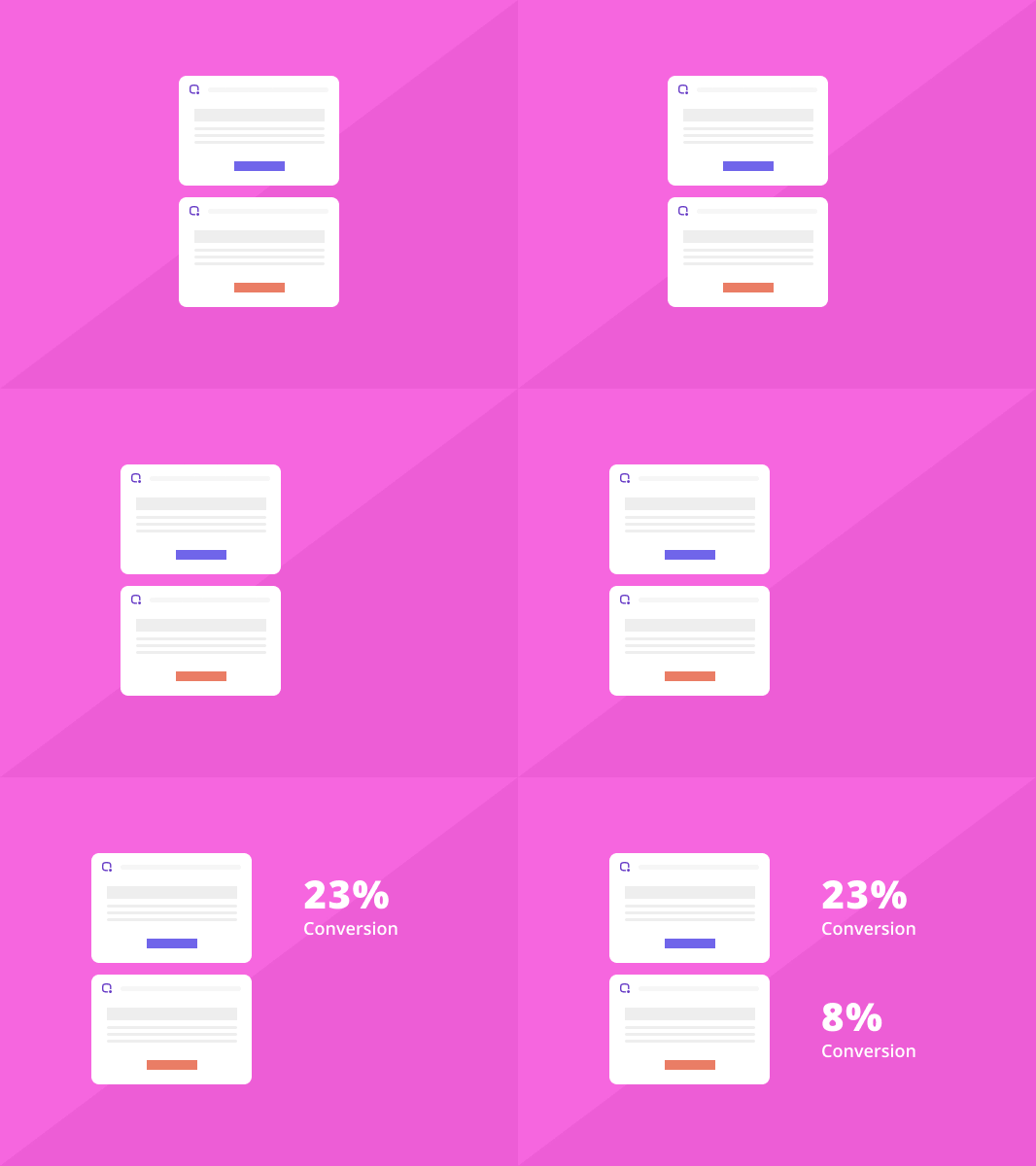
For instance, in the image below, a read call to action button performed way better than a green one by over 20% after 2000 visits.

Terms/Definitions Used In A/B Testing
The main design of an app or page is known as the “control.”
The other versions of the page are usually known as “recipes,” “challengers,” or “variations.”
The entire process of testing and determining which page model creates more conversions is known as “experiment” or “test.”
Now, conversion or performance will vary considerably depending on the type of website as well as the specific page you are performing your A/B tests.
For an e-commerce site’s home page, a conversion could be somebody placing an order.
While for a SaaS company, it would be a visitor subscribing to the service.
For lead generation sites, a conversion may be somebody filling out the contact form.
Here is an example of what A/B testing is all about:
Example 1
You have a home page that gets 200,000 visitors every month.
To ascertain if there is a way to get more conversions, you develop a different design.
Then you use a testing software like Optimizely or Picreel to divide the visitors between the control and challenger.
So 100,000 visitors are directed to the challenger and 100,000 to the control.
Then use the software to find out the winning model depending on the number of conversions.
Example 2
Your blog’s homepage gets 5,000 visitors every month.
And here, your main objective is to get visitors to subscribe to your email list.
So you create a new home page for the blog that displays the subscription button or box.
The A/B testing software then sends 2500 visitors to the main design and the remaining 2500 visitors to the new design.
The software then monitors conversions or subscribers in each case.
At its core, the technique monitors the number of people visiting each design as well as the number of conversions every design creates.
There are also some robust testing softwares that track additional data such as:
- Conversions
- Page views
- Visitors
- Revenue per visit
- Bounce rate
- Exit rate
- Revenue
- Source of traffic
- Medium of traffic
Elements to A/B Test
There are some aspects of a marketing resource that contribute more to conversions than others.
And to succeed in your strategy, only focus on the most practical aspects.
Here is a look at the most effective A/B testing elements that you should focus on:
1. CTA
A call to action button that showcases your firm’s conversion objective is very important.
To achieve this, test everything, including the CTA copy, button design, and color, to determine what works.
Try enlarging or making it blue for link color or red/ orange for an emotional response.
A good example of this idea is Flex Studios’ website.
It features scrolling images with changing the text that accompanies each picture while displaying a green CTA button with the text “Book a class.”
2. Copywriting
Should you go for a short or long copy?
The answer depends on the type of business.
Short is usually more effective for certain products, while long is critical in a decision-making process.
So do a test and see what works for your firm.
Try reordering benefits and features or making the language less or more literal.
You can also utilize BiQ’s Keyword Intelligence tool to look for the ideal keywords.
This tool will help you determine why people might be searching for a particular keyword in a search engine.
With this information, you can design your copy in a manner that meets your visitor’s needs instantly.
The image below shows a search for the keyword “inbound marketing” inside the tool.
It gives out details on related keywords, content ideas, and even trending searches around the keyword.
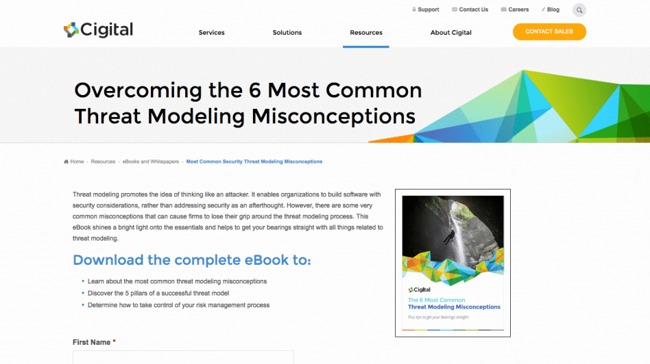
A great example is Cigital’s home page.
The headline is straightforward, and the e book’s description informs viewers of the specific value they will get by downloading it.

3. Image/Audio/Video
You certainly want to utilize videos, audio, or images that help improve your site.
So decide what to use and where to use them.
If you are not sure, run A/B tests to determine which ones will perform better.
4. Headlines and Subheads
Your headline and subheads are at the core of your value proposition.
They sum up why anybody would want to do business with your company.
There are many approaches that you can try when testing your headlines and subheads:
- Make testimonials part of the headline.
- Try shorter vs. longer headlines.
- Ask a question.
- Try different selling points.
5. Font
It is not enough to create clear CTAs like “sign up here” or “subscribe here,” you must also use a font that is pleasant and easy to read.
In a study conducted at the Yale School of Management, participants were asked to read different phone brochures.
One group read a difficult-to-read font with a distracting drop-down shadow while the other group read an easy-to-read clear font.
The groups were then asked if they would purchase the phone instantly or needed more information to decide.
Only 18 percent of the group with the easy-to-read brochure said they needed more time to decide, while a whopping 41 percent in the other group wanted to delay the purchase.
6. Link Colors
Colors affect different people differently.
For instance, what color do most people wear to funerals?
Your guess is as good as mine.
This is not to sound grim, but human beings are programmed to associate certain colors with certain events or situations.
So, test every color on the site; the menu icons, text color, and CTA buttons.
7. Landing Page
Landing pages are where visitors land on your site after clicking on an advert.
Now, specific landing pages designed for various offers are critical for offering quality experiences and driving conversions with targeted messages that match every visitor’s need.
Run A/B test on your landing pages and determine what works.
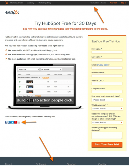
For instance, you can run a test on one model of your post-click landing page with navigation and another without.
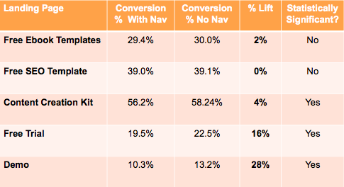
HubSpot tested this with one version that had navigation against one that didn’t.

The results?

Landing Page Optimization
A robust keyword campaign is at the core of a converting landing page.
Go for long-tail keywords that focus on the initial search intent.
Sprinkle the keywords logically and naturally throughout the content.
Keep in mind that you are writing for human beings and not bots.
Do not overuse keywords.
Google’s algorithm can easily pinpoint this, and it won’t help you rank.
Similarly, use secondary keywords to bring out what the landing page is about.
Also, consider phrases or semantic keywords that you do not want to rank for directly but support your primary keywords.
Here is a good example;
- Primary keyword = “Home appliance”
- Secondary keyword = “Home appliances,” “best home appliances,” “Tips for buying the best home appliances”
- Semantic keywords = “Microwave,” “Uses of home appliances,” “Fridge”
If you are still on the fence about what keywords to use, BiQ’s Rank Intelligence can help.
Identify what other sites are ranking for, look up organic keywords, and discover related keywords to make sure your pages are comprehensive.
Conclusion
A/B testing helps companies, teams, and even individuals make careful and meaningful adjustments to their visitor’s experience while collecting information on the outcome.
This puts them in a better position to develop hypotheses and learn more about why some aspects affect user behavior.
What’s more, A/B testing can be used continually to enhance various experiences.
For example, a B2B technology firm that wants to enhance their sales funnel quality and quantity through site landing pages can try A/B tests on various aspects of the page.
Elements such as form fields, visual imagery, headline, call to action, and the general layout of the landing page can be tested.
After testing one aspect at a time, the data collected will help the firm determine which adjustments impacted visitor behavior and which ones didn’t.
Over time, the designers can blend the impact of various winning adjustments to come up with a robust landing page that looks better than the old one and converts.
There you have it on A/B testing.
It’s one of the best ways of enhancing your site’s conversion that works.
You can’t go wrong with these steps.
Good luck!


