In this post, we have compiled a list of split testing ideas you should try out for your website.
The Best Split Testing Ideas You Need To Try In 2022
Split testing helps you generate more leads, get more traffic, and even increase revenues. In fact, it can help you maximize sales and make your marketing campaign successful.
What Is Split Testing?
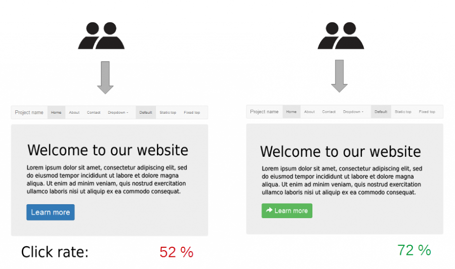
Split testing, also known as A/B testing, allows marketers to test two web page variations and compare the results.
For instance, you can split your audience and divide your variations 50/50. You can then compare the results and see what works better.
There are different split testing ideas and things you can test. Let’s look into them so you can get similar results.
18 Split Testing Ideas You Can Try
You can test almost anything – from font size to change the whole appearance. But not all of the things will bring you the same results.
So we have compiled 18 split testing ideas that you can implement today. These are the tests that have the most significant impact on your conversions. To make it easy, I’ve broken the 18 test ideas down into 7 categories:
- Landing page
- Copywriting & content
- Images & videos
- Call to action
- Website navigation
- Mobile optimization
- Email marketing
Landing Page
You only have a few seconds to capture your audience’s attention. Therefore, you must be able to optimize the key elements of your landing page to maximize conversions.
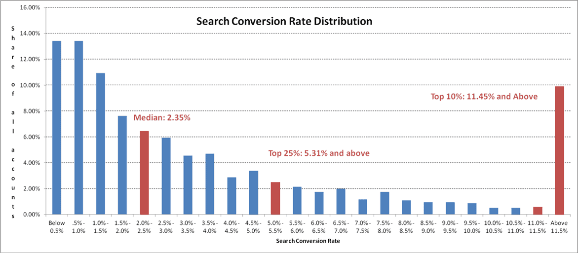
On average, landing pages have a 2.35% conversion rate. But your aim should be much higher ~ 11.4%.
That’s the conversion rate of the top 10% of landing pages.
The question is, what elements should you be testing?
All elements on your landing page are important, but a few things make a greater impact. Let’s check it out below:
1. The headline of the landing page
The headline is one of the first things your users will see once they land on your landing page. It will definitely create and shape the first impression of your brand or business. So it has to communicate credibility.
Ultimately, you want to make sure the headline is catchy and clear – the audience will know what to expect from the page. It has to capture their attention and compel them to keep reading until they see your call to action.
For example, below is an example of a split test done between a short-form and long-form sales page.
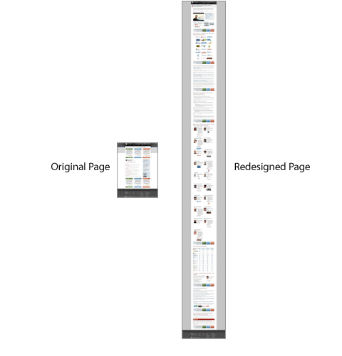
It turns out that the latter sales page generated more than $1 mil/year in new subscribers.
Experiment with words and phrases that are exciting or more targeted. A simple tweak would certainly make a big difference.
2. The Layout
The layout of a landing page is basically how arranged are the sections of the page.
Should you introduce the offer immediately or start with a story, addressing problems and providing your audience with social proof?
Which one is better, out of the different options, must not be decided by you. You must let the audience make the decision. You get to know whether your audience prefers a story or social proof, or any other layout that will work better and drive conversions with split testing.
3. Video
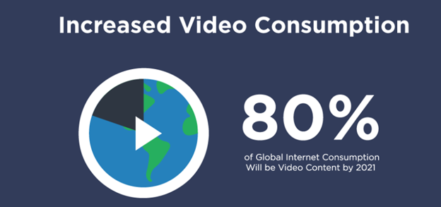
VIdeo is consumers’ favorite type of content, so use it to your advantage. Presenting your offer by a video can be a complete gamechanger to your business. It can supercharge your conversion by more than 80%.
But that doesn’t mean you need to use videos on all of your landing pages. Some landing pages may work extremely well without videos too. So try out which works best for your landing page.
4. Countdown timer
Urgency can lead to your customers rushing decisions and unplanned purchases.
That’s why you should include it in your landing page to increase conversions and sell more products. In fact, it can increase sales by 9%.

You can test different timing too. For example, restrict the timing to 48 hours, 24 hours, or 12 hours. Just keep testing. You might find that a certain countdown timer works best to encourage your website visitors to take action.
Copywriting & Content
The way you write the content plays a huge role. You must personalize it as much as possible and tailor it to your audience. We’ll take a look at the two split testing ideas to do that.
5. The Readability Level
These split testing ideas will help you to understand your audience better – test the readability level.
Maybe they want you to talk in simpler terms, but what if they don’t…
That’s why you should test different Grade levels to determine which one works better for your audience. You can easily do that with BiQ Cloud Content Intelligence.
Go to Content Intelligence and type in the URL and target keyword of the content.
You’ll get all bunch of stuff about the content, as you can see below.
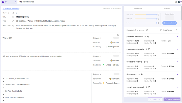
But your main focus should be on Readability in the Analysis tab.
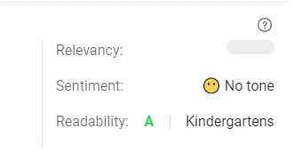
You should try changing it up a bit, increasing the sentences’ length, and choosing more technical language.
6. Headline
A headline is the most important part of any piece of content.
That’s why it’s a great split testing idea to look at the different variations of headlines and compare the results.
So, what variations of the headline should you test?
Well, there are a bunch of things you could do. But probably the best way is to test the different beginnings of the headline.
You can see the top-rate headline formulas below.
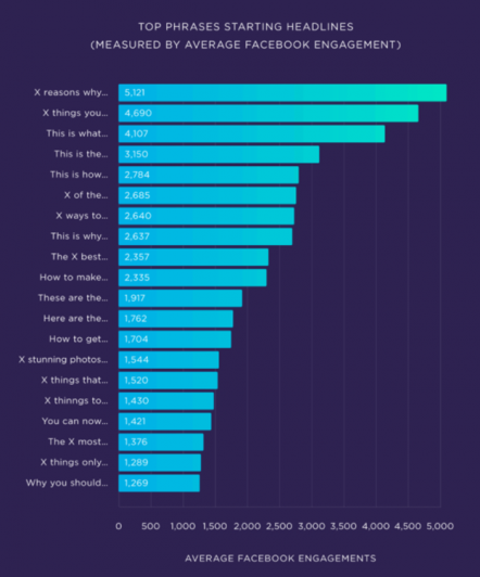
As you can see, most of these headlines include numbers in them. This is because headlines with numbers perform the best.
So be sure to include them in your next headline.
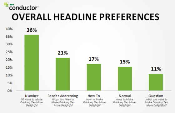
Pick a few of the headline formulas above, split test them, and choose the winning one.
Images & Videos
Visuals have a massive impact on your results.
The type of image you use or the video’s length and topic can have a lasting impact on your audience.
Let’s look at both of them closer.
7. Image Testing
Images evoke emotions.
That’s why you should test both positive and negative images and see which one of them works better for your audience.
For instance, you can be in the marketing niche. In that case, you can be showing a picture of two images—a person skyrocketing conversions or a person going bankrupt.
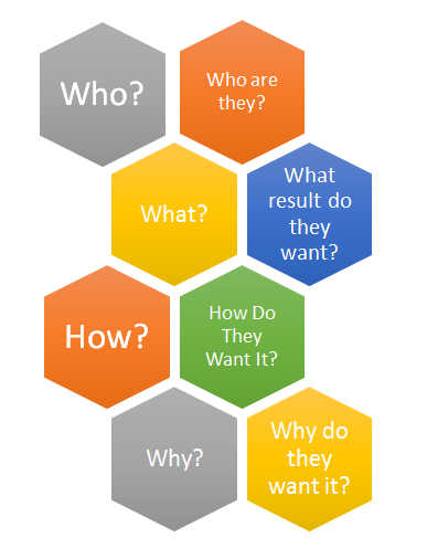
Usually, fear of failure is stronger than the joy of success. But you never know, so test it.
8. Video Testing
The second thing is video.
Unlike images, the video gives you more options to test. For instance, you can test the video’s length, title, thumbnail, etc.
Which one of the thumbnails do you think is better?
The length of the videos is important too.
You get the most engagement in the first 2 – 3 minutes of the video, then it sharply falls and keeps falling.
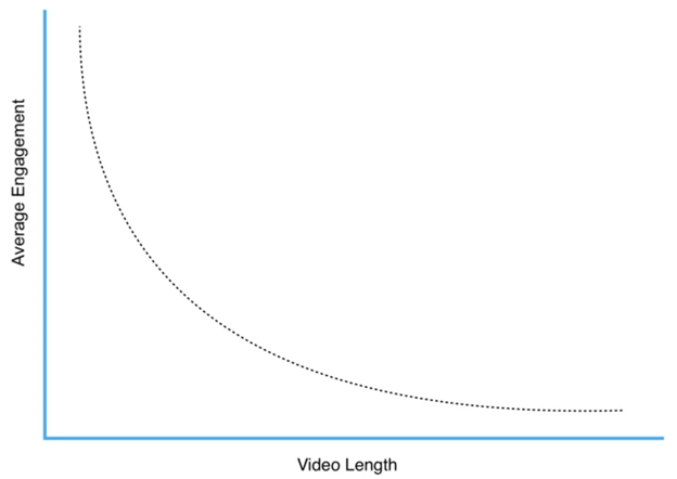
So the question is, “Should you produce longer videos or split them?”
Split testing will help you find the answer.
Call To Action
A call to action (CTA) is a marketing term for any statement designed to reach conversions. Ultimately, you want your CTA to trigger your customers’ immediate response, encourage immediate sales, or any conversion that you want.
CTA is probably the biggest game-changer in the conversions world. Just look at the stats below; a single call to action increased conversions by 1617%.
Below are some of the split testing ideas you can test with your CTA:
9. CTA That Tells Benefit
First of all, if you’re looking to make a lot of sales, you must include a benefit in your CTA. Personalize it as much as possible.
You should never write “Click Here” as your CTA. Instead, include a benefit of your product.
But a product can have more than just one benefit. That’s exactly what you should work upon. You should try including different benefits in your CTA to find out which one works the best.
10. The Color of the CTA
Red will work for one website and not another. It’s the play between colors that matters.
Let’s look at how a single change in color can make a big difference in conversion.
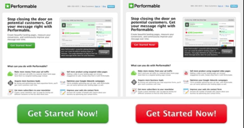
Everything is the same except for the color of the CTA.
And the results?
Performable found out that red CTAs boosted their conversion rate by 21%.
Colors are important, and you shouldn’t overlook them. They evoke different emotions, so you should use them wisely to maximize your sales and conversions. For example, blue is a color usually associated with hyperlinks. This prompts users to associate the color blue with something you can click on, making it a great choice for CTA buttons.
Make sure not to use the same CTA color buttons for non-action items. This will confuse your audience.
Website Navigation
Website navigation is one of the important parts of a website. It largely defines how the visitors will use your website.
Depending on your audience, you need to decide how convenient it is for them to choose and find a product and what they do once they reach your website.
That said, there are many different split testing ideas you can try for your website navigation. Here are some of the most common:
11. Primary & Secondary Menu
You can have multiple navigation menus at your site like below.
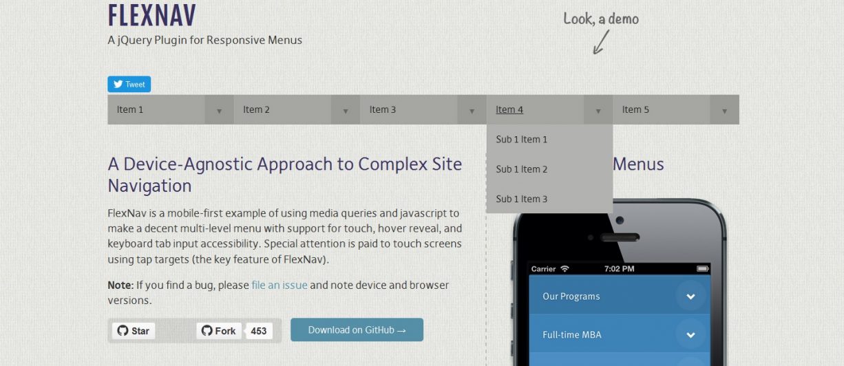
But are they really useful or not?
You can also find out whether you should remove it altogether and replace it with a drop-down menu. This would simplify your website and make the content pop out more.
But, it could also lead to chaotic site navigation. That’s why you need to test it first and then decide. It’s a good split testing idea to try.
12. Drop-Down Menu
If you have a poor navigation bar, your customers will leave immediately.
A navigation bar is a perfect split testing idea that can increase conversions. Consider the following navigation bar menu at the top.
If you look at it, it looks a lot similar to a basic navigation bar.
But what if you added a drop-down menu to each category of the navigation bar? Would it lead to more conversions or not?
As it turns out, IT WOULD.
Including top-selling products in the drop-down menu led to a 53% increase in revenues.
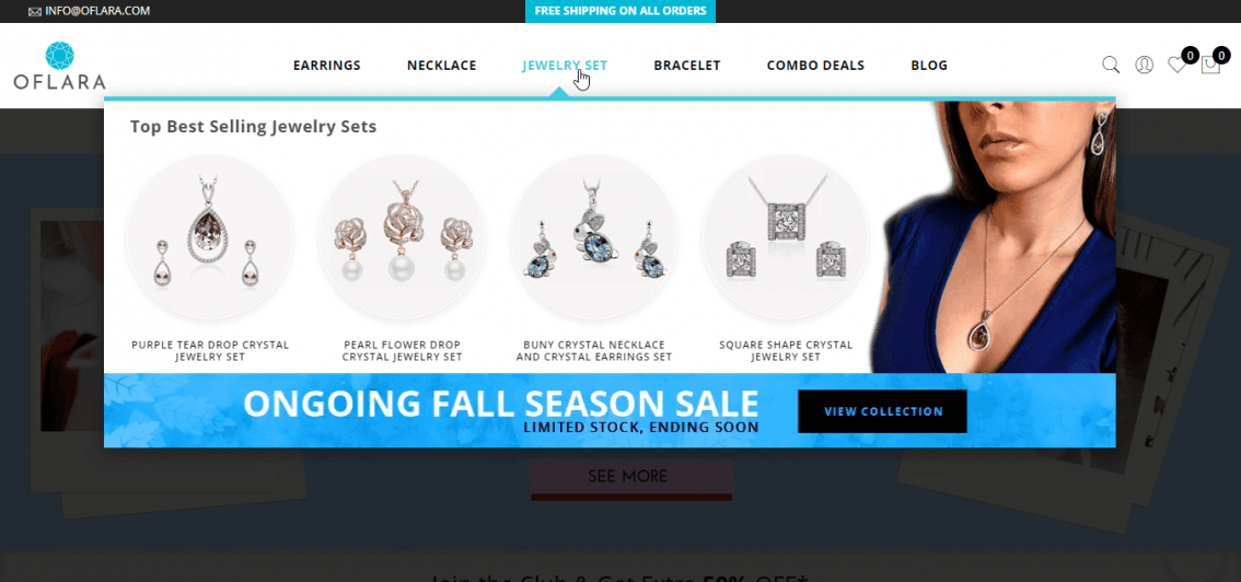
Now you don’t need to stop here.
You can also test other drop-down menus and include things such as sub-categories, best-deals, etc. The options are limitless.
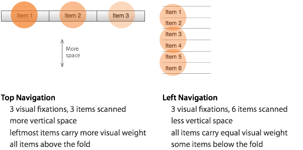
Another thing to consider is, do your site visitors prefer horizontal or vertical orientation? All these would be something that you could spit test on your website.
Mobile Optimization
Most searchers are now conducted through smartphones and tablets.
So it’s a good split testing idea to perfect your mobile site and provide a seamless user experience.
13. Test Icons vs. Text
The mobile screen is a lot smaller than on a desktop.
That’s why you should test what your audience prefers. Does your audience want more space on the screen with icons?
Or rather, they prefer a more detailed description with text?
Split test it and find out what works best for you. It’ll help you determine what your audience likes, improve user experience and increase conversions.
14. Buttons, Blocks & Hamburgers
You must split test everything, especially on mobile. You don’t have the luxury of space as on a desktop, so everything matters.
Split test the color and size of the buttons. Choose different fonts and font sizes in blocks and find out the winning strategy.
You might not realize it, but as a small difference as the edges of a hamburger menu matter. So be sure to test everything.
The difference between the three?
One outperformed the others in CTR by over 13%. Find out which one it was on your site by split testing all three of them.
Email Marketing
Email marketing can be huge if you can do it right. It has the highest return on investment out of all marketing channels—a whopping 4000%.
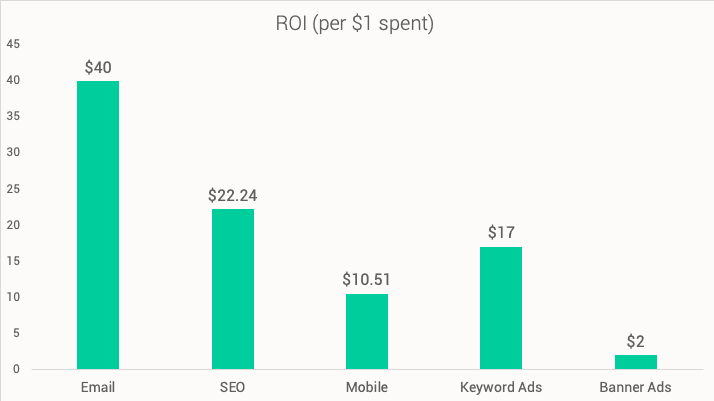
Let’s now look at the most important elements of email marketing you should split test.
15. Delivery Time
If you are sending to the right person but you may fail to get your audience to take action at the wrong time. So, it’s important to test the best timing to send out your email.
You can see the best times to send emails to subscribers below.
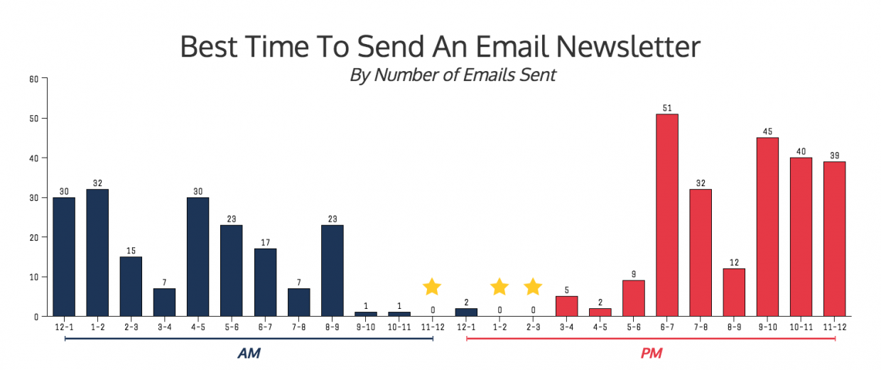
But, this may not apply to your email list. Do not blindly follow the best time and day to send an email based on what others have done. Your email list may have different preferences than theirs. So, it is always better to test than follow.
That’s why it’s a good split testing idea to test different sending email times to find the one with the highest open rate and conversions.
16. Subject Line
The subject line is something like a headline of your content. It’s the first touchpoint that determines if your subscriber wants to open your email.
That said, your email subject line could make or break the success of your email marketing campaigns.
Depending on your audiences, some may prefer longer, more descriptive subject lines. What if you include numbers, the name of the subscriber, or a benefit?
Send out a few emails with the same content but different subject lines and see which one gets opened and performs better.
17. Call To Action
As you may have noticed, there are different calls to action you can use in your email. It could be a hyperlink, image, or button. Or you may also use them all at the same time.
Other than that, you could also try placing the CTA either above or below your message.
18. Email Length
According to research, the ideal length for an email is between 50 – 124 words.
While the sweet spot for email length is under 125 words, that doesn’t mean it will work for you too. This is where split testing will work wonders for you.
Go ahead and cover everything you need to deliver to your audience and test the email range that gives you the best opens and engagement rate.
Now when it comes to testing your email marketing, always start with the big stuff first. Start by split testing your subject or timing first.
Which Split Testing Idea Will You Try First?
Now those are the split testing ideas you can test yourself. Pick any one of the split testing ideas to work and discover what works best for you.
Once you are done with achieving certain goals, move on to another split testing. It will help you constantly evolve with the shifting trends to stay on top of the industry.
Now is your turn. Which split testing idea will start working on next? Or did I forget to mention your favorite split testing idea?
Either way, feel free to let me know in the comments below.


