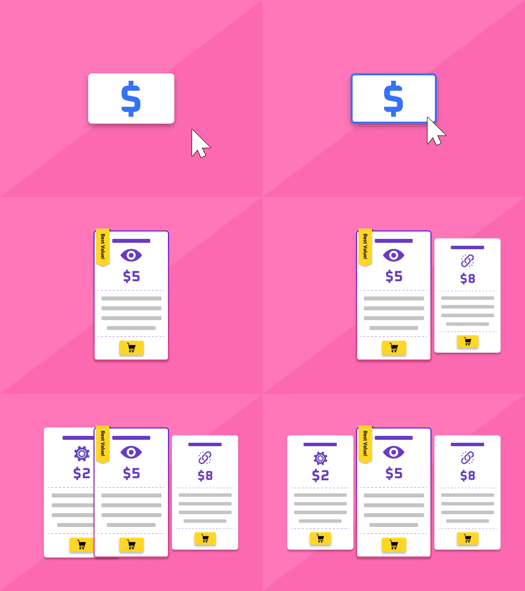
Just like your SEO content, pricing pages need to have optimization done too. Here are 13 pricing page best practices you can consider using on your website today.
The only pricing page best practices article you’ll need.
Let’s face it, creating an effective pricing page for your website that lists different pricing options available to customers is what determines whether you make a sale or not.
A pricing page is basically the landing page with all your product/service features, benefits, and of course, the prices of each tier available. As such, it’s perhaps the most important page of any website looking to make sales and win conversions.
In other words;
“Without a well-designed pricing page, you will find yourself losing potential revenue and conversions.”
While many companies are already accustomed to listing their product/service pricing on their websites, this post will focus specifically on pricing pages.
Often, the pricing page is the last page users see before deciding whether they’re going to buy from you or not. Therefore, getting it done right the first time should be your top priority, as it will mean more conversions in your sales funnel.
The pricing page examples and strategies in this post will mostly revolve around BiQ’s very own practices. We’ve experimented with these strategies and consider them the pricing page best practices that get results.
BiQ has experimented with these results pricing page techniques and tested them through the years. Try them out and marvel at the effectiveness of these pricing page optimization tactics:
Pricing Page Best Practices
Focusing on simplicity and less information usually works better if you want to create a successful pricing page. As you will deduce from the context below, our pricing page examples all follow simple practices that you can use to make your own pricing page designs more effective.
Here’s a more comprehensive guide, along with examples, of some of the most effective pricing page best practices:
1. List Your Plan Options
Many businesses provide different service tiers, each offering different features. However, when each service tier offers several different functionalities, it can be difficult to intuitively layout this information.
But it isn’t impossible. You can always list what comes in your basic packages, but instead of repeating everything through to your premium packages, you could say something like, “everything in basic and more.”
Doing this will save you space and give your package some air of exclusivity. You will also have more room to provide details of what other tier plans offer.
2. Use Clean Designs
As with all things marketing, your pricing page must also have a clean design that customers can easily read and understand. You don’t want to make your customers scroll endlessly before they can reach your pricing details.
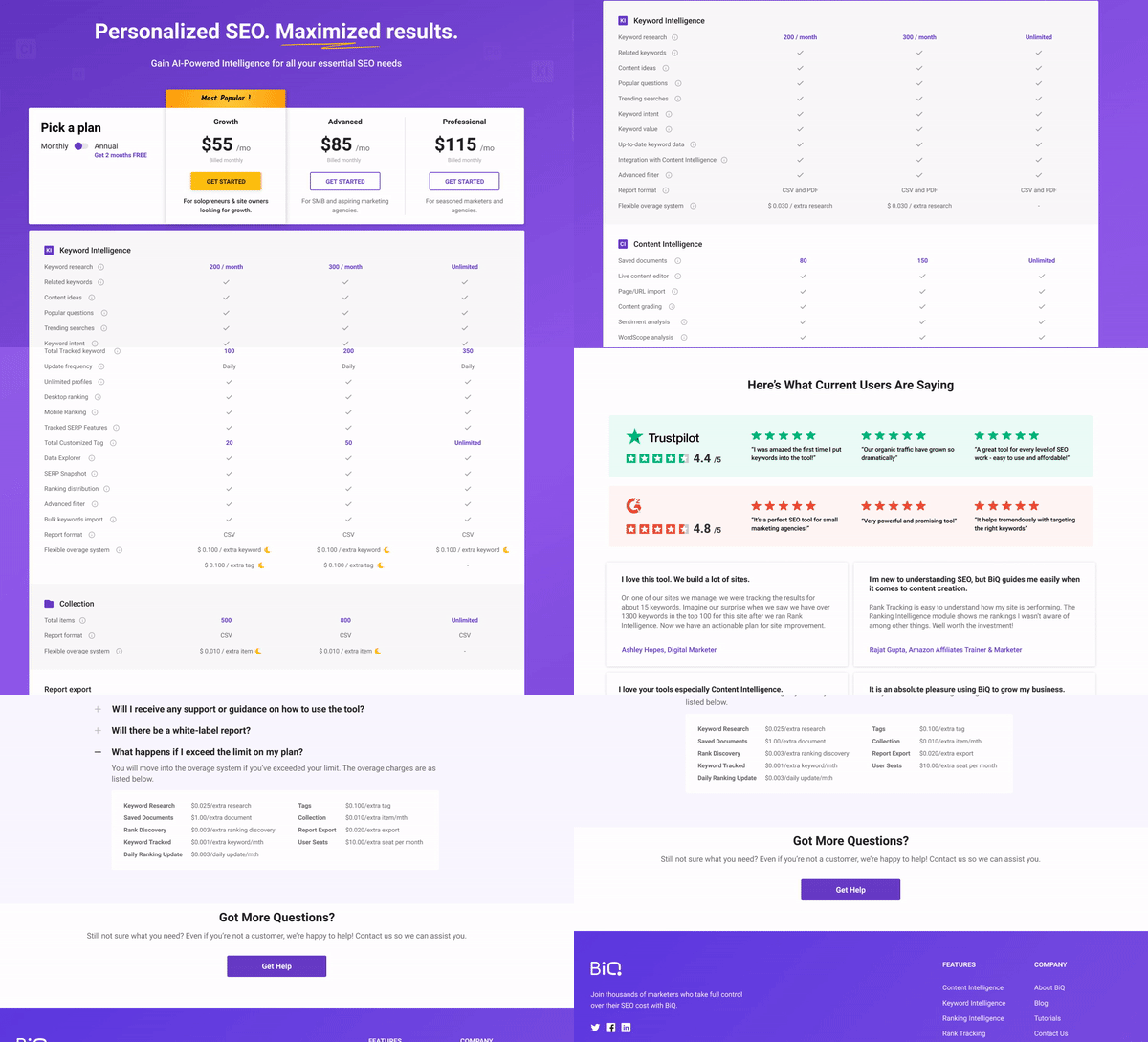
Your pricing options must also be clearly presented. You can even use a table or bullet points to lay them out to your visitors. The key here is not to overwhelm your readers.
Finally, it’s always good practice to try and keep your pricing options to a minimum. The most pricing tiers you should have is four, depending on your products or services. The more pricing tiers you add, the more complex you’ll be making your pricing page, making it harder for potential buyers to determine the best plan for them.
If you have a complex pricing plan that buyers won’t easily understand, then they will be more inclined not to make a transaction.
Ideally, you always want to make your pricing page simple enough that your prospects can easily understand its contents. You never want anything else to grab your prospect’s attention but your price and what users will get out of the CTA.
3. Have a Simple Header Copy
Basically, the header copy is meant to have just enough information that will likely convert the user without getting in their way. Here, your primary goal is to be as concise and straightforward with your words as possible.

You may provide quick bulleted points about your product or service features to grab your prospects’ attention while on your pricing page. Some businesses have adopted the idea of using a simple header copy that aligns perfectly with their branding, which is also very effective.
4. Highlight a Value Before Purchasing
Another pricing page optimization practice you may do best is to show your buyers what they stand to gain from buying your products/services. It’s important that your buyers also understand how your products/services work and how they can benefit from using them in their homes or businesses.
Highlighting your products’ or services’ value in your pricing pages is an effective way of encouraging your prospects to buy from you. If designed well, the pricing page can offer you a competitive edge and provide you with an opportunity to highlight features that differentiate you from your competition.
Most prospects that get to your pricing page are always out for value. Potential buyers already have perceived value in mind. Your work is to make the value of each product plan clear enough for them. Do this right, and your products/services will sell like hotcakes.
As a result, every word on your pricing page must work toward enhancing the importance of your product/service. That’s to say that your pricing page copy and price list must emphasize the results they deliver.
5. Add Features Available at Each Price Plan
Customers will always want some basic understanding of what your product/service is about without buying it.
What is the purpose of the tool you’re selling?
The pricing page is the perfect place to remind your prospects of the specific features your product/service offers and the benefits it provides. You can even throw in a free or trial plan for potential buyers to test what they’re about to buy.
Generally, it’s always best to include five or more high-quality features that your prospects can use in their decision-making process.
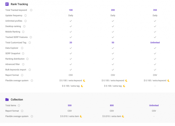
Remember to always add a list of your product’s features for each plan on your pricing page.
BiQ’s Content Intelligence provides users with critical information regarding the best content-driven strategies to use that are SEO-friendly and focus on boosting your prospect’s engagement. The tool avails marketers real-time information regarding their content grade and how relevant they are to your audience.
Additionally, BiQ’s Rank Tracking feature makes it easier for marketers to track their pricing pages to determine which pricing page strategies are the most effective and why. With Rank Tracking, you will be better placed to track and analyze all your pricing pages and emulate the best pricing pages in your other pages in the best way possible.
As with other forms of writing, it’s important that you understand your pricing pages’ results and how your audience engages with them.
6. Highlight the Plan You Want People to Buy

As a marketer, you should know better than anyone else which product/service options will fit most customers’ needs. With this information, it’s always best to reduce the confusion buyers may face by highlighting the plan you think most prospects will consider a good fit.
Remember, it doesn’t have to be your most expensive plan. Instead, the price plan should be based on evidence that most customers will actually derive value from. As a result, there should be some form of proof highlighting which plan works best to reduce buyer confusion and pricing page confusion.
7. Maintain Your Brand Personality in the Pricing Plans
Your pricing page is probably the most important page in your product marketing campaign, making it a great place to make your flag fly high. Therefore, you shouldn’t be afraid of sprinkling a little brand personality in there.
The fact that your potential buyers have reached this stage in your sales process means that they trust your brand and want to transact with it. In this case, an incongruous pricing page is the last thing you need.

Therefore, if possible, try to maintain your color schemes on this page as the rest of your website. You can also show some personality via creative tier names. You’re not restricted to the “Basic,” “Standard,” or “Premium” tier names. You can decide to use memorable names that have more stick potential in your customers’ impressions.
8. Use Social Proof
By now, you may have seen some form of resemblance between the tactics used to enhance your pricing page and your landing page. Well, providing social proof is another significant motivator that will push your buyers towards buying your products/services further.
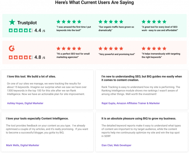
Using social proof on your pricing page is another critical thread that will help you build trust and pull your buyers closer to making sales.
Did you know that over 88% of consumers trust social media and other online reviews as much as personal recommendations?
Including things like reviews, testimonials, and other social proof methods is like having a friend or family member whisper to your prospects something like this, “Oh, yes, this is exactly what you’re looking for. Go for it!”
That’s precisely what every business that’s looking to make a sale needs.
9. Emphasize Discounts
Everybody likes discounts! It’s just something hardwired to our brains. In today’s digital world, companies that scale the fastest are the ones that always gain the spoils. Therefore, you always want as many prospects to pay upfront for your products/services as possible.
By highlighting your savings of annual product or service options, you can nudge your buyers toward making that choice right there and then.
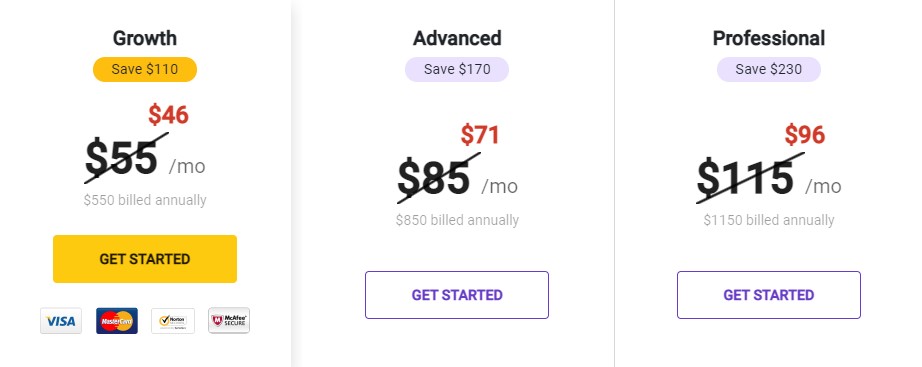
Most pricing page examples will show you the exact percentage you’ll be getting off the original price. Basically, it will be screaming, “it’s cheaper. Get it now!”
10. Support the Live Sale with a Chat

A live chat feature is another great complement to consider having in your product pricing section. With a live chat, your prospects can instantly reach and contact you, a real human, for more information about your pricing options.
You don’t want to risk using chatbots in this section. Remember, this is the point where you fence your buyer’s decision-making process. Therefore, it would help a lot if your prospects had a real human typing on your side of the screen. You can even have a picture of a real person on your live chat screen to reinforce your legitimacy.
11. Offer a Money-Back Guarantee

For a long time, trust has been a friction point known to prevent prospective clients from purchasing products or services. This type of doubt is often referred to as fears, uncertainties, and doubts (FUD). It’s often expressed in questions like:
- Can I trust this brand to deliver on its promises?
- What if I don’t like it?
- What if it doesn’t suit my purposes?
- Can I trust that my transactions will be secure?
- What if I cannot master its use?
- What if I pick the wrong pricing plan?
Such questions can generate FUD in your prospects and likely lose you a sale. However, you can alleviate such fears by offering your prospects a free trial or a money-back guarantee. These types of offers will make your customers feel like their risks are significantly reduced, allowing their actions to follow suit.
12. Make the CTA Prominent
Your CTA is another crucial metric to the success of a good pricing page. The CTA must stand out from the rest of the page and clearly convey what action you want from your visitors. The price and other features shouldn’t block it.
Also, the wording in your CTA matters a lot. A study by HubSpot found that using words like “submit” negatively affected conversion rates.

You can make your CTA actionable, specific, and prominent. A good CTA will always start with a verb and informs the reader what they will get by taking a specific action.
13. Always Test!
The final yet most important pricing page optimization lies in testing it out. Testing also plays an essential role in ensuring you have an effective and working pricing page that contributes towards a sale. You can only make the right decisions if you have the right data to work with and not guesswork.
As a result, it’s an integral component to have as your pricing page best practices. You always want to test your layout, copy, headline, pricing, CTA – everything you can test. Testing continuously is the only way you’ll know what’s working and what’s not on your pricing page.
Here’s where BiQ’s Rank Tracking features play a prominent role in this. When used appropriately, it’s easy to track and fill in missing data or time lag you would otherwise not know about.
Conclusion
As it turns out, although most pricing pages have some or all of the components mentioned above, they don’t always correlate. Every business is different, and the same can be said for their pricing pages’ best practices.
Your main focus should be on presenting your prospects with your pricing information in the simplest way possible, from the most expensive to the least, and a recommended option to prevent decision fatigue.
Hopefully, you’ve gained a tip or two from this excerpt. Keep in mind that it takes more than one try to perfect your pricing page results. And BiQ Cloud is the best tool to help you get there. So, keep working on your pricing page optimization!


