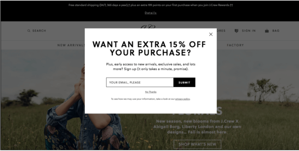
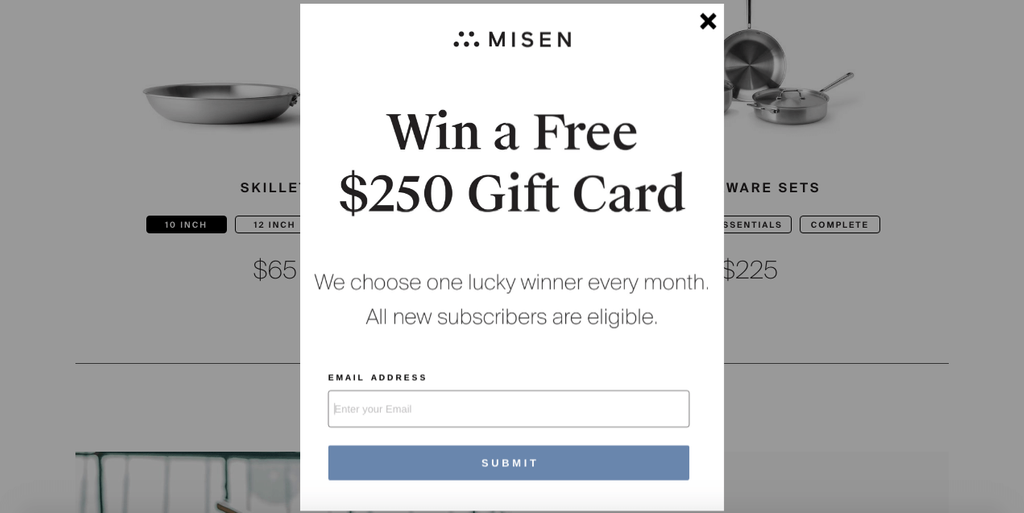
If you do not have exit intent popups on your website, you should do it immediately. They are your last chance to capture leads so here are 12 ways to do it effectively.
Have you implemented exit intent popups on your website?
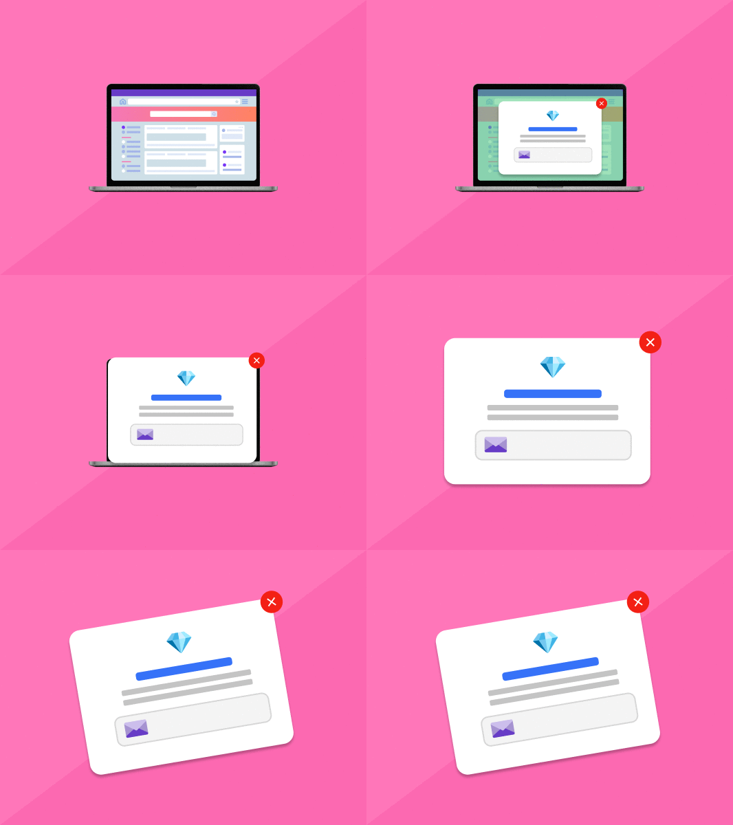
Exit intent popups, also referred to as the exit pops or on-exit overlays, appear on the visitor’s screen when they attempt to leave a site. Pop-up’s primary purpose is to influence people to stay longer on a page and probably make a sale.
The on-exit overlays may differ depending on the page the users are viewing. For instance, for a new visitor, the pop-up may include a registration form. While for a regular user, it may offer a discount when selecting items on the shopping cart.
According to a True North report in August 2020, companies that use exit intent popups improve their conversion rates by around 5 to 10%. When an organization manages to catch the user’s attention with enticing offers, the chances of returning to the sight are much higher.
The actual timing of pop up as they exit the site influences their final decision. If captivating enough, it may persuade prospects to buy or share contacts for future follow-ups. Join me as we discuss three incredible ways why exit intents are essential for your business.
Why Are Exit Intent Popups So Important?
1. A Second Chance to Convert with Exit Intent Popups
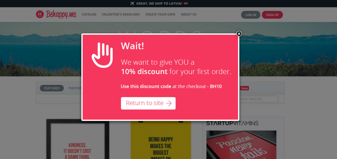
Credible exit-intent popups convince prospects to stay a bit longer on your site. Depending on your settings, the visitors may either end up signing up or making an order. Additionally, they give a company another chance to pursue fleeing clients.
Customers opt to move to a competitor if they receive dissatisfying results. For these kinds of customers, you have to work extra hard to convince them not to leave. Start by emphasizing the initial message.
Reinstate it and make valid reasons why your brand is better than others. You can opt for a different approach with a new choice of words for more appeal. The primary purpose of this second attempt is to get more contacts for your database and increase leads.
2. Use Exit Intent Popups To Engage Customers with Offers
Strive to entice your clients with compelling and educative various exit popup examples and redirect them to your products. You can create something like this. “Oh, sorry to see you leaving, but before you do, maybe you’d like to hear about our 30% discount on product XYZ”.
This is an incredible way to lure back your customers. In the process, they may view the XYZ offer and also check other products on your site. For better results, ensure to provide in-depth information on related products or services.
3. Build your Subscriber List with Exit Intent Popups
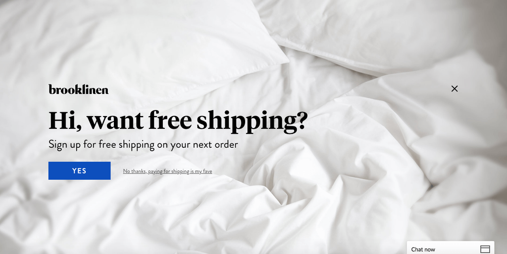
There are various ways on how to get more subscribers with your popups. You can include a courteous scroll box that guides the reader through the page or insert a data-driven attractive banner on the page.
Note that your content convinces your reader to leave or to subscribe. If you are not making many leads, ensure to activate more exit popup examples at the bottom of your page.
This comes as a call of action after your prospects read your content. Remember that frequent exit popups may get annoying to subscribed and repeat customers. Avert that by using JavaScript to protect them from getting a reminder up every time they exit your page.
12 Incredible Ways On How To Create Exit Intent Popups That Converts
1. Write an Exceptional Headline
One of the essential things that a headline should include is a winning call to action. Use CTA terms like ‘find out,’ ‘read more,’ or ‘buy now’ to persuade your readers to find more about your brand.
BiQ Keyword Intelligence has played a fundamental role in enhancing business traffic and conversions. The main advantage is that it sets up your SEO optimization objectives and gives solutions to achieve them.
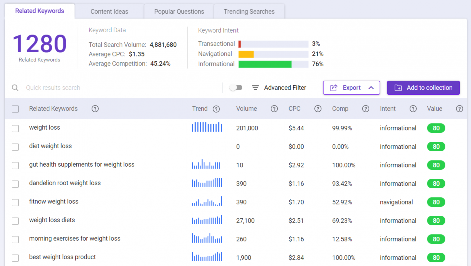
As an advanced SEO suite, the platform searches keywords monitors competitors’ strategies, and performs an SEO audit for your site. This approach is beneficial to freelancers and small to medium-sized organizations.
When a company uses BiQ Keyword Intelligence for their exit intent popups, they receive a calculated keyword search.
Additionally, it makes it easier for businesses by giving them the very best keywords to stand out in the market.
2. Make a Standout Copy
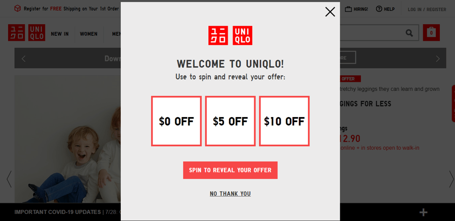
Most companies are now implementing intelligent content strategies and embracing advanced technology to reach the right market. Content writing has made great strides with these innovations.
If written well, they make lasting impressions and increase leads.
Keep in mind that your content should convey a message, entertain, give solutions, and convert a reader to a client. The first trick is to make it less complicated for your audience. Get one reliable person to develop the company’s content to prevent muddling up of ideas on your site.
Most importantly, do not forget to write and optimize your copy for SEO. You may
Always ensure that you edit and proofread your work before posting. From this approach, a company understands more about the client’s behaviors and intentions. Also, they easily pinpoint the prospects and threats in their content making.
3. Focus on the CTA
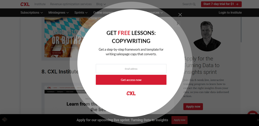
Your business requires an outstanding call-to-action that highlights the benefit of taking measures. The CTA should be convincing and straight to the point. Companies offer a discount, an exclusive upgrade, or free service to capture the audience’s attention. Please focus on the offering and make it as simple as possible.
If you notice a higher conversion with free coupons, concentrate on that CTA before jumping into another. Whatever benefit you offer your clients, ensure to use strong CTA phrases and words. For example, “Your time is running out! Grab a three free months subscription before the year ends!
Always ensure that your exit intent popup gives your visitors a chance to save some money. The bottom line is to create some sense of urgency in your audience and coerce them to think twice before leaving your site.
4. Eye Catchy Design

When it comes to conversion rates, visual content plays a significant role. Based on a Bandwagon Creative report, visual content increases conversion rates in businesses up to seven times. There are several ways you can add visuals to motivate your visitors to convert.
First, your catchy design should direct your visitors to your site’s specific locations, like the CTA or the core message. There is an excellent benefit of using people’s imagery whenever applicable. Not only do they help to build trust, but they add some human touch to your site as well.
Bear in mind that human beings connect to real faces relevant to what you are offering. For instance, if you want to introduce a toothpaste brand, get an appealing model with a stunningly bright smile. That way, it gets easier to convince your audience of the advantage of using your product.
5. Make Use of Social Proof

This is a psychological effect that dictates that human beings engage more in action if others do it. For instance, you may create a testimonial with a famous person speaking about the benefit of using your products. That way, it may influence your audience to dig deeper into your pages to get more information about your brand.
This strategy reassures your shoppers about the importance of using your products and guarantees quality. Thus, it may build trust and enhance your market presence. Some of the popular ways of creating social proofs include reviews, comments, corner and engagement spots like retweets or Facebook fan pages.
6. Add Urgency

Creating a sense of urgency is a popular strategy used by marketers to sway the audience to their brand. This makes your visitors feel like they will miss out if they do work fast to your CTA. The best way to practice this with an exit intent popup is to make it time-sensitive. For instance, you can say, “Grab your 20% off coupon! Offer valid until the end of the week,”
Another practical approach is to state the number of offers available. “Only ten pieces left. Grab yours now!” Remember that your popup has to be real with no devious intentions. Your number count of offers needs to be genuine and not a ploy to get people’s attention.
Your visitors may not fall for it if the offer is not alluring enough despite your urgent persuasion. To catch their attention, you need to combine it with a persuasive pitch. A captivating approach takes two angles.
First, you need to create a feeling of desire by adding urgency to your popups. Then, couple it with a shove (convincing pitch) that pushes your audience to respond to your content real fast.
7. Split Test Often

Testing whether a strategy works in your website is one of the vital elements in marketing. Start by installing simple tracking codes to your pages. In the end, the process loads many versions of the same page for different visitors to your site. This helps an organization to determine what strategy works better than others.
For instance, on page A, you may post a benefits guide headline, “Get longer and silky hair within 30 days”. On page B, you can come up with a curiosity-filled headline. “The ultimate solution to brittle hair lies here. Click to find out how”.
From these split tests, an organization may recognize which has a positive impact on directing visitors to the main page. That way, you can change some elements on your page according to what your audience wants.
8. Interactive Experience
Like the name dictates, this approach encourages readers to engage with your content. There are various ways to connect with your visitors, like videos, interactive infographics, assessments, calculators, and many others.
Studies state that consumers share visual content more than 40 times compared to plain ones. This enhances the conversion rate by up to 86%. There is a notion that most visitors to your site may watch a video but fail to go through the content. Interactivity may not only augment conversions but pushes people to share engaging content.
With business competition becoming fiercer, companies need to find strategies that stand out. Most brands create an interactive experience as a lead magnet to garner contacts. As a result, this is a plus to any business.
9. Create Content Targeted to the Right Audience at the Perfect Time

Creating exit intent popups is never enough if they fail to reach the right audience and at an accurate time. Exit intent targeting pushes your content to the right audience. Also, it satisfies your customer’s specific needs. Other benefits include educating the audience, creating a brand, enticing a sales process, or establishing reliability.
The main concern is to ensure that your content has the right keywords to attract potential clients. Do not forget to work on your content tone and approach to capture the attention of readers. Additionally, ensure that you understand what your clients need and give them solutions that gratify it.
10. Make use of Numbers
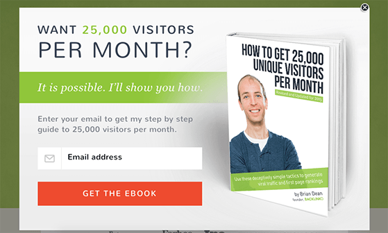
Numbers work magic if you want your audience to pay attention to your content. Once you include them in the exit popup, you instantly grab the reader’s interest. According to experts, numbers in figures (2) work better than those spelled out (two). For instance: “5 ways to use our peanut butter in your kitchen”. Comparable to this: “How to use our peanut butter in your kitchen.”
Based on these examples, more audiences may likely peruse the content on the first one. With busy lifestyles, people do not have all the time to read lengthy content. If you provide them with numbered guidelines, they may manage to scan through quickly what they need.
Numbers manage to generate more traffic because they promise a specific benefit. They also provide an easier read and clear organization of your work.
11. Follow the Arrow
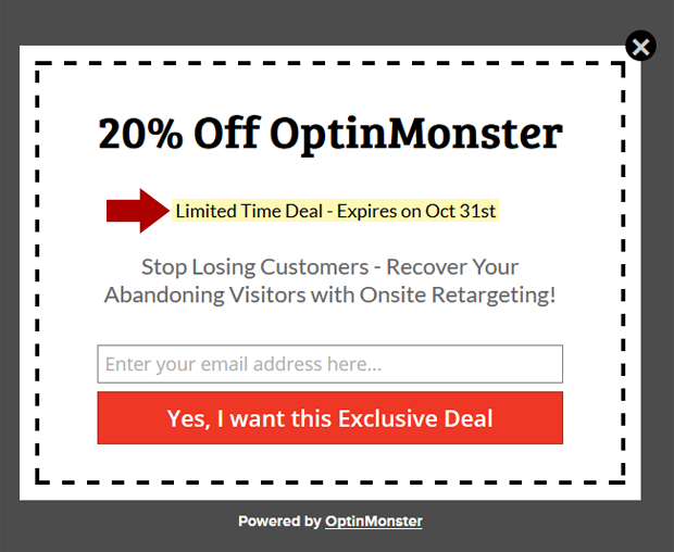
Arrows play an invaluable tool in helping the audience navigate web pages. A well-placed arrow should give CTA’s buttons higher visibility, prioritize information, offer directional cues, and guide your visitors to specific elements.
They should also arouse the visitor’s curiosity and convey a nonverbal message such as, “Click Me Now!!” Given that arrows make CTA buttons more visible, they also enhance the chances of getting them clicked.
Additionally, they have a significant effect on guiding visitors to lead generation sites or forms with your site.
12. Compelling and Interesting Offer
An offer persuades shoppers to make a last-minute buy. Sometimes, the reader may not be in a position to buy on that particular day. However, when they leave their contacts behind, you may pursue them for a future sale.
In your content, ensure that your discounts and offers are precise and persuasive. An image of the product on offer works best in convincing your audience to try it out. Do not forget to mention the benefits and how they would save if they take the offer.
Instead of using the standard terms, ‘Subscribe Now,’ you can use a more convincing approach such as “Get Your Coupons Now.” Always include the fine details about the discount and offers somewhere on your exit popup examples.
Conclusion
Exit intent popups indicate that your website visitor wants to abandon your page without making a conversion. Before they exit, it is your liability as an entrepreneur to divert their mind.
Start by providing your clients with quick, reliable, and personalized solutions. Then, incorporate it with an interactive experience, discounts, social proofs, and other catchy offers.


