Looking for ways on how to create a landing page that optimize conversion? Here is a 10-step checklist that will guide you through the full process from creation to tracking and improving.
It’s the reality. Every company needs to sell and make a profit in order to stay in business.
And yet, this part of the process is often overlooked and many websites and marketers are only focused on boosting their site traffic and visibility.
While that is important, at the same time, you must be also working on the process of converting prospects to customers and getting them to stick with the company.
We must realize that an essential part of generating revenue is conversion, and for that, you need to make sure you have an optimized landing page.
Before that, let’s get a good glimpse and understand what a landing page is and learn how to create a landing page that is capable of converting your prospects and getting them hooked for the long haul.
What is a landing page?
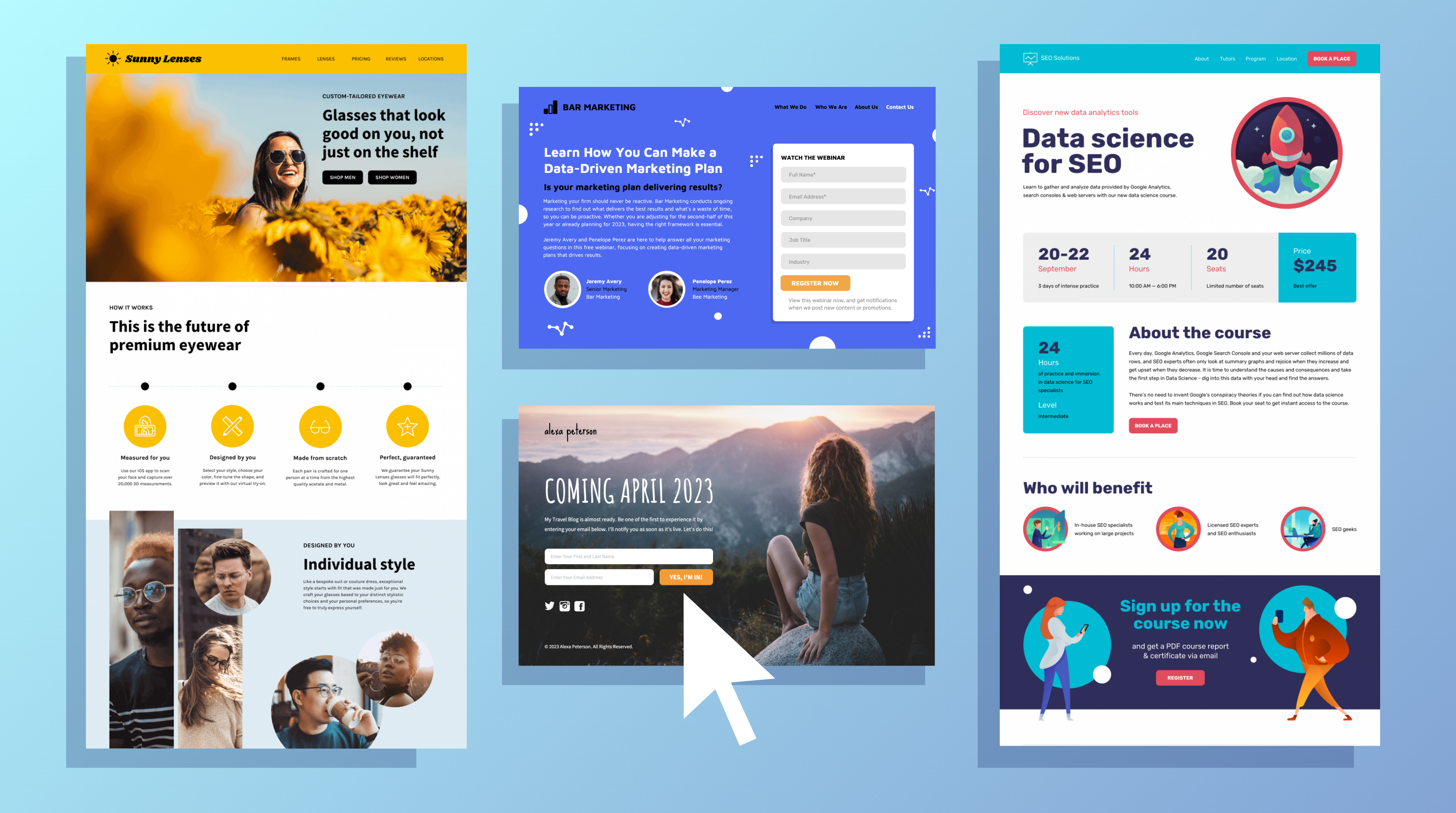
A landing page is a special page on your website that is built and optimized for the main purpose of generating leads or converting your prospects to customers.
It is often the page that a site visitor lands on after clicking a Google text ad, banner, or display ad.
Your business landing page is a crucial part of your digital marketing efforts, and its work is to create a quality experience for site visitors.
Most site owners create specific landing pages tailored to different site visitors and this technique helps in driving conversions with targeted messaging that matches each end user’s needs.
So, instead of directing your organic and PPC traffic to your homepage, you’ll be pointing them to specific landing pages.
However, before we look at how to build a landing page, let me share with you the benefits of creating one to further drive your motivation.
Why do you need a landing page?
A landing page is an essential piece of your marketing and sales strategies. It helps your business increase the conversation rates while cutting down the cost of acquiring new leads.
It’s worth noting that a landing page should serve only one purpose – conversion. That means you should avoid any form of disruption, such as navigation bars or irrelevant content, or media.
Research shows that removing the top navigation bar on a landing page can increase conversions by 100% and that’s what so special about your landing page in that it is solely created for conversion.
1. Captures high-quality leads.
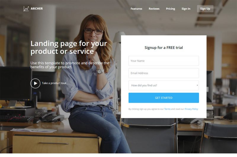
With a landing page, you are more likely to capture not just leads but high-quality leads. Unlike other lead capturing techniques, a landing page gives you prospects who clicked on your ad, meaning they are interested in your product or service.
A well-optimized, highly-responsive landing page gives those leads a chance to understand your business better and whether your value proposition meets their expectations.
With proper finesse, you can convert your leads right off the bat. However, this will require that you understand how to create a landing page coupled with offers your site visitors won’t resist.
A lead capturing landing page should showcase all the essential details about your product or service without making your prospects look for further information elsewhere.
2. Sales conversion

In some sense, your prospects don’t wish to be closed. Or simply put, they don’t want adverts and emails asking them to buy random products or services.
With landing pages, it will only be accessed by people who are interested in your offer. After all, it’s them who express interest first clicking on a CTA or display somewhere on the internet, and they would land on a page that’s been customized for their needs.
This makes landing pages one of the most effective kinds of advertisement with the best possible ROI.
3. Rank higher locally
Landing pages are often created to target a specific set of keywords or search terms. You can then capitalize on these keywords to boost your organic search ranking.
This means that people searching for similar topics will quickly see your business and click on the links on your site, directing them to your landing page – this becomes a win-win situation.
To achieve this, you should learn how to create a landing page that’s optimized for search.
You can start by optimizing the site design for local SEO and making sure the page is highly responsive.
4. Offers better user experience
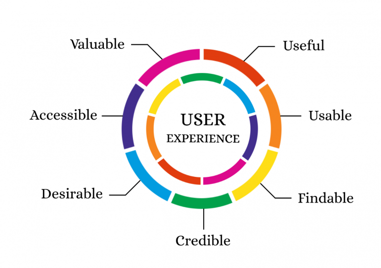
A well-designed landing page that meets the prospects’ expectations boosts conversion and guarantees a better user experience.
If, for example, the landing page is customized to the users’ needs and the prospects had an easy time reaching out to you, they won’t have to continue searching for a solution to their problem elsewhere; instead, they will put their faith in your site.
Such kind of personalized services build credibility and ensures a strong relationship based on trust. Through word of mouth, your customers will refer your business to their peers, citing your quality products and services.
How to create a highly effective landing page
According to Unbounce, the average conversion rate on landing pages across all industries is 9.70%, and HubSpot estimates that a highly optimized landing page covert at 30% or higher.
Before you can create landing pages for your business, you should know what you want to achieve with each landing page.
There are two types of landing pages:
- A reference landing page: This provides attractive information to the site visitor or an overview of the product or service.
- A transactional landing page: This landing page persuades the site visitors to purchase or leave their contact information on the site.
The type of landing page you should create will depend on your marketing and sales goals and the stage your prospects are in the buyer’s journey.
Once you’ve understood all these, you can equip yourself on how to create a landing page for your online store, service business, etc.
That said, below are the ten crucial tips on how to create a landing page that your site visitors can’t resist.
1. Know your buyer persona
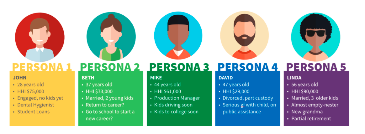
A key to success when creating a landing page is to understand the person you want to target. This will help you know their pain points, fears, interests, and even what they value most about a product or service.
To define your buyer persona, you need to know some characteristics of your ideal target, such as the level of education, personality, habits, age, career, budget, etc. This information will guide the design of your landing page so you can specifically target their needs.
Once you have defined your ideal target audience using all the attributes you can think of, the landing page creation process shouldn’t be as complicated.
2. Define your goal
When creating a landing page, your Call-to-Action is a representation of your goal. A rule of thumb is to have several landing pages for the same product or service you are selling.
The reason being, people will buy your product or subscribe to your service for different reasons, and all these reasons should be captured in the messaging within your landing page.
And since you can’t stuff all that into one landing page, you need to create multiple landing pages that speak to a specific set of the target audience or buying personas.
In fact, HubSpot reports that companies that utilize more than 10 landing pages benefit from up to a 55% increase in leads compared to those using 10 or fewer landing pages.
But while you should have as many landing pages as possible, you should always stick to a singular goal per landing page.
Make sure your copywriting and call-to-action define your ultimate goal; for example, you can ask prospects to:
- Fill out a form or survey.
- Download a free eBook
- Register to a webinar
- Buy or order a product, etc.
3. Do keyword research.
To master how to create a landing page, you need to know the keywords your target audience uses to search the internet for solutions to their problems.
A rule of thumb is to start by making a list of the most relevant and critical phrases around your business.
Regardless of your business, there are those search queries you need to capture in your landing page to make sure you are speaking the same language as your target audience.
Tip: Use BiQ’s Keyword Intelligence to find the right keywords to target
Our BiQ’s keyword Intelligence tool will help you find the most relevant keywords to target. You will compare the search volume, keyword competition, and value of each search phrase and even see the trends around the keywords.
The tool also provides related keywords to target in your landing page to ensure variety and proper optimization.
4. Craft a catchy headline
If you are to convert your prospects, your headline should be as attractive and professional as possible.
Some marketing experts refer to such a headline as the “hero shot.” In other words, it’s the headline telling your prospects to feel comfortable – that they have landed in the right place.
This headline should be appealing, simple, and well-thought-out. You can make it even better by accompanying the headline with high-quality graphics or images.
For example, the landing page below asks prospects to enter their zip code to enroll in a flight training course.
The headline is simple, “Learn to fly today,” and the rest of the talk has been left for high-end graphics and images.
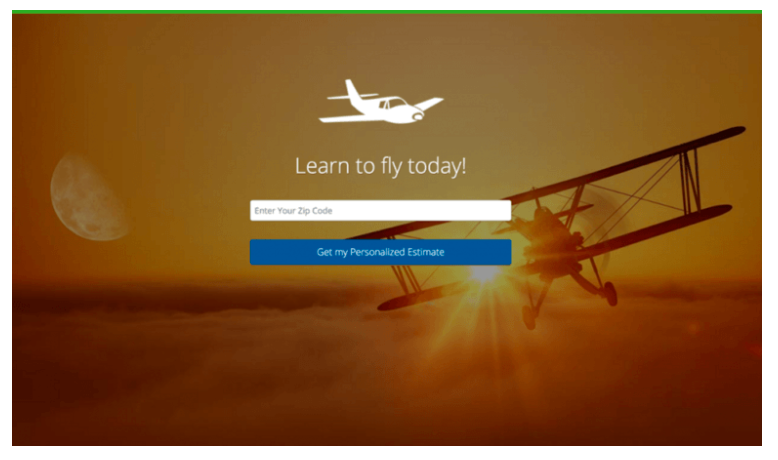
As you can see, everything looks clean and classy, plus the graphics prepare the prospects to fly.
A rule of thumb when crafting your headlining message is to always make sure it is short and sweet – not long and boring.
5. Create a click-worthy call to action
It’s a click-worthy call to action (CTA), not a click-bait.
Also, it shouldn’t confuse your site visitors. A landing page that happens to be the home page could be a total mess.
For example, if you want your site visitors to book a call for a consultative SEO session but you direct them to your homepage, there are chances they will find some recent posts, videos, sign-up buttons, free resources, etc.
They will not know what next to do and may end up enjoying your last post or an explainer video on the site instead of booking a call.
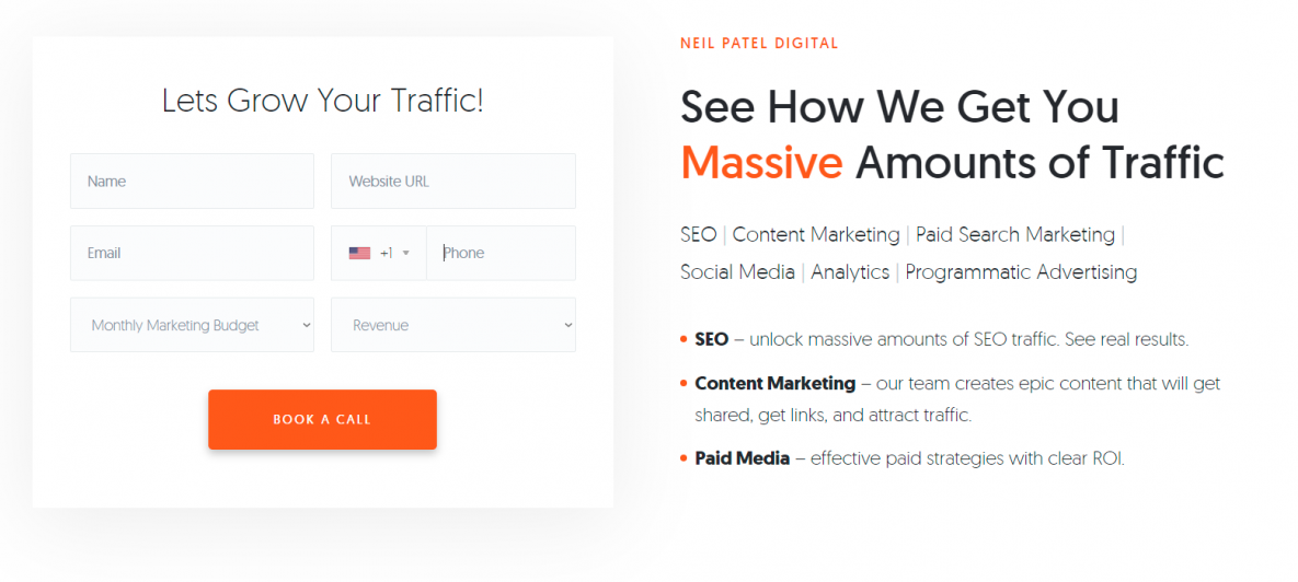
Here’s an example of Neil Patel’s ad asking the site visitor to “Book a Call” on one of his content pages.
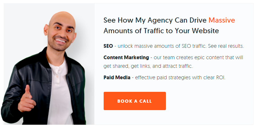
As you can see, the Call-to-Action button speaks for itself – Book a Call. If you click on the CTA button, it takes you to a clean landing page.
Again the CTA is “Book a Call,” with some explanations on what you get when you book the call. The CTA is consistent and straightforward, making it click-worthy.
6. Include social proof
A 2020 Bright Local consumer survey found that 79% of consumers trust online reviews, as much as personal recommendations from friends and family.
The idea behind social proof is to assure your prospects that they are in good company and they aren’t the only ones trusting you to solve their problems.
The social proof should be real and should showcase your expertise. You can use a testimonial, brand logos, client logos, subscriber counts, etc.
7. Use visual content
Your site visitors love visuals since they are easier to comprehend and require little to no commitment. For instance, a keto diet picture explains a lot about healthy eating and can help strengthen your message.
In fact, research shows that using visuals such as video can boost a landing page’s conversion rate by 80%.
8. Place your landing page in your funnel.
This is perhaps obvious. After doing all the optimization, you want to direct the right people to the landing page.
By placing your page in your funnel, you make sure that your ads, both organic and paid, all link to the right landing pages.
This way, you avoid the traditional conversion technique where a prospect is directed to the homepage.
9. Add analytics tracking
If you don’t track your efforts, it becomes difficult to tell whether you are progressing or not. Analytics tracking helps you measure your performance so you can improve on the gray areas and ultimately boost your conversion.
Tip: Use BiQ Rank Tracking to monitor your commercial keywords ranking movements
This Rank Tracking feature allows you to track your commercial keywords’ daily movements so you can respond quickly and secure your keywords before your competitors steal and optimize them.
You can also sort your keyword rankings by pages to see the overall page ranking over a given period.
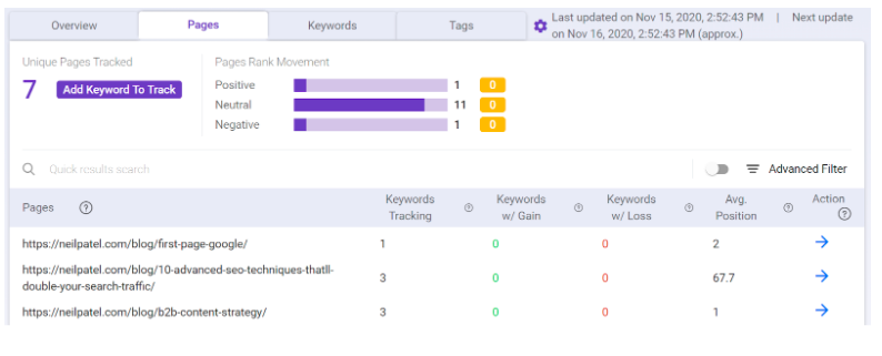
It is especially important to track your commercial keywords as your competitors are most likely targeting them as well.
10. Implement A/B testing
A/B testing allows you to test different elements within your landing page, e.g., the CTA position, button type, headline text and length, website design, image choice, video, etc.
However, you should change one element at a time to make sure you can associate a specific tweak to the change in conversion rate.
Tools to help you create the perfect landing page
Now that you have known how to create a landing page, you can use some tools and software readily available in the market to build the perfect landing page for your business.
This way, your work will be to edit and optimize the pages for higher conversion.
There are several tools, and you can pick any depending on what you need. Below are some of them.
1. Leadpages
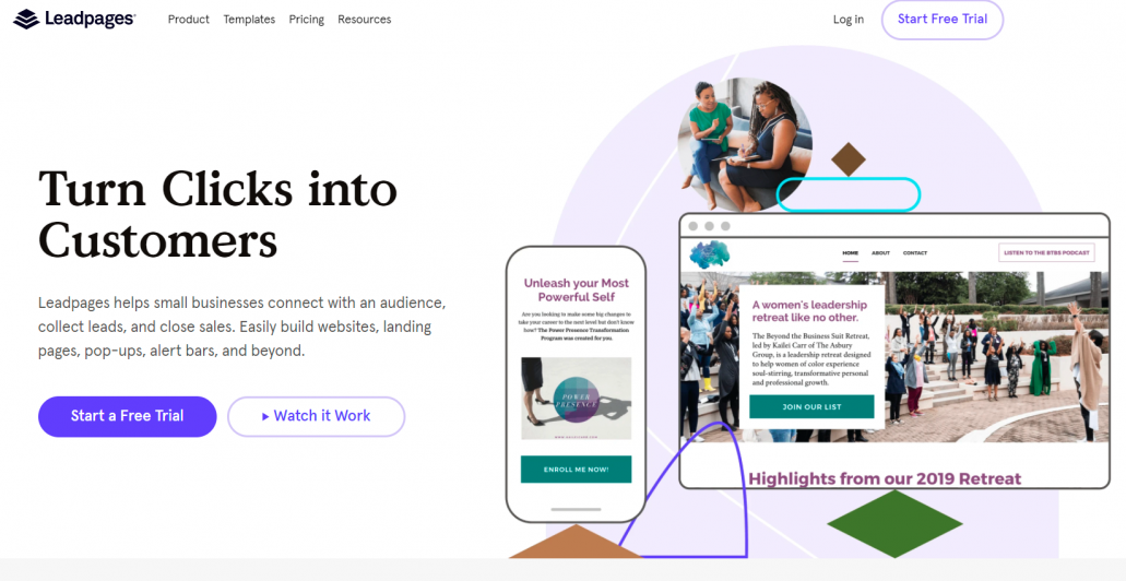
Leadpages is a lead generation platform where you can personalize your landing page to get exactly what you want.
Leadpages is quite flexible as it allows you to integrate with other platforms, and it offers plenty of unique widgets. Subscription starts at $17 per month for a 2-year plan with a 14-day free trial.
2. Unbounce
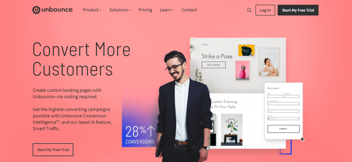
This is an easy-to-use conversion platform that allows you to convert your prospects with little to no effort.
Here you don’t need any coding skills, and you can easily duplicate any template you want. Unbounce comes with a 30-day free trial, while subscriptions start from $79 per month.
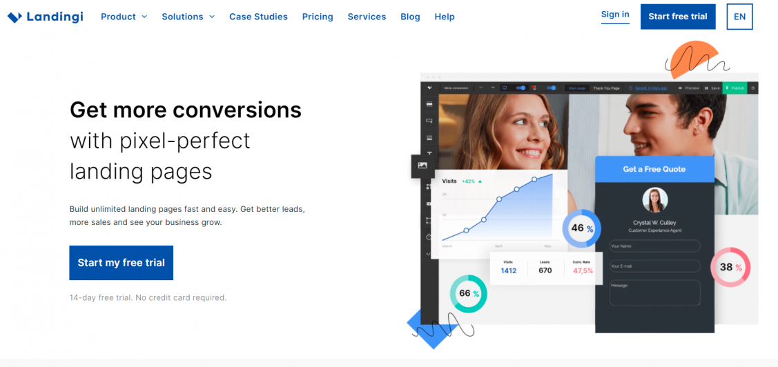
3. Landingi
This web-based landing page builder offers a drag-and-drop landing page template design with rich widget selection and plenty of customizable features.
The platform has four pricing plans, with the cheapest starting at $29 per month.
Conclusion
Knowing how to create a landing page is key to running successful marketing campaigns.
Also, your landing page can get many things done, from lead generation, conversion to helping your site rank for organic SEO.
Hopefully, the above tips have inspired you to create and optimize your landing pages for better lead generation and conversion.


