Every website has a landing page. A page for their customers to stand on and to start touring your website.
Landing pages are arguably some of the most crucial elements of lead generation. Yet, many firms don’t utilize them enough (or at all), with many people choosing to focus more on their websites’ homepages instead. You see, it’s easy to assume that a homepage is the most important page, considering that it’s the first thing visitors see when they visit your website.
But studies show that a website by itself converts only about 1% to 3% of site traffic. So homepages don’t really convert much. How about landing pages?
Now, landing pages, also known as lead-capture pages, are standalone pages designed to convert higher percentages of site visitors into leads. They are basically the pages visitors ‘land’ on after clicking a social media post or ad.
Unlike homepages, landing pages serve a singular and more focused intent- to direct site visitors to a specific service, offer, or product, and persuade them to buy or click. But before looking at the best elements to include in your landing page, it’s wise to first start by realizing the different types of landing pages:
3 Types of Landing Pages
1. Click-through Landing Pages

This is one of the simplest types of landing pages. Their sole role is to lead potential customers to your sales funnels.
As such, click-through landing pages are usually devoid of anything that can distract your site visitors from the main goal: clicking the call-to-action button.
What’s more, click-through landing pages normally consists of:
- An attention-grabbing headline
- A sub-headline expanding upon why the user has visited the page
- A product screenshot or image, or even an embedded video
- Feature touts highlighting why the user should buy the product
- A well-placed and big enough call-to-action button
- One or two customer quotes to reinforce why the user should click the call-to-action button.
2. Lead Capture Landing Pages

Also known as Squeeze pages, lead capture landing pages offer your site visitors a reward in return for their personal information.
Common examples include newsletter sign-up pages, demo request pages, and e-book download pages. In any case, consider any website page featuring a fill-up as a type of Squeeze page.
A lead capture page can have the following:
- A video explaining your service
- Customer badges
- A list of the features your product or service offers
- Navigation links to all other pages on your website
- Multiple CTA buttons
- Social media links
- Contact information
3. Long-form Sales Landing Pages

Long-form landing pages are basically comprehensive landing pages. They take more space because they explain everything a visitor needs to know to click the call-to-action button. You see, some methodical buyers first need to read a sizable amount of a product’s info before choosing to click your CTA button.
Long-form landing pages get designed for such visitors. According to Conversion Rate Experts, one short-form post-click landing page converting to its longer variation increased a site’s conversion rate by a whopping 363%. With that said, long-form landing pages mostly consists of:
- A headline
- Images
- An embedded video (if applicable)
- A marketing copy explaining every crucial thing about your service or product
- Testimonials
- Multiple call to actions
With the information above, you might have a rough idea of what ought to be on a landing page. But to put everything into perspective here’s a short guide:
4 Things to Include in your Landing Page
1. Headline and Sub-headline
The objective of the headline and sub-headline is to establish a connection with your visitors and persuade them to click the call-to-action button. Ensure to craft catchy and relevant headlines as well as sub-headlines to encourage your visitors to stay on your website and browse through what you’re offering.
2. Copy
After headlines and sub-headlines, the next thing to include in your landing page is an intriguing marketing copy. The copy should be extremely clear, considered, and straight to the point. You can even use bullet points to make your copy easier to read.
3. Image
Images are such a critical component of landing pages because visitors can prominently notice as well as quickly resonate with them. In any case, your images ought to illustrate offerings or speak about your brand, increase your site’s engagement rate, and set the tone of your audience’s entire experience.
4. Call-to-action
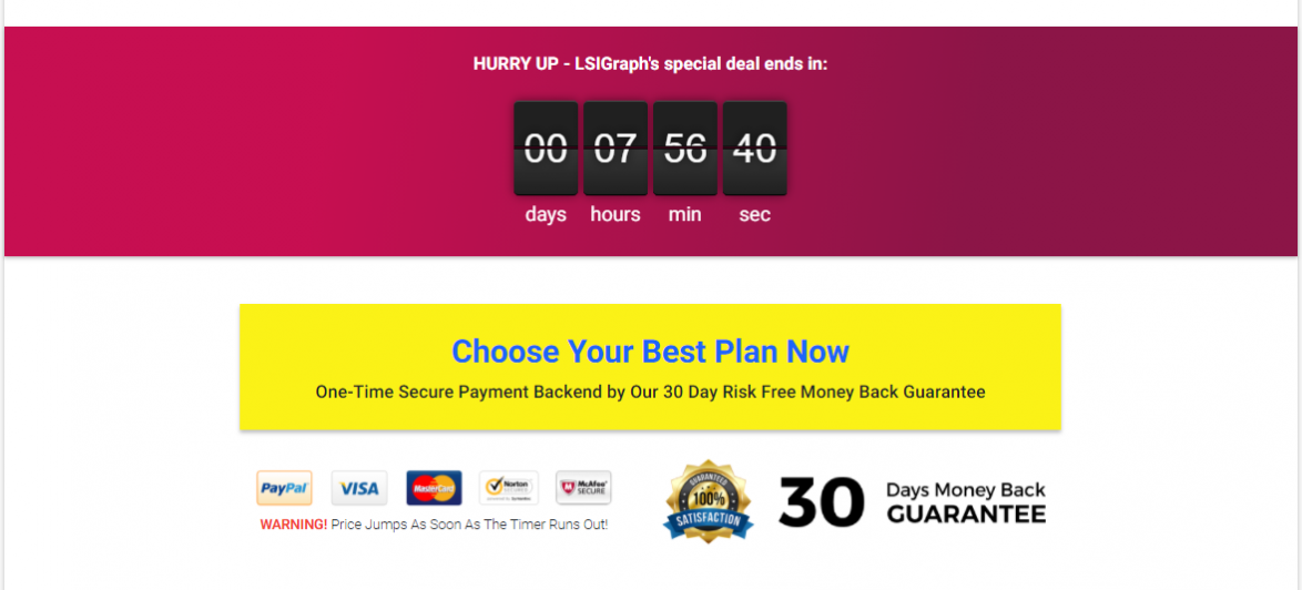
If anything, call-to-actions (CTAs) can get you that one click to close the deal for your business. This is why you ought to go all out to craft CTAs that are impactful, compelling, and attractive. To get higher conversation and click-through rates, consider the following best practices:
- Cultivate a sense of urgency
- Use action-packed words
- Go with legible and large text sizes
- Include fancy button graphics
Now, do the above elements alone ensure that your landing page is performing at its best? Of course not. Why? You’ll also need to optimize your landing page to get the most out of it.
What is Landing Page Optimization?
Landing page optimization (LPO) is the process of refining the performance of the different elements in your landing page to get your website the highest possible conversions.
Mind you, the term ‘optimization’ by itself refers to the methodology, process, or act of making something (such as a system, design, or decision) as functional, effective, or fully perfect as possible. LPO can, in fact, allow you to acquire more customers, maximize your ad spend value, and lower your business’s customer acquisition costs.
The Most Ideal LPO Process
Try and Google ‘how to optimize your landing page.’ You’ll find about 9,200,000 search results. With all that information out there, it becomes difficult to filter out what works and what doesn’t. Nonetheless, there’s one specific optimization process that experts tout to be the most ideal method for landing page optimization.
It’s the conversion pyramid or hierarchy of conversions, which was first brought to light by the Eisenberg brothers. If anything, the conversion pyramid consists of 5 levels, all of which your landing page, as well as its elements, must master to reach the epitome of optimization. The 5 levels are:
- Functional- This is the most basic level. Meaning your landing page should first be functional before anything else. It should not have any bugs or technical issues that can drive potential customers away. Also, your landing page should load at excellent speeds. Otherwise, visitors will move on without looking at your offerings.
- Accessible- Once your landing page is functional, optimize it for all devices to ensure it has the same impact on all site visitors no matter the device they’re using to view.
- Usable- Your landing page should offer an excellent user experience. So ensure it has no page scrolling or readability issues. It should also be clutter-free.
- Intuitive- Going through your landing page’s element ought to be as seamless as possible. If the hierarchy of elements doesn’t make sense to your visitors, they’ll move on.
- Persuasive- Adopt landing page elements that remove friction and doubts from your conversion process. In other words, your landing page should motivate users more.
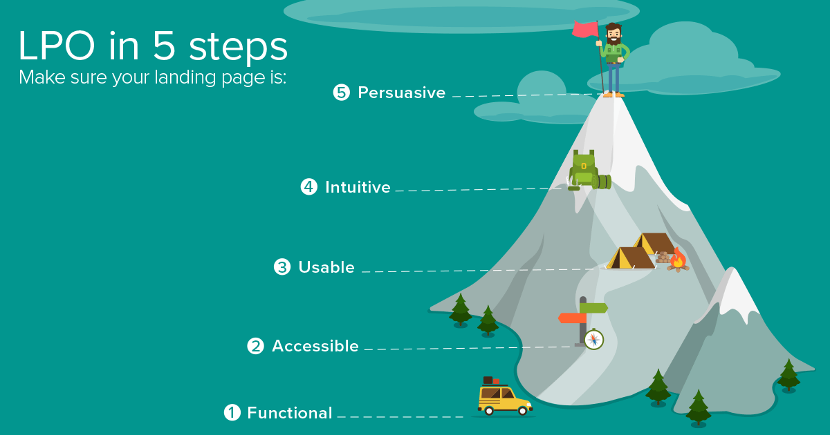
Once your landing page achieves the above 5 levels, users will easily and readily click your CTA button. But on top of passing the conversion pyramid test, your landing page should also:
Get SEO Ranking
Keep in mind that your landing page should target a given set of keywords. Keywords move your landing page up the ranks and place your sale, promotion, or product in front of users searching for similar topics.
A great starting point for keyword research is BiQ Keyword Intelligence.

You can easily get a list of related keywords to use on your landing page.
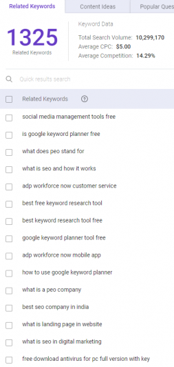
You can also easily toggle the keyword search intent, try to aim for keywords with transactional intent since those tend to convert better. Keywords with an informational intent can be used on long-form landing pages to provide more educational value that can entice the readers to click on the CTA.
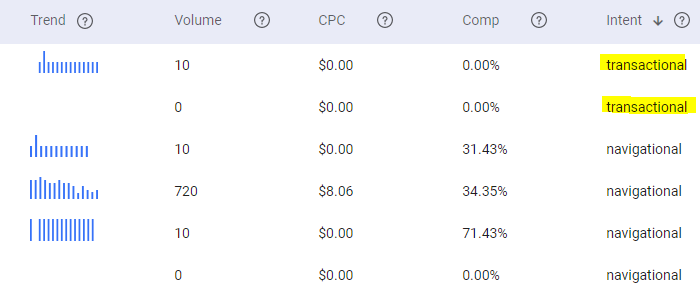
And on top of keywords, you can also incorporate Google Adwords as well as other paid boosting methods.
Focus on One Upcoming Sale or Product
A landing page works best when it focuses on one sale, product, or promotion. Focusing on a single message will help move your specific marketing or sales goal to the foreground for higher conversions. It also allows you to track and isolate a particular product’s success rate.
Make the Subscribing/ Buying Process More Efficient
Your landing page should act as a portal that moves users down your sales conversion funnel more efficiently.
How to Get Started with LPO
Think of your landing page like a leaky bucket. Pouring in lots of water into the bucket keeps the bucket topped up and makes it appear as good as new. But after a while, all the water pours out leaving your bucket empty.
Similarly, no matter how excellent your landing page appears, if you don’t identify and patch its loopholes, you’ll eventually lose your potential customers. This is why you ought to consistently pay attention to and optimize all your landing page elements. Here’s what you can do when starting out on landing page optimization:
- Present Hard-to-resist offers- Your landing page should be so compelling that visitors can’t resist whatever you’re offering.
- Add Above-the-Fold Content- This is basically the content a user will first see when he or she visits your landing page. Just as with good front-page stories, your above-the-fold content should draw customers in and keep them on your page.
- Pay Attention to SEO- As mentioned earlier, your landing page copy should incorporate relevant keywords that allow it to rank higher on SERP.
- Add a Powerful CTA- The more powerful your CTA, the more visitors you’ll convert into customers.
- Offer a Guarantee- A guarantee will help people feel reassured about your product or service.
- Keep thing Extra Simple- Adopt a simple landing page design to allow visitors to easily navigate through it.
- Incorporate a Sales Pitch Video- According to Cisco, videos make up to 80% of global internet traffic today. So if you want to attract more customers, create a sales pitch video and post it on popular sites like YouTube. Mind you, the best performing videos run for only 30 seconds to 2 minutes.
- Add Trust Badges- Security labels like testimonials, social media mentions, and media coverage news go a long way to build trust and boost the authenticity of your products/ services.
- Colour Contrast- By making use of color clarity and contrast, you’ll make your CTA pop instantly making it easily noticeable.
- A/B Test the Landing Page- The best way to know how your landing page is performing is by looking at its metrics. So don’t hesitate to look at things like user recording sessions, scroll maps, and heat maps to see if there’s anything you can improve.
In Summary
A landing page is one of the most powerful sales conversion tools. But only when used right. So ensure to keep optimizing your landing page to get the best out of it.
Refining your landing page is a sure bet to getting the best out of your traffic as well as save your advertising resources.


