Being a UX writer involves both craftsmanship and science. Here are 18 tips to be mindful of when it comes to UX writing for a website and creating UI copy to guide users within a product.
When it comes to building your website, creating a great website design is pointless if you don’t have a copy that is on par.
Likewise, having a great microcopy with low-quality visuals can also drive your visitors away at the first glance.
Needless to say, both your copy and design should complement each other. For a copywriter, there’s where your skill of UX writing comes in.
What is UX writing?

UX writing is purposeful writing for design.
It is writing where words are crafted with a design that is taken into account, where your copy often has a purpose and is driven by client objectives.
In any case, your writing has a primary objective and that is to improve the user experience when they interact with your website or product.
Often, UX writers compose user interface (UI) text and some other content expected to help the client as they collaborate with, or experience, an item.
How is UX writing different from other kinds of writing?
Ultimately, UX writers are client experience writers who composed the content you see (or hear) in a user interface. A UI is the place where an individual and a PC or app interact to complete something.
UX writing is essential for the design cycle and is a significant part of your client experience. Contingent upon the needs of the organization and the group, the particular kinds of writing will differ.
In fact, when it comes to UX writing, there are certain traits your writing should emphasize:
- Clarity: clients must comprehend what you talk about; the central message isn’t obscured or convoluted
- Compactness: unlike other forms of writing, this text is essential, terse, and focused on the objective. No filler talk is incorporated.
- Scannable: your users are not going to read your copy word-by-word. So make sure your vital information is concise and easy to scan.
- Consistency: the copy inside the interface of one advanced item keeps a similar style, tone, voice, and phrasing
- Value: the copy gives clients vital data or assists with collaborations
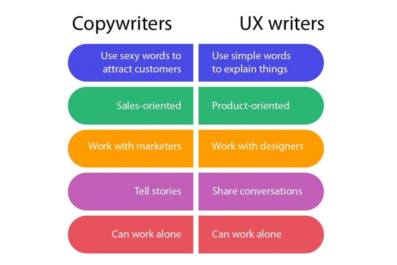
In any case, understand that copywriting = writing to advertise a product.
UX writing = content included in a product.
UX writing creates materials that turn out to be essential for the client experience for a given product.
The writing is very well part of the design process for your user experience. That’s why UX writers are essentially product designers and are very much involved in creating the website, app, or feature.

18 Fundamentals of UX writing
1. Make it easy and seamless
Writing the copy that is important for the UI configuration is both craftsmanship and science. Aim for straightforward and easy to understand text for the user.
As Dropbox UX writer John Saito puts it, the goal of UX writing “is to not have your words be noticed, so it becomes a seamless experience.”

Just like this example from Spotify, a short snippet of copy is the ideal. Remember the end goal is to write so clearly that end users wouldn’t even notice your word choice.
2. Be clear and concise
Sometimes we might have a few important messages we want to convey at once. The key is to condense the content but never restrict it.
Adopting concise writing means removing all extra information that is not important. Ask yourself if the messages you are looking to convey are essential and if so is it really necessary to put it all here.
Use as few words as possible without losing the meaning or importance. When writing briefly, ensure each term on the screen works per your objectives to help users use a product.

3. Avoid long blocks of text
When using products, users are generally still exploring the user interface. They, therefore, don’t read through long UI text — they scan.
As a rule of thumb, use scannable squares or grids to help guide your copy. Better yet, if you already have a layout of your user interface design draw out, craft your copy there.
One good writing practice is to take care to avoid orphans and widows. These refer to a lone word that appears at the top or bottom of your copy which can make it seem out of place.
4. Prevent heavy cognitive load
You may have a lot you want to say, but you also need to make sure you keep your sentence short and simple to avoid cognitive overload.
Compose text into more determinate sentences and passages. Write the primary draft in advance and afterward edit for simplicity and clarity.
It’s important to get feedback from a third party perspective. Ask your friend or colleague to see if they understand your user interface and look for places you can further improve.
5. Avoid using jargon
If anything, one of the huge attributes of successful UX writing is simply straightforwardness.
For clarity, you need to avoid using specialized terms and use generally recognizable justifiable words and expressions.
All things considered, it’s particularly critical to keep away from language that tends to have mixed messages.
6. Be grammar-flexible
Good grammar and punctuation are the ingredients of great content. Notwithstanding, it works differently you compose copy for a tech solution or when the message is restricted to 140 characters. Thus, here you need to be adaptable concerning grammar.
7. Make it engaging
Have you ever shopped on the web and experienced content or pictures that made you grin or chuckle? When that happens, it’s one of those moments that you leave with a lovely sentiment about the brand.
You’re bound to re-visit the site or application, and you may even enlighten your companions concerning it, subsequently expanding brand loyalty.
Remember that regardless of whether you can’t make your clients laugh, in case you’re displeased with your writing, your client will most likely be dissatisfied with it, as well.

People want simple and quick answers for traveling through advanced encounters. your UX copy should successfully capture attention and guide users throughout their interaction with a product.
The key is to always remember who you are writing to and use specific verbs instead of generic ones.
Explicit action words, such as to save or load, are more significant to clients than non-exclusive ones such as manage or navigate.
8. Write using present tense and active voice
When it comes to your copy, try not to work with the future tense when describing the activity.
- Don’t say: App has been downloaded.
- Say: App downloaded
The passive voice makes people yawn. Think about this sentence in the two voices:
- Don’t say: The start button should be clicked when you are ready to launch the sprinkler.
- Say: Click the start button to launch the sprinkler.
Writing in the present tense keeps the copy relevant and avoid any anticipatory feelings. It also reminds users that their experience is happening in the present, and keeps them more engaged.
9. Build a natural dialogue
In all forms of UX writing, make sure you are speaking to a friend.
Yes, think of the user as your friend who expects simplicity. A human with an intelligible style and voice of communication doesn’t attempt to waste time at each step of using a product.

Synonyms are useful for making language brilliant and distinctive in articles or books. However, they may wreck user experience, tasking them with the hard work of discovering the connection between synonymic terms rather than merely reading content to solve their issues.
Settle on one style of phrasing and naming things or tasks – and use them all through your copy.
For instance, utilize “erase” each time when this activity is intended to be done and don’t replace it with “eliminate” for certain parts of the text if the action is the equivalent.
10. Be careful when using humor
A lot of creators state that consolidating humor in UI makes it sound more human. However, in any case, like some other segment of UI, humor ought to be used reservedly.
Consider the time and place. Humor might work best for your website copy, but when it comes to your product, individuals will probably read the content in your interface regularly, and what may appear to be sharp from the start can get boring over the long haul.
Additionally, you need to be mindful that humor in one culture doesn’t necessarily appeal to other societies. So be careful when using humor.
11. Use graphics to help you communicate
We, humans, are unbelievably visual animals. A capacity to deciphering visible data is wired into our minds.
Besides, different people may not learn the same things from reading the same message. One rule of thumb is to use images to accompany important messages, to make sure all your readers are on the same page.

In some unique circumstances, it very well may be almost challenging to state something in words. That is the place where symbolism can uphold us and make text fathomable.
12. Catch attention with marked elements
Based on eye-tracking studies, when users read webpages, experts have found that numbers frequently stop the wandering eye and improve focus and attention when incorporated in huge text blocks.
Individuals subliminally link numbers to realities, details, sizes, and distance – something possibly helpful for them.
So, they are snared with the numbers in a copy, while words speaking to numerals can be missed in the majority of the content.
What’s more, digital users love numbers more than analog media consumers. Designers can use this understanding to make the content concise and efficient for skimming the information.
Just a simple implementation is to use numerals instead of words for numbers.
- Don’t say: tap your phone seven times to enable debugging.
- Say: tap your phone 7 times to enable debugging.
13. Make it consistent
Avoid surprises. Users don’t like it when they’re anticipating something and end up with another. Individuals must have the option to tell initially what a component does.

Besides, inconsistency can cause confusion
Irregularity makes disarray. One ordinary illustration of inconsistency is changing a word with an equivalent in an alternate part of the UI piece.
For example, when you choose to use “Add to Cart” as your call to action in one part of your UI, don’t replace it with “Buy Now” in a different part of your website. Make sure everything is consistent.
14. Craft your brand voice
For that, having a consistent brand voice can make a predictable client experience. Clients know who you are as a brand and it is imperative to give a comprehensive client experience from beginning to end.
The objective is for clients to hear a similar voice in each connection they have with your image, from the mindfulness stage to buying to maintenance.
A client’s first taste of a brand often comes through promoting content. They may see a computerized advertisement or watch a TV plug. So, when they go to your site or application, that same brand voice should ultimately help through the buyer’s journey.
Clients become acquainted with your brand image, and afterward, they realize what’s in store, building a feeling of trust and kinship with your vision. When that client makes the most of your image character, they’ll probably cooperate with you once more, which carries me to my next point.
15. Understand your objective and flow
When you are a UX writer, you are not just writing. You are very well part of the product designer.
You need to predict how a client will experience your product or feature. Understanding the buyer journey helps to determine the flow and overall value of content.
Also, your writing should always give the user the necessary information to help with interactions. Arrange your writing in a hierarchy to help with web scannability. Begin with the objective – start with the most critical information in your first fold.
16. Avoid showing all details upfront.
Now and again, it very well may be useful to give extra data or supplemental guidance for clients.
Be that as it may, generally, very frequently, such subtleties are introduced forthright. An excess of data can rapidly overpower clients.
Along these lines, reveal details selectively. Utilize a component a few content scheduling solutions to show more serve up details gradually.
17. Ensure interactive elements are obvious
Clients get baffled when interactive components—like links and buttons—are hard to spot. Configuration fastens that are anything but difficult to track down.

In case you’re utilizing a site design that does exclude borders and shadows, it fastens a rectangular shape and adjusted corners.
18. Make sure it is SEO-friendly
It’s imperative to write UX content that can be used all across the web and portable applications. You might need to organize your onboarding experience to guarantee that your content effectively directs the client.
Any way you decide to organize certain territories of your application, it’s critical to set a work process and guarantee each viewpoint is covered and focused on detail.
Conduct detailed keyword research. Google recognizes your site content with the help of keywords. These are typically firmly identified with the search terms that are entered by the clients in web browsers.
So before writing any copy for your website or landing pages, you should intensively examine the key phrases firmly connected with the theme.
You can use BiQ Keyword Intelligence to explore your potential target keywords. It permits you to find information on keywords volume, patterns, watchword rivalry, related catchphrases, and then some.

What makes BiQ’s Keyword Intelligence stand apart from the other keyword research devices available is the catchphrase analyzer highlight.
It encourages you to see why somebody may be looking for the catchphrase in the internet searcher. With this information, you will have the option to design your content to address your clients’ issues.
And if you are uncertain which word to utilize, you can sort through the phrases dependent on their worth. A high-value term implies it can carry more traffic to your site at a lower competition.
At the same time, ensure that you use keywords while keeping up the relevance to your content. Search engines utilize various systems to recognize content that has been made with the sole reason for SEO ranking.
Not exclusively will such content become deindexed, yet there are risks that your site gets boycotted via web crawlers.
What makes a fantastic UX writer?

Have a designer mindset
You don’t need to be the world’s most stunning UX designer with the coolest impacts on your portfolio.
However, in any event, you need to be interested in the things UX designers are doing and how they’re doing it. What instruments they’re utilizing — in any event, this can help to create straightforward content.
Active listening and understanding
Taking analysis well is anything but something simple to do. Being told something you just went through seven days chipping away at “thoroughly doesn’t work,” “it’s excessively occupied,” “There’s such a large number of words” isn’t enjoyable.
Nonetheless, as a UX writer, you must keep the client’s experience first, not your inner self. But this may be a whole lot easier said than done.
Interpersonal relationships
Relational abilities are attributes you depend on when you collaborate and speak with others. They cover an assortment of situations where correspondence and collaboration are fundamental.
These aptitudes include the capacity to impart and construct associations with others. Regularly called relationship building abilities, they will, in general, join both your inborn character and how you’ve figured out how to deal with certain social circumstances.
Compelling relational aptitudes can help you during the prospective employee meet-up and positively affect your professional advancement.
Put yourself in your user’s shoes.
Recognize problem areas and occasions to settle or even forestall terrible encounters for the user. You don’t need to zero in on where his/her enthusiastic way plunges into the red. You can be proactive in your answers by discovering approaches to forestall awful encounters instead of re-effectively tackling the difficulty that is as of now there.
Familiar with SEO and coding, especially for websites
UX writing is part of the content strategy, so you need to make sure you know how Google ranking works. It also makes it easier if you know a little coding.

Test and experiment
A/B test all parts of your UX writing. You should consistently search for approaches to advance your UX writing. A/B testing empowers you to create improvements without making changes that are hindering your objectives.
For instance, you may find that little changes to your onboarding messages decrease costs and improves reach. You can likewise utilize A/B testing to test aspects of the content.
Track your UX performance and getting insights from it. Client experience covers a broad scope of variables. In any case, at its center, UX is basically about the human experience on a site.
Hotjar is an analytics and client management solution that can help you understand your site clients’ habits and get their criticism through apparatuses, for example, heat maps, meeting accounts, and studies.
Key Takeaway: Start Practicing UX writing
So there you have it, here are the 18 tips to help your UX writing and some traits you must have to become a fantastic UX writer.
Most importantly, you should remember to always look to improve your user interaction and boost satisfaction from your product or website. I hope these UX writing tips have been helpful, do let me know in the comments.


